Cart Abandonment
What is cart abandonment?
One of the most significant contributors to lost sales in the eCommerce industry, cart abandonment, or shopping cart abandonment refers to the simple phenomenon of a visitor browsing an online store, adding an item to their cart, but leaving without making a purchase.
Even with the ever-evolving, dynamic landscape of the eCommerce sector, cart abandonment remains one of the biggest battles to be fought by digital marketers today. In fact, on average, the global cart abandonment rate sits at a whopping 69.57% And while this number varies substantially across verticals and devices, it is a testament to how colossally significant the issue is in today’s day and age of always-active, on-the-go shoppers and cut-throat competition among online retailers.
Though there are multiple factors that add up to a high cart abandonment rate, it ultimately indicates a poor user experience, a distorted purchase funnel, and a complicated checkout flow. So, simply optimizing your user experience and fixing leaks in your purchase funnel could significantly reduce your cart abandonment rate and thereby boost the sales and revenue for your eCommerce store.

How to calculate the cart abandonment rate for your online store?
Cart abandonment rate formula
The best way to calculate your online store’s cart abandonment rate is by dividing the total number of completed transactions by the number of carts created. Subtract the result from one and further multiply it by 100.
CAR (in %) = (1- CT/CC)*100
Here:
CAR stands for – Cart Abandonment Rate,
CT stands for – Number of Completed Transactions
CC stands for – Number of Carts Created
Revenue loss for your business = Number of Abandoned Carts * Average Order Value
Pros and cons of cart abandonment rate
1. Pros:
One of the primary benefits of calculating cart abandonment rate is that it enables businesses to understand the shopping behavior of their visitors and customers. The metric is generally an indicator of how intuitive and trustworthy a checkout process is.
Tracking your business’s shopping cart abandonment rate offers in-depth insights into the reasons behind revenue fluctuations, transactions failures, and more. Most importantly, it helps you identify friction areas on your website that may be preventing online visitors from converting into paying customers.
Reducing the cart abandonment rate is one of the most effective ways to immediately increase revenue and loyal customer base.
2. Cons:
It’s important to note that though knowing your site’s cart abandonment rate can be incredibly helpful within context, it can also be misleading. For instance, if you have very few online sales or website visitors, cart abandonment rate can’t prove helpful as the data set is too small for you to rely on. Be sure to measure this metric along with other key factors such as average order value, gross margin, website speed or uptime, conversion rate, and so on.
Another disadvantage of only measuring the shopping cart abandonment rate is that it doesn’t paint the complete picture. It just raises the initial flag indicating that something’s wrong. There are numerous reasons why the metric might increase. Identifying the underlying issue requires proper, in-depth investigation.
So, while shopping cart abandonment rate is a good metric to track the growth of your business and flag potential issues, it’s better to map other related business metrics as well to identify the exact issues and solve them at the earliest to increase conversions.
Industry Benchmarks
According to many eCommerce studies, the average shopping cart abandonment rate is 68.81%. In some cases, the abandonment rate is as high as 74.52%. A higher than usual abandonment rate is usually a cause of numerous reasons including the complex checkout process, shipping charges, required account creation, limited payment options, and more.
12 cart abandonment statistics you must know
A majority of cart abandonments are simply a natural consequence of how people browse through websites today, especially eCommerce sites. Window shopping, product price comparison, saving items in wishlist, exploring gifting options, etc. are some unavoidable cart and checkout abandonments that almost all websites experience.
As a business, it’s important for you to know and track all the reasons why users are abandoning your website’s cart. Here in this post, we’ve listed some general shopping cart abandonment statistics for you to consider to shape effective marketing plans.
- Average cart abandonment rate across all industries is about 69.57%.
- Mobile users report the highest abandonment rate of about 85.65%
- eCommerce band lose approximately USD18 billion in sales revenue ever year due to cart abandonment.
- Checkout optimization has proved to improved conversions by nearly 35.62%.
- Extra cost is apparently the top reason why shoppers abandon carts.
- To create an account in order to make a purchase is the second top reason why shoppers abandon carts.
- Nearly 57% of shoppers usually abandon a cart if the page doesn’t load in three or less seconds.
- Average checkout flow has 14.88 form fields and 23.48 form elements.
- 18% of people abandon shopping carts because of a long and complicated checkout process.
- 55% of shoppers abandon their carts when they’re asked to re-enter their credit card or shipping details.
- 46% of shoppers abandon carts because their discount coupon did not work.
- 39% of mobile users abandon carts because they find it difficult to enter their persona information.
12 reasons why customers abandon their carts
Given the eCommerce landscape today, buyers’ journeys on online stores can be quite complex and nonlinear. Hence, it’s increasingly difficult for marketers to constantly nudge the shopper towards completing their purchase. So, reasons for cart abandonment can be countless and hard to pinpoint. However, studies have deduced the most common ones to be the same for every online retailer. Here’s a look at some of the most prevalent reasons for shopping cart abandonment in the eCommerce industry:
1. Too long or confusing checkout process
One of the reasons shoppers fail to make it through the checkout process is because it seems unnecessarily long and confusing. After having spent enough time browsing your online store, shortlisting items, and finally deciding to purchase a select few, they seldom have the patience to fill out lengthy, ambiguous, and sometimes complicated forms. For instance, checkout involving forms spread over multiple pages, no checkbox to select the same billing and shipping address, or ambiguous form fields without descriptions are some of the things that make for a complicated checkout flow. Not only does this make for a poor shopping experience, but also annoys your prospective buyers only to cause them to walk away.
2. Hidden, unexpected, or high costs (mainly shipping and taxes)
All the effort you put into getting shoppers on your online store to browse your stunning catalog, visit product pages, and finally add their favorite items to the cart is often rendered futile when they come across unpleasant surprises on the checkout page.
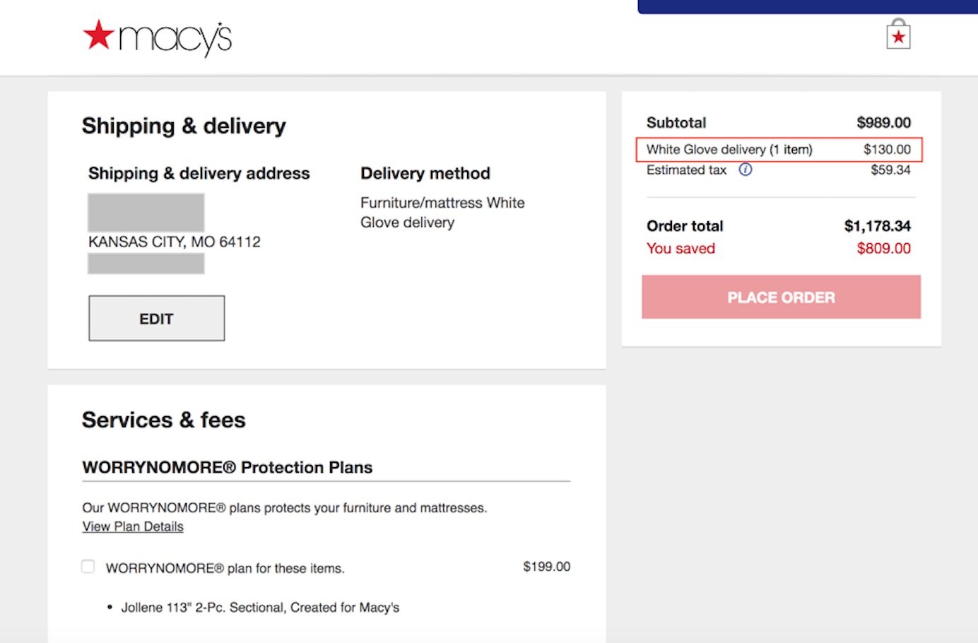
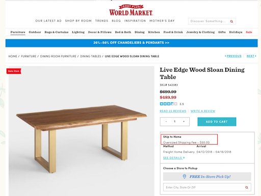
Unexpectedly high taxes, enormous shipping charges, unanticipated express delivery charges, unreasonable minimum order value for free delivery, and all such information that surprises users by showing itself only during checkout is one of the major reasons behind cart abandonment. In fact, according to a study of ‘Reasons For Abandonment’ in 2019 by Baymard Institute, more than 50% of the respondents cited extra costs being too high as their primary reason for cart abandonment in the past 3 months.
Your prospective buyers see this as a deliberate attempt on your part to keep critical information from them until the final step, and hence lose trust in the credibility of your eCommerce store.
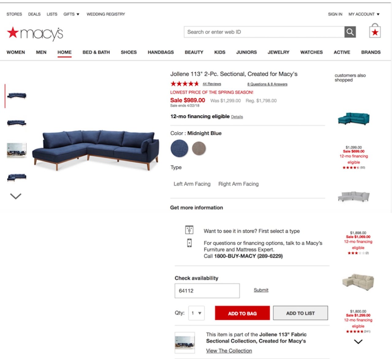
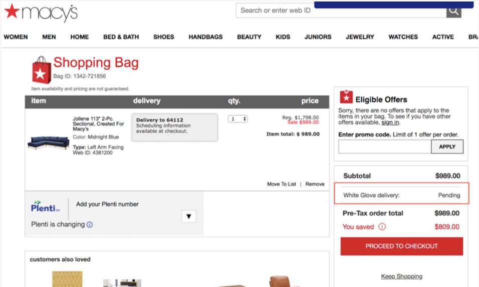
Take a look at the below example from Macy’s where the furniture product pages don’t highlight the exact shipping cost until after the checkout process was initiated:

3. Mandatory account creation for checkout
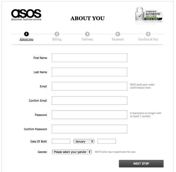
Imagine your prospective customer scrolling through Facebook in the middle of a busy day and coming across an item they are instantly enticed to purchase. They click on the ad, land on your product page, add the item to their cart, and proceed to checkout, only to get a prompt that says, ‘Create an Account to Shop’. Since they were already pre-occupied, it’s no wonder they won’t have the patience to go through the account creation process, and hence would end up abandoning their online shopping cart. For on-the-go shoppers, mandatory account creation poses as one of the biggest roadblocks in completing their purchase.
4. Payment security concerns
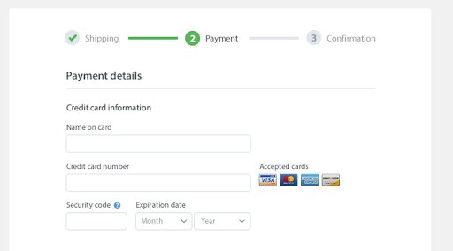
Users often hesitate when sharing their personal or sensitive information, such as credit card details with lesser-known or relatively smaller/newer stores. Since their critical information is in question, even the slightest bit of doubt regarding your site’s trust factors, a sense that your online store has no payment security measures, or even the lack of trustworthy payment services (such as PayPal) is enough for them to walk away. Lack of trust badges, SSL seals, and other similar stamps that visually reinforce trust are usually the primary triggers for buyers to be in doubt.

5. Low purchase intent
Online window shopping is another reason you might find visitors on your site abandoning their carts. There are times people browse your online store out of boredom or with no particular agenda and end up casually adding their favorite items to the cart, but ultimately abandoning them due to lack of a substantial purchase intention.
6. Comparison shopping
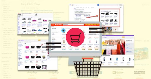
When shopping online, buyers want to ensure they bag the best deal possible, so they are not going to settle for the first store they browse. They often tend to search for a certain item, park it by adding the item to their cart, and then go hunting for the best price for the same on competitor stores. Therefore, comparison shopping is a leading cause of cart abandonment owing to buyers’ tendency to research thoroughly and lookout for the best offers, most competitive prices, and the most convenient shopping experience.
7. Lack of desirable payment options
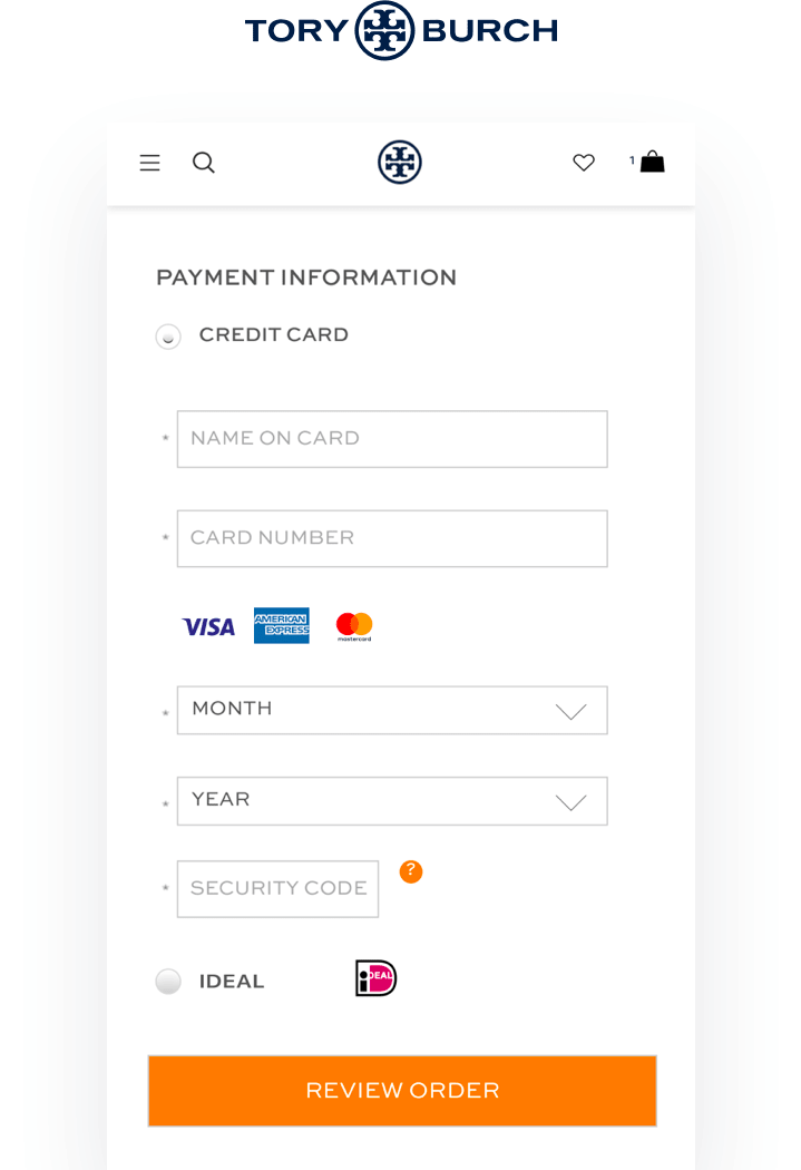
The availability of a limited number of payment options could be a reason buyers end up unwillingly abandoning their carts. With an endless array of credit cards and payment services popularly used today, there are bound to be buyers who trust one over the other or only restrict their usage to a select few payment methods. Therefore, it’s common for shoppers to drop-off and abandons their carts when they don’t find their preferred or trusted payment option among the ones provided.

8. Ambiguous or unsatisfactory return or refund policy
Very often, some online retailers only highlight the return and refund policy at the payment page or worse, do so in an unclear, ambiguous manner. For example, just mentioning ‘10-Day Replacement’ on the product pages could confuse visitors, and they might have questions such as – whether or not pickup is provided in case of a return, how long does the refund process take, etc. For a prospective buyer, it might lead to doubt, confusion, uncertainty regarding the purchase they were sure about just minutes ago and turn out to be a reason for them abandoning their cart. Similarly, if the return policy imposes an unsatisfactory condition such as ‘Exchange your item within 7 days or avail a refund (up to 50% of the item value)’, it might again lead to the shopper abandoning their cart.
9. Unsuitable delivery timelines
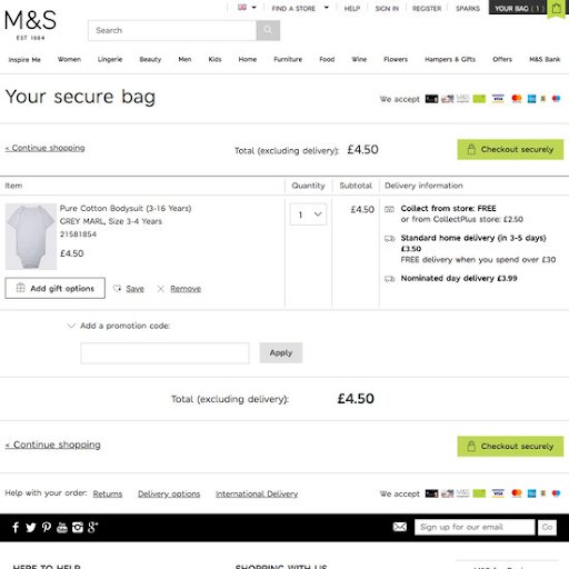
More often than not, delivery timelines are calculated basis the buyer’s location. And in cases where the address is asked for only during the checkout process, the delivery timelines sometimes come as a surprise to the buyer. Whether delivery is taking longer than usual or if the exact date and time of delivery is not suitable for the buyer, there’s a high probability of them abandoning their cart in such cases.
10. Site/app performance issues
Nothing kills a good customer experience like a poorly loaded website or app checkout page. Bad site performance is one of the leading causes of cart abandonment and contributes to billions of dollars worth of lost sales. Visitors often find it extremely difficult (and rightfully so) to navigate through the checkout process due to slow sites or apps that sometimes even collapse. And as a result, they tend to drop-off and abandon their carts. Also, with ever-reducing human attention spans of distracted, on-the-go online shoppers, it’s almost impractical to expect them to stick around for checkout pages to load steadily to complete their purchase.

11. No readily available or applicable offers or coupons
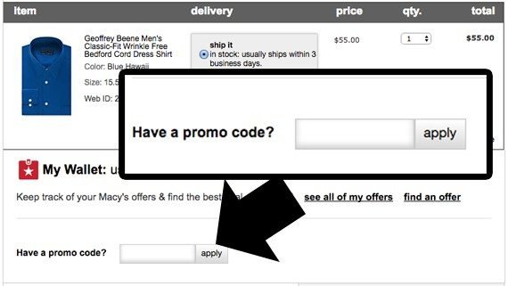
Since coupon codes are usually generated and applied at the checkout page, customers have to wait until the final step to find out if their cart items are eligible for any discount or offer. And in case they don’t find a suitable coupon code for their cart items, they are often left disappointed and tend to abandon their carts in anticipation of better deals. Oftentimes, visitors even have to leave your website/app to look for coupon codes. In such cases, there are slim chances of them returning to their abandoned carts as they tend to get distracted or eventually lose interest.
12. Restrictions on quantity
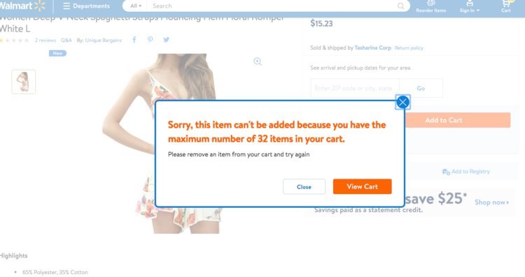
There are eCommerce stores that put a cap on the quantity of items you can purchase of a particular kind (or sometimes even on the total number of items per bill), and don’t highlight this information upfront on the product pages. It is only when customers add this product to their cart, they realize they are only allowed a certain maximum quantity of the same, and this often results in them abandoning their carts.
8 ways to reduce cart abandonment
Fighting cart abandonment is quite straightforward, and ideas can be plenty. The key here is to continually optimize your online store for the most delightful shopping experience you can offer while getting rid of any roadblocks keeping shoppers from completing their purchases. You can set the ball rolling with the following ideas and later build on top of them to systematically combat cart abandonment:
1. Streamline the checkout process
Realign your checkout process to eliminate all unnecessary pages and steps that make it complicated or lengthy. For starters, get rid of all fields in your checkout flow that are important solely from a back-end/marketing standpoint, such as, ‘Where did you first hear about us?’ or ‘Would you recommend us?’. Streamline the process to ask for minimum details from the customers. Unless it’s an absolutely essential one like home address, don’t add another field. Give them a small checkbox asking if their billing and shipping address is the same. Avoid making them fill in the same information twice. With every additional, unjustified field, you are risking your conversions.
Simple fixes can help you make it easier and almost lightning-fast for visitors to checkout their cart on your online store. For instance, add a progress bar indicator so that once started with the checkout process, your visitors are aware of how far along they are in it and the amount of further time commitment the process requires. This will leave no room for confusion and encourage prospective customers to complete their already initiated checkout process. Also, showcase product thumbnails during checkout and order confirmation to assure them that they have selected the right products and don’t have to abandon the process to double-check.
Next, get rid of all distractions. Any element in your checkout process that doesn’t push the customer towards the final sale is a distraction. For instance, a carousel of ‘lightning deals available today’ or a pop-up that asks shoppers to ‘sign up to receive exclusive deals’ in their inbox can serve as massive distractions. Such elements draw visitors’ attention away from the actual task and are a huge cause of cart abandonment.
Another element to optimize for is the ‘Back’ button. Allow your customers to use the back button freely at any stage during checkout instead of flashing the ‘Error’ message as soon as they hit back. They might want to review their order before the confirmation step or could have even clicked the back button by mistake. Showcasing an error message can be a huge risk as you can never be sure if they will take the trouble of going through the entire process again.
2. Be transparent about all costs to avoid any surprises
Declare all additional costs explicitly on product pages and leave nothing open to interpretation. For instance, if you have a threshold for free shipping, display the exact amount worth of items a shopper needs to add to their cart to qualify for it. Similarly, if a certain item isn’t covered under your standard shipping and delivery policy, it might work in your favor to highlight the same in the first fold.
The same applies to EMI schemes, as well. Don’t make your customers go through the entire checkout process only to later tell them that you do not offer EMIs on most credit cards. Make sure you specify all requirements and eligibility criteria on the product/ category pages themselves.
Also, while nothing can replace the power of free shipping in persuading a visitor to complete their purchase, it might not be the most viable solution for smaller online businesses. If you, too, are hesitant about providing free shipping, the next best thing would be to declare the shipping and all related costs upfront on the product pages. This would include handling charges, taxes, and any other additional cost that might come as a surprise at the checkout page. You can provide a shipping cost/tax calculator on the product pages to help visitors figure out the overhead before they are ready to make the payment. This will help you gain their trust and avoid abandonment due to price shock.
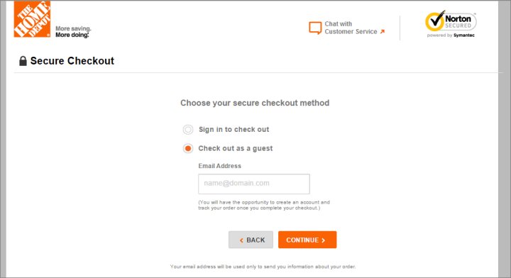
3. Provide guest checkout option
Needless to say, you wouldn’t want to miss any opportunity to collect visitors’ valuable data. However, enforcing account creation for checkout to capture data might not be in your best interest as it could lead to annoyed customers resulting in increased drop-offs.
Visitors are likely to assume the process of account creation to be unnecessary and time-consuming, and hence become automatically uninterested in making the purchase if it involves account creation. What you need to do is cut the checkout process short and make buying from your store seamless by offering a guest checkout option, even if you have to sacrifice the collection of useful data for it.
You can surely incentivize the creation of an account by offering loyalty benefits to registered members, exclusive access to sales, etc. But, always ensure you have an option for guest checkout to provide a hassle-free shopping experience to on-the-go shoppers.
4. Have an omnipresent cart button
An easily accessible and omnipresent cart button will ensure navigating to and from the cart is as seamless as possible for a visitor. So, whether it is reviewing the cart total or double-checking previously added items, your visitors will always be a click away from accessing their cart and initiating the checkout process. Moreover, an omnipresent cart button will ensure visitors are repeatedly reminded of the items they have shortlisted, even if they were merely browsing or window shopping and had little intention of making a purchase. It will rule out the possibility of visitors adding items to their cart and forgetting about them as they get distracted.
5. Offer live chat support
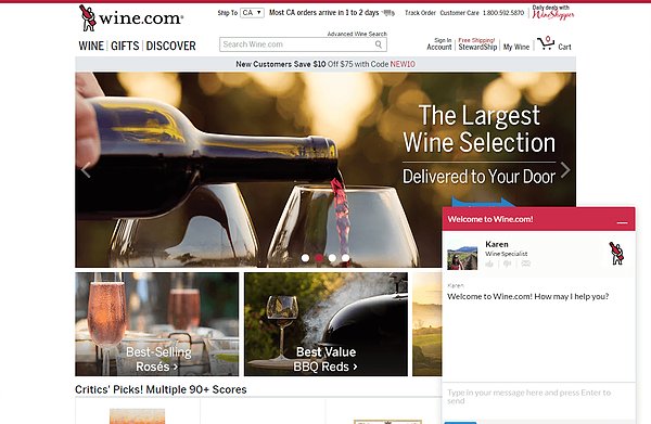
Oftentimes, customers might have questions or concerns regarding certain items that they are unable to find answers to in the product description or site/app FAQs section. Offering live chat assistance on your online store will ensure hesitant customers get real-time resolution to their queries that nudges them to go ahead with the checkout process. By not providing live assistance, you are risking customers abandoning their carts to get their queries answered.
6. Use trust symbols to reassure customers
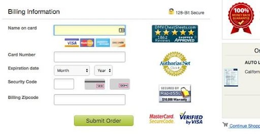
Imagine a visitor landing on your store via a Google ad or browsing it upon a friend’s recommendation. They need to be convinced of the credibility of your store in order to go ahead with the checkout process and share their personal and sensitive information with you.
Showcasing a valid SSL certificate and well-known and recognizable security badges such as those of Norton, McAfee, TRUSTe, and BBB can help you reassure them of the trustworthiness of your store and security of their purchase so they can complete the checkout without worrying about credit card frauds, payment thefts, etc.
7. Optimize your app/website for performance
If your average load time for any page in the checkout process is longer than the industry average, you might be inviting busy or impatient customers to lose interest. Optimizing each and every element of your checkout flow (such as image sizes, server response time, social plugins) for reduced page load times (without compromising on usability) is, thus, essential to provide a hassle-free, enjoyable, and memorable end-to-end shopping experience.
8. Provide enough payment options
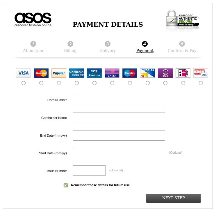
With a plethora of online payment methods available globally today, preferences are likely to vary from customer to customer. While thorough research on your target audience’s behavioral characteristics can help you understand their preferences better, it can still be hard to shortlist the select few payment options to offer that your target audience is likely to trust the most. To overcome this uncertainty, it is better to provide almost all of the most trusted payment avenues on your eCommerce store including all basic credit cards, e-wallets, cash, bank transfers, prepaid cards, direct deposits, and credible payment services such as PayPal (for customers reluctant to share their bank or credit card information). This will ensure no customer abandons their cart as a result of not finding a trustworthy payment option.
4 ways to combat shopping cart abandonment
While you can dive right into implementing the ideas around how to reduce cart abandonment, it would be wiser to follow a systematic approach that involves understanding and strategically tackling the sources leading up to the abandonment rate and then devising an experimentation and optimization roadmap to solve for it. Here are some ways to combat shopping cart abandonment.
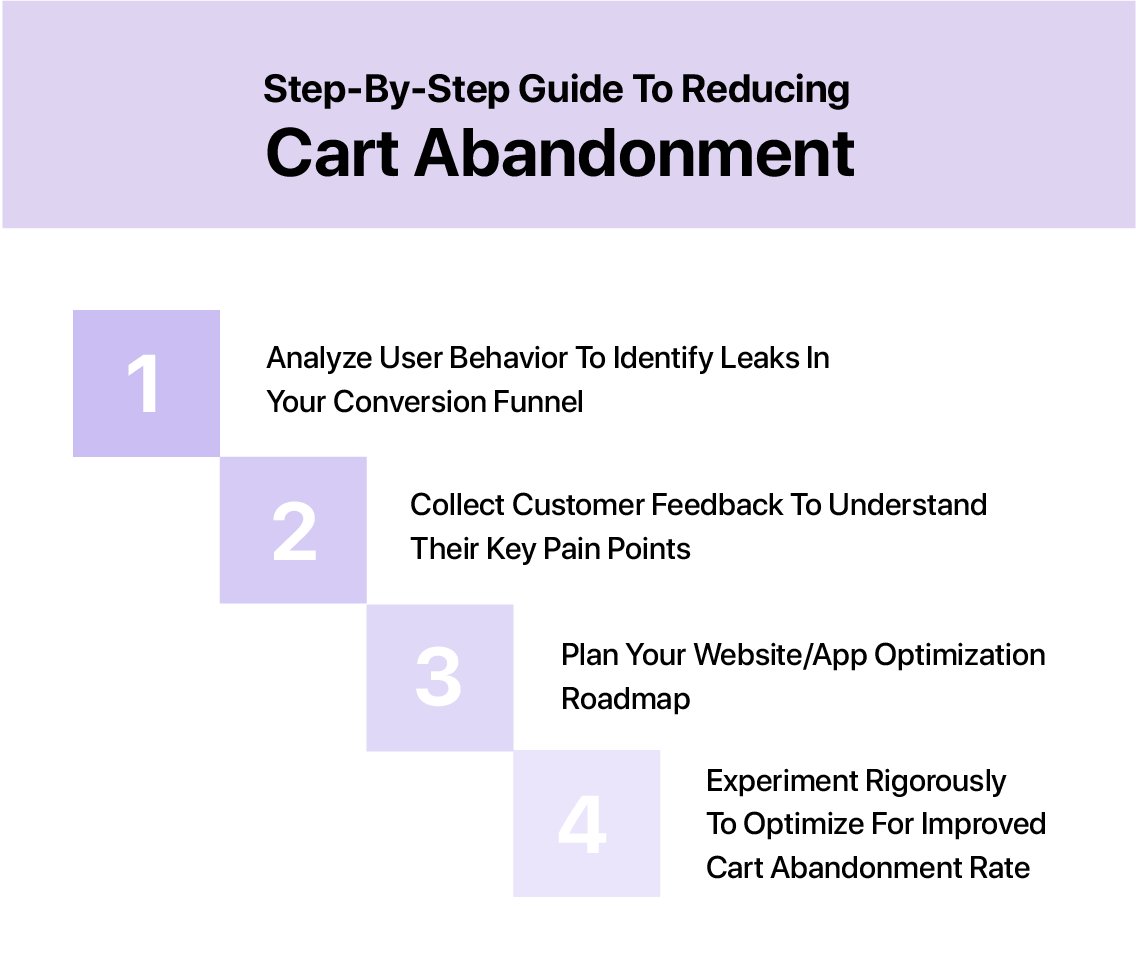
1. Analyze user behavior to identify leaks in your purchase funnel
Before getting started with optimizing for a reduced shopping cart abandonment rate, it is imperative to leverage qualitative methods to track and analyze user behavior on your online store to identify the various stages/steps at which they are dropping off.
This exercise will help you form hypotheses to test and deduce the probable reasons for the drop-offs and, therefore, identify numerous optimization opportunities to solve for the leaks. For example, you can use tools such as session recordings to record and playback visitor sessions to analyze their behavior on your website/app once they add an item to their cart, and figure out why they abandoned it. Similarly, you can go for heatmaps to visualize visitors’ click and scroll behavior, which would help you understand their interaction with your website/app and deduce which elements attract or distract them. You can use VWO’s AI-powered free heatmap generator to get a predictive view of visitor behavior on your webpages.
Another tool you can use is form analytics which is useful in helping you determine your visitors’ key pain points in interacting with your forms – fields at which the maximum time is spent, ignored and dropped fields, etc. which could ultimately be the reason for them abandoning their cart and not completing the checkout process.
2. Collect customer feedback to understand their key pain points
Once you are done analyzing visitor behavior on your online store, the obvious next step would be to let your visitors tell you what exactly their key pain points are. You can leverage tools such as on-page surveys, exit intent pop-ups, and live chat to ask abandoners why they left their cart behind. This helps foster direct communication between you and your customers, and as opposed to other qualitative tools, surveys, exit intent pop-ups, and live chat can help you directly get a piece of your customers’ minds. You can then make decisions based on actual customer feedback, not just inferred information and completely avoid misinterpretation of data.
Once you have a list of the precise reasons for cart abandonment from your visitors themselves, you’ll be able to clearly define the critical areas of improvement on your website and app to deliver a better user experience, which will guide you to draft an even effective and targeted optimization strategy.
3. Plan your website/app optimization roadmap
Now that you have carried out extensive qualitative research and clearly recognized critical improvement areas on your website and app that you need to focus on to outdo your user experience, you are all set to start planning a definitive data-driven optimization roadmap targeted towards solving visitors’ key pain points. Use these pain points to define your optimization goals, prioritize these goals strategically, and start with roadblocks that attribute to the maximum drop-offs. You can now go ahead and draft data-backed and well-researched hypotheses to systematically tackle them.
4. Experiment rigorously to optimize for reduced cart abandonment
To let data validate your findings and guide your decisions, be sure to experiment actively to narrow down on the best possible solutions for all visitor pain points. By using A/B testing to create and validate (or disprove) your hypotheses, you can make informed decisions about what’s working and what isn’t for your visitors and customers.
For example, if you’ve observed a high percentage of visitors abandoning their carts due to unexpectedly high shipping and handling charges, you can A/B test to see whether providing a shipping charges calculator or clearly mentioning the shipping charges has a better impact on the cart abandonment rate.
Similarly, if you own a fairly new online store and have deduced that visitors might have concerns regarding the credibility of your payment process, you can test to see if adding security badges helps tackle that issue. You can even go a step ahead to test which security badge has the highest impact on your shopping cart abandonment rates. This way, you’ll only rely on data-backed decisions in optimizing your website/app and are likely to end up with more fruitful results.
Also, ensure that testing isn’t a one-time process; build and maintain a culture of experimentation to continually optimize your website and mobile app for an enhanced user experience and a reduced cart abandonment rate.
6 proven methods to recover abandoned carts
It would be safe to assume that it’s practically impossible to bring down the cart abandonment rate of your online store to 0%. You will always have visitors abandoning carts, and there’s little you can do with regards to eliminating the issue completely.
What you can do instead is retarget abandoners and re-engage with them to repeatedly remind them of what they’re missing out on and entice them to return to your online store and complete their purchase. Here’s how you can leverage various remarketing channels and tools to target abandoners and make the communication as impactful and effective as possible.
A. Off-site opportunities:
1. Recover lost carts with targeted email campaigns
While this medium can only be used for shoppers who had signed in to their accounts or had provided you with their email ids, it’s still one of the most effective and popularly used for abandoned cart recovery. If done right, automated recovery emails can work wonders in driving abandoners back to complete their purchase. In fact, studies report that almost half of the cart recovery emails sent are opened.
Given this optimistic number, working on a strategic abandoned cart recovery email campaign seems worthwhile, doesn’t it? And creating a winning one doesn’t take much. The ingredients are pretty standard. You need a persuasive subject line, appealing imagery, a well-crafted copy, and a clear CTA.
Other critical factors to bear in mind to ensure you are on your path to a high recovery rate include segmentation of the email database and timing and frequency of the email. Slicing and dicing your cart abandoner email lists basis products bought, time of purchase, geography, first time or repeat shopper, etc. can help you effectively apply personalization and meaningful incentivization.
You could also set a triggered email marketing campaign based on user behavior. Visitors abandoning the website or app at the product page, checkout page, and shopping cart can be sent three different triggered emails respectively to ensure the content and CTAs are relevant.
Similarly, you need to take a call on the frequency and timing of your cart recovery emails. If you had to pick a good starting point, the first email could be sent out within one to two hours after a customer abandons the cart. The second email could be sent 24 hours later, followed up by a third email 3-5 days later.
2. Re-engage at scale with push notifications
A rapidly-growing retargeting channel that one could argue is substantially more efficient than emails, push notifications can be effective in sending systematically timed reminders about abandoned carts. Unlike emails, push notifications are device agnostic and opt-in only. They also usually have a higher CTR. Once the visitor allows you to send push notifications, you’ve unlocked a goldmine of remarketing opportunities that you can leverage to recover and convert them.
You can time your push notifications to ensure the first reminder is sent within a couple of hours of abandonment, and the subsequent ones are sent at reasonable intervals. You can also personalize your push notifications to make them more relevant, and offer a discount on abandoned cart items to further increase chances of converting abandoners.
Also, ensure your copy is intelligently crafted to make you sound more empathetic, affectionate, and supportive towards your visitors to help rekindle their purchase intent. It could provide that extra nudge needed to drive them back to your online store.
3. Deliver customized messaging with dynamic retargeting ads
Dynamic ads are another powerful channel you can leverage to retarget cart abandoners. Whether you are running them on Facebook, Google, or any other platform depending on your target audience, remarketing ads can be exceptionally impactful in improving recovery rates as they allow you to customize the ad copy for every abandoner that you remarket to. This means that every user-targeted will see exactly the items lying in their cart with a CTA leading them directly to it.

4. Interact with abandoners through Facebook Messenger bot
Enough has been said about the penetration, popularity, and effectiveness of social media in driving business growth. But, it’s interesting that, as eCommerce marketers, you can go beyond marketing and promoting your business on popular social media platforms such as Facebook to leveraging it to recover lost business opportunities (i.e., shopping carts).
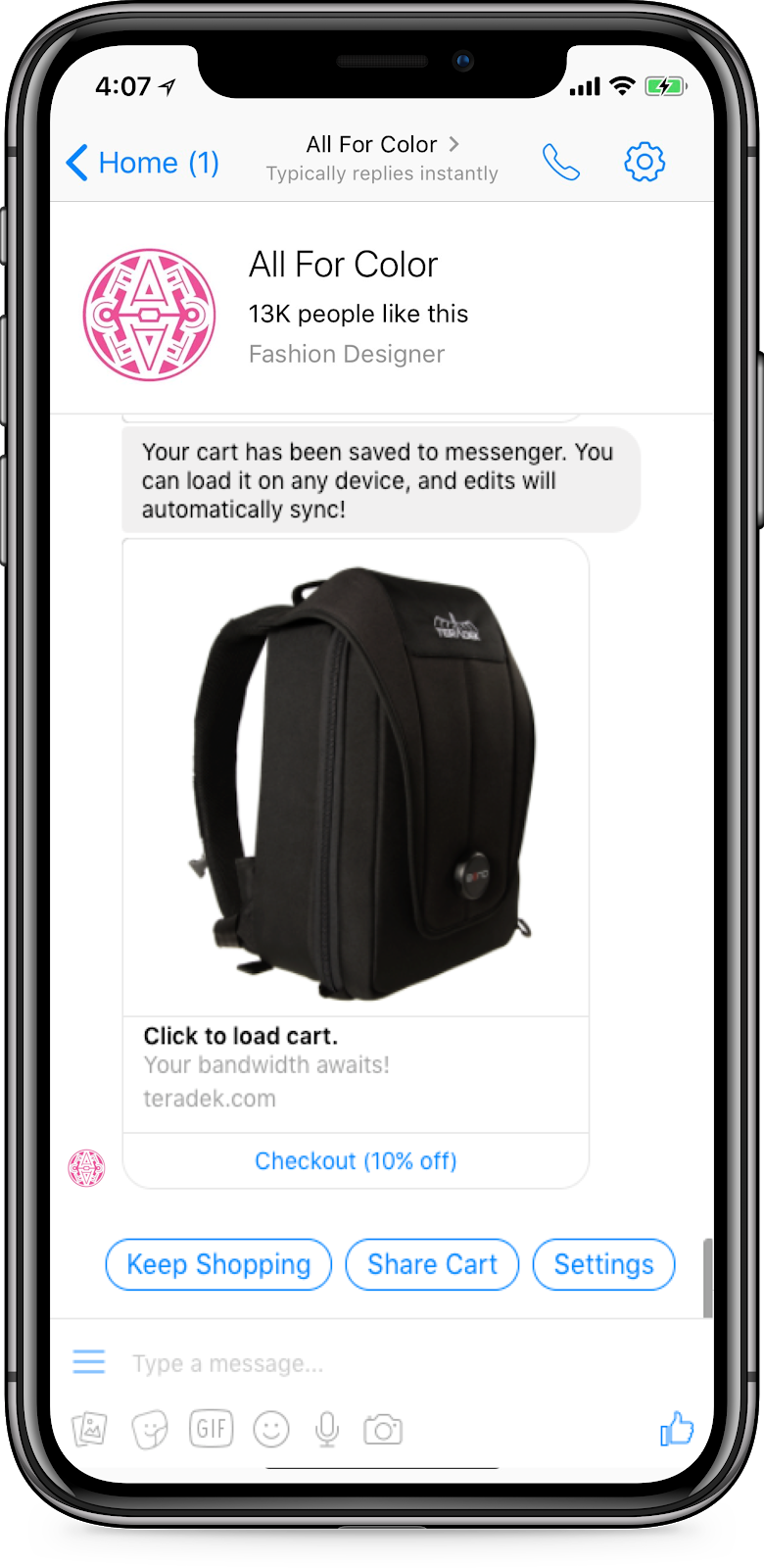
As opposed to the more conventional remarketing tools, Facebook Messenger has emerged as a highly effective, more personal automated channel for reaching out to potential customers who have abandoned their eCommerce carts. Achieving high open rates for recovery emails is dependent on plenty of factors and hence, can be dicey, and retargeting ads are undoubtedly expensive. Remarketing through Facebook Messenger chatbot is, therefore, gaining pace as it allows you to deliver personalized, real-time messages and achieve significantly higher open and click-through rates, while completely eliminating the possibility of your message landing into a spam folder.
Here’s an example of an automated message from Facebook Messenger from an online fashion store:
B. On-site opportunities:
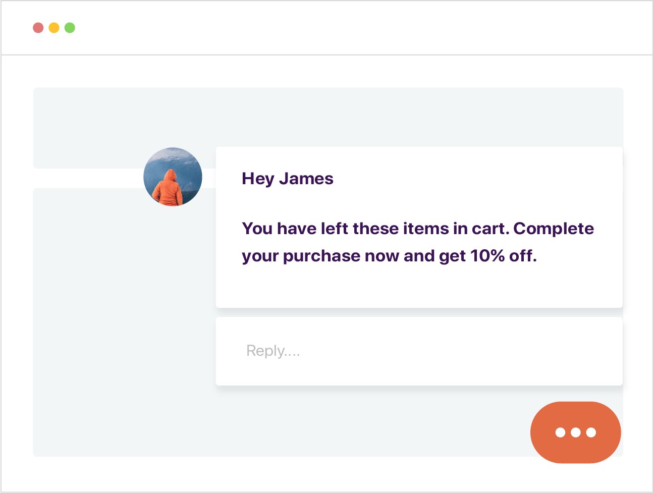
1. Offer real-time support with live chat
On-site live chat support can be a useful tool both for reducing cart abandonment (as discussed above) as well as recovering abandoned carts. By using live chat support to reach out to abandoners on your eCommerce store, you can remind them of their previously abandoned cart (and assure them it’s been saved) and instantaneously address their paint points to recover and convert them quicker than any other recovery or remarketing channel.
While you can apply the same strategies for recovery as you would for emails, push notifications, or Facebook Messenger chatbots, think of live chat as providing on-ground support or resolution to recover shopping carts on the website/app itself, without having to leverage a separate remarketing channel altogether.
2. Retain shoppers with exit intent pop-up
Pop-ups monitor visitors’ mouse movements on your online store and show themselves whenever they detect visitors abandoning the store. A highly effective tool in capturing visitor attention, exit intent pop-ups have evolved to now being custom-made to tackle one of the most critical issues at hand for eCommerce marketers – cart abandonment.
They can be used to offer irresistible deals/free shipping, create urgency, offer support, promote new items – all in an effort to retain the user on your website/app and keep them from abandoning their cart. Since they are triggered on your eCommerce store, you needn’t rely on separate channels to recover lost visitors and have an excellent opportunity to convert visitors sooner, then and there itself.
5 cart abandonment solutions and best practices
When customers abandon their online shopping carts, it doesn’t mean they’re gone forever. There’re many ways to recapture their attention, get them to, and minimize the impact it has on your revenue. Learn strategies to perfect cart abandonment email recovery efforts.
1. Build a comprehensive omnichannel retargeting strategy
With digitization transforming human lives, your customers are now more connected than ever before. Therefore, just like your marketing strategy, you can’t afford to rely on a single channel for your remarketing communication as well. Whether it is push notifications, ads, or emails, they might not be as effective as standalone remarketing channels in driving visitors back to your online store and converting them.
To effectively retarget abandoners and not miss out on any conversion opportunity, it’s almost imperative to create a sequential remarketing strategy that takes cue from your store analytics to strategically leverage all channels.
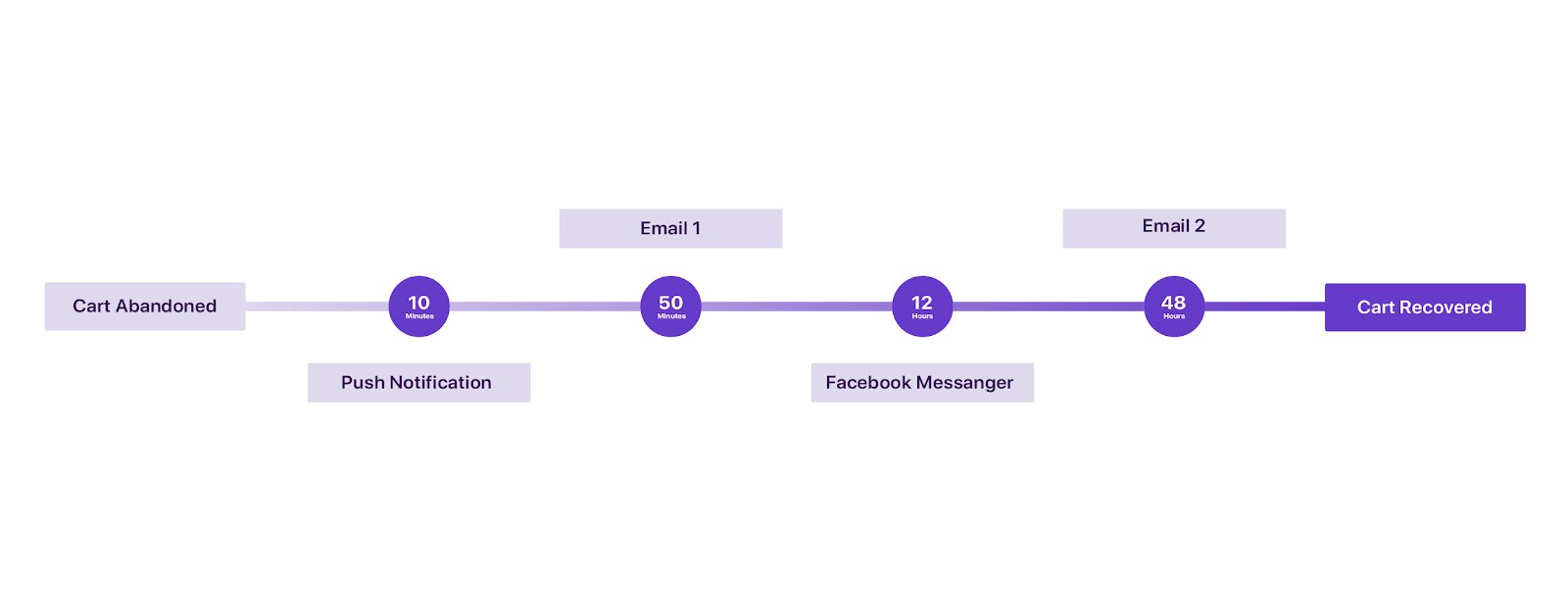
Systematically using a combination of push notifications, emails, SMS, ads, and Facebook Messenger bot to remind visitors about their abandoned carts can help you reach out to them on their preferred channel, and also at the moment of their highest intent. Since timing is critical when it comes to retargeting, you can strategically time your cart recovery communication and plan out which message to send out when via what channel.
With this, not only do you increase your chances of recovery or conversion, but you are also assured of a series of backups. You can also use this as an opportunity to understand your visitors, their behavior, and more to further streamline your remarketing strategy and convey the right message to them via the most relevant channel. All you need to make sure is that your customers don’t receive any redundant messages or don’t feel like they’re being spammed.
Take a look at the following omnichannel retargeting strategy, for instance. It uses multiple channels to retarget its abandoners while perfectly timing the messages for maximum results:
2. Offer irresistible, exclusive, and personalized deals and use scarcity and urgency to create FOMO
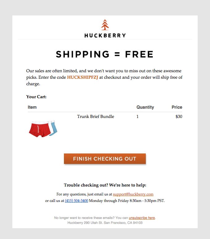
Some of the most common and obvious tactics that eCommerce marketers have always leveraged in their cart recovery messaging is offering exclusive (and limited period) offers and free shipping to lure shoppers back to their cart. And it undoubtedly is quite effective in doing so as visitors tend to add items to their cart and hope for a price slash in the near future to complete their purchase. Similarly, personalized deals based on customers’ shopping patterns are also highly likely to win them back as it would have more relevance and value for them.
Offering exclusive deals creates what we commonly call “Fear Of Missing Out’ as shoppers are inadvertently tempted to make the purchase before they lose out on the offer. Similarly, for window shoppers, creating a sense of scarcity has quite an impact. Highlighting that a product they liked is limited in quantity and likely to be unavailable soon might rekindle their purchase intent and entice them to buy it quickly.
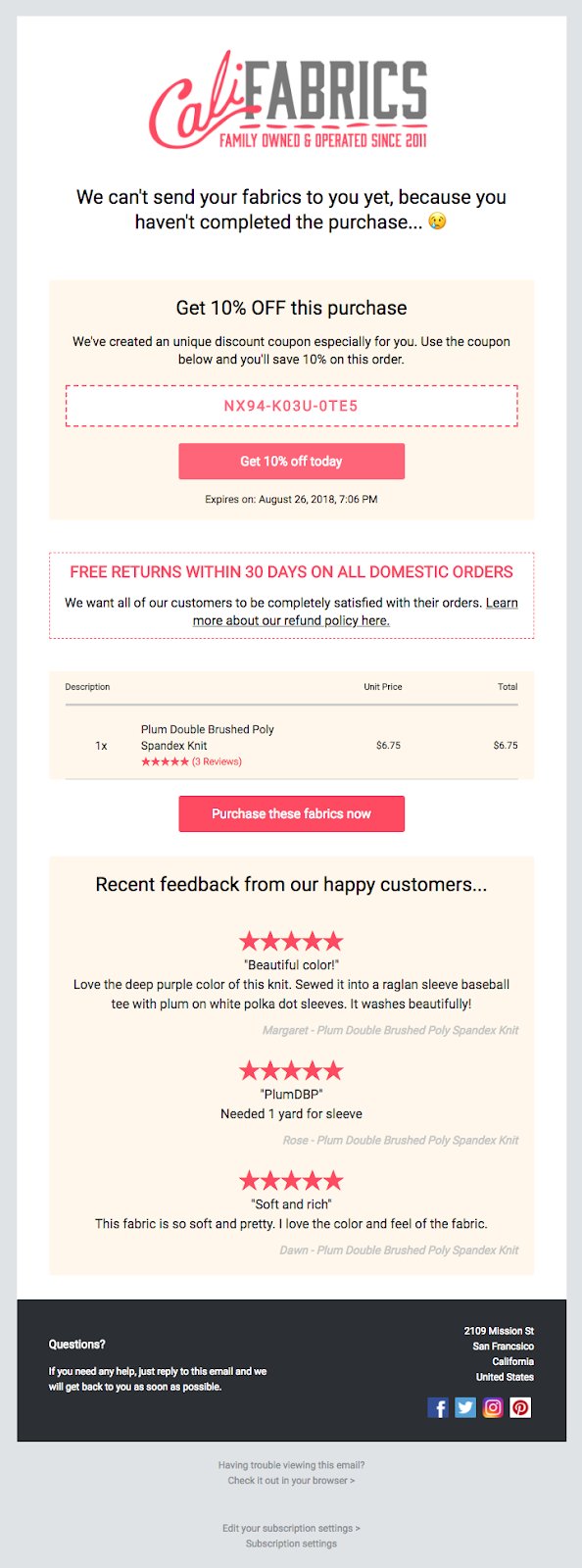
3. Use social proof in recovery messaging
If 88% of your potential customers trust user reviews as much as personal recommendations, you might be missing out on huge conversion opportunities by restricting them to product pages. Including social proof such as product ratings, reviews, and testimonials from other customers in recovery messaging can work like magic in reminding readers of how sought-after the product they left behind is, highlighting what they’re missing out on, and convincing them that it deserves a second chance. And you need not include all reviews from your website in your recovery email. Just pick the top 2-3 ones or just one that is most likely to have the highest impact in persuading and converting abandoners. You could also include a celebrity or influencer testimonial, if you think that might show better results.
4. Personalize abandonment emails and push notifications
Personalization can help you cut through the clutter by truly showing your potential customers that they mean more to you than just a lost sale. Personalizing your messages is one way you can connect better with your audience and potentially drive higher sales. Using specific details such as visitor first name, product name, and other demographic and psychometric attributes you have captured can help your email or push notification grab your audience’s attention while their inbox is flooded with cart abandonment emails and desktop is buzzing with push notifications from eCommerce stores.
For instance, let’s say Susan searches for black heels on your fashion eCommerce store, adds it to the cart and later, abandons it. The push notification you send out to remind her of her purchase and drive her back to the cart could either read something like –
Hey there! You left something in your cart.
Grab it now at 10% off before it vanishes!
Or you could go ahead and personalize your message to make it something like –
Hey Susan! You left these eccentric block heels in your cart.
Grab them now at 10% off before someone else does!
Personalizing this push notification not only clearly reminds Susan what exactly she abandoned, but is also likely to do a better job at persuading her to return and complete her purchase.

5. Offer help through customer support and FAQs
Very often, people abandon carts due to some apprehension about their chosen product, the online store, or maybe the shipping policy. To recover such visitors, it is wise to include the link to the FAQs section on your website and also mention customer support contact details in your recovery messaging. It will ensure that if that particular visitor had abandoned their cart due to any confusion, query, or doubt and was unable to find the needed support on the portal itself, they can now directly get the help they need and complete their purchase.
Cart abandonment examples from various industries
1. Booking abandonment
A term specific to the online travel industry, booking abandonment is responsible for massive revenue losses every year and is most dominant in the case of airline websites (87.87%), followed by online travel agents, car rental, cruises and ferries, and hotels (in that order). The most common reasons for booking abandonment that attribute to the whopping numbers include low intent (just researching), dissatisfaction with pricing, long and complicated booking process, lack of preferred payment options, to name a few.
The important thing to note here is that given the large ticket size, the research phase for most of your visitors is likely to be longer and more comprehensive, possibly involving cart abandonment as an organic part of the process. Therefore, keeping visitors from abandoning their carts is more about creating an unparalleled, absolutely delightful user experience that entices them to book the vacation they had been planning for months or even start planning one.
Among other elements, captivating visuals are an integral part of your website/app that you might want to optimize for to appeal to the reluctant visitors and give them that nudge of confidence to go ahead with their booking.
Similarly, sharing fascinating stories of other travelers could provide that extra push and persuade them to book their next trip. However, you can also start with simpler tweaks towards reducing booking abandonment. For example, providing an option to save details for later could be helpful for those in the research phase hopping from site to site in their quest for the best deal. They wouldn’t have to re-enter their personal information in case they decide to go ahead with a deal they had previously come across on your site/app.
2. Form abandonment
Whether its an eCommerce store, a travel booking portal, or a lead generation website; forms have a critical, almost indispensable role to play in gathering user data for any online business. However, more often than not, they are unable to successfully do so due to visitors abandoning these forms for multiple reasons, including lack of motivation, an obstacle or doubt regarding the form fields, unnecessarily long and complex forms, poor usability and design of forms, etc.
While there’s no silver bullet to completely eliminating form abandonment, there are some steps you can take to make the most of your forms and systematically mitigate abandonment. Some of the simpler, more obvious ones include shortening and simplifying your forms, removing all needless fields and distractions, reducing the number of minimum clicks, and including a progress bar indicator. These tweaks are a good place to start to improve the ease and usability of filling out your forms.
Once done with these hygiene checks, you can think about how you can make the entire experience less tedious and more fun that leads to a high-converting form. You could incentivize form submission so visitors don’t feel demotivated midway and look forward to completing the process. Adding security badges and SSL certificate will help instill trust in the credibility of your website/app and reassure your visitors of the security of their information. Improving the design language to make forms more appealing and less complicated could again help you convert better and reduce abandonment.
3. Browse abandonment
Another phenomenon prominent in the eCommerce industry, browse abandonment refers to the practice of visitors landing on a website/app, browsing category and/or product pages, but dropping-off before adding any item to the cart.
While there are multiple reasons for browse abandonment, one of the most common ones is window or comparison shopping. A significant percentage of your visitors are going to be the ones who accidentally land on your website/app and stay solely with the intention of browsing your catalog to see if anything interests them. They might even visit product pages to learn more about the product, and then wander off if nothing catches their eye.
In such cases, you can either use the principles of scarcity and urgency in your on-site messaging to persuade these visitors into adding these items to the cart even though they never intended to make a purchase, or strategically re-target these visitors using effective abandonment notifications or emails to recover them and nudge them down the conversion funnel.
While appealing on-site/app messaging can help you win over some impulse shoppers, carefully crafted retargeting recovery messaging can help you convert the uninterested ones. For example, personalizing recovery emails and adding dynamic recommendations are likely to be more impactful in tempting them back to your store. Similarly, showcasing other best-selling and most highly-rated products from the category, adding social proof, and offering exclusive coupons could be effective in driving them to your online store.
4. Search abandonment
While the concept of search abandonment may seem similar to browse abandonment, there is a slight difference between the two. Search abandonment refers to visitors landing on your eCommerce website or app and actively searching for a specific product or offer before abandoning it without clicking on any product.
In search abandonment, the intent, in all likelihood, is higher than any other form of abandonment. Hence, recovering and converting abandoners revolves mainly around retargeting them with follow-up notifications or emails targeted towards tackling the probable reasons for abandonment.
For instance, let’s assume someone searches for red scarves on your fashion eCommerce store and abandons the search disappointed due to unavailability of red scarves. Once they are back in stock, it’s an opportunity for you to convert this visitor by simply notifying them about the same or maybe even offering them an exclusive deal on it.
VWO cart abandonment case studies
1. ReplaceDirect
From notebook accessories and mobile equipment to batteries and other power supplies, the Dutch eCommerce store ReplaceDirect is known for its extensive product range and is one of the largest online retailers in the Netherlands in the category. They took up A/B testing to optimize their website to battle cart abandonment, convert better, and boost sales.
Since shoppers abandon carts majorly due to hidden shipping costs that get added at the checkout page, the ReplaceDirect website highlighted that no shipping charges would be added at the product pages itself to avoid any surprises. However, they were unsure of whether visitors actually paid heed to that information.
They hypothesized that providing a clear order overview (that highlighted the total billing amount) during the initial stages of the checkout process would better highlight that no shipping charges were being added and, therefore, keep visitors from abandoning their carts. They made several tweaks to the second step (filling out personal information and shipping address) of the checkout procedure. They inserted the order overview and clearly stated the total amount and delivery date at this step itself. Next, they got rid of unnecessary fields from the form and redid the design of the page to give it a cleaner look.
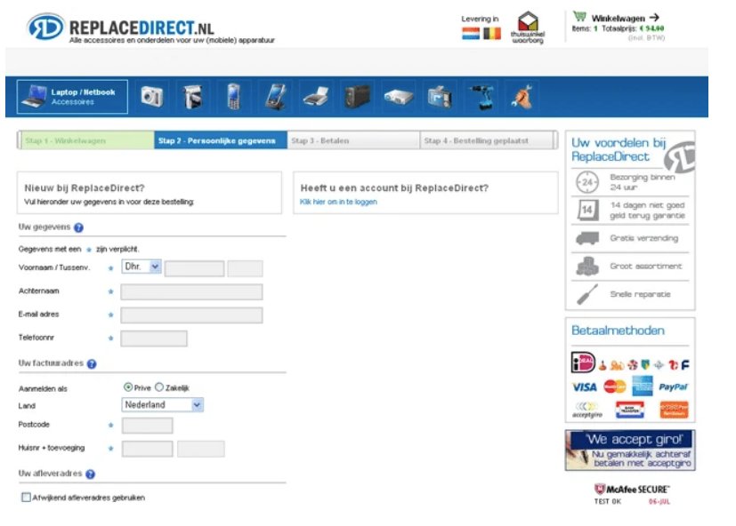
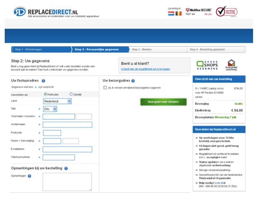
As a result of the test, the variation performed exceptionally better and led to a substantial 14% increase in sales and a massive 25% reduction in the cart abandonment rate. While the teams at ReplaceDirect hoped and expected the test results to be in their favor, winning by a margin this huge turned out to be a pleasant surprise for them.
2. Bionic Gloves
Based out of the UK, Bionic Gloves is an eCommerce store offering specialist gloves for golf, fitness, and other activities. Designed by Orthopedic hand specialists, its products are known for superior ergonomics, grip, and comfort. Just like any other online store, their ultimate ongoing goal was to increase revenue, and they were actively working towards optimizing their website to boost sales. During this, they realized that cart abandonment was one of the major causes for lost business opportunities for online retailers, and Bionic Gloves was no different.
While the team at Bionic Gloves had a lot of ideas to battle abandonment, most of them seemingly defied conventional wisdom. They concluded that A/B testing is the only way to validate their otherwise counter-intuitive hypotheses and unlock unconventional optimization opportunities to tackle cart abandonment.
The first hypothesis they created was that removing the ‘special offer’ and ‘gift card’ code boxes from the shopping cart page would reduce cart abandonment. They set up an A/B test for the same and tested the variation on close to 1400 visitors for 48 days.
Here’s a look at the control and variation from the test:
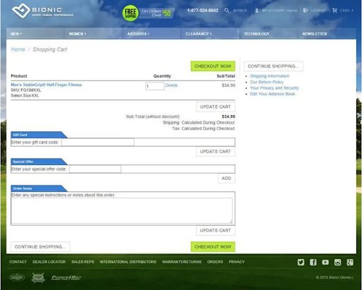
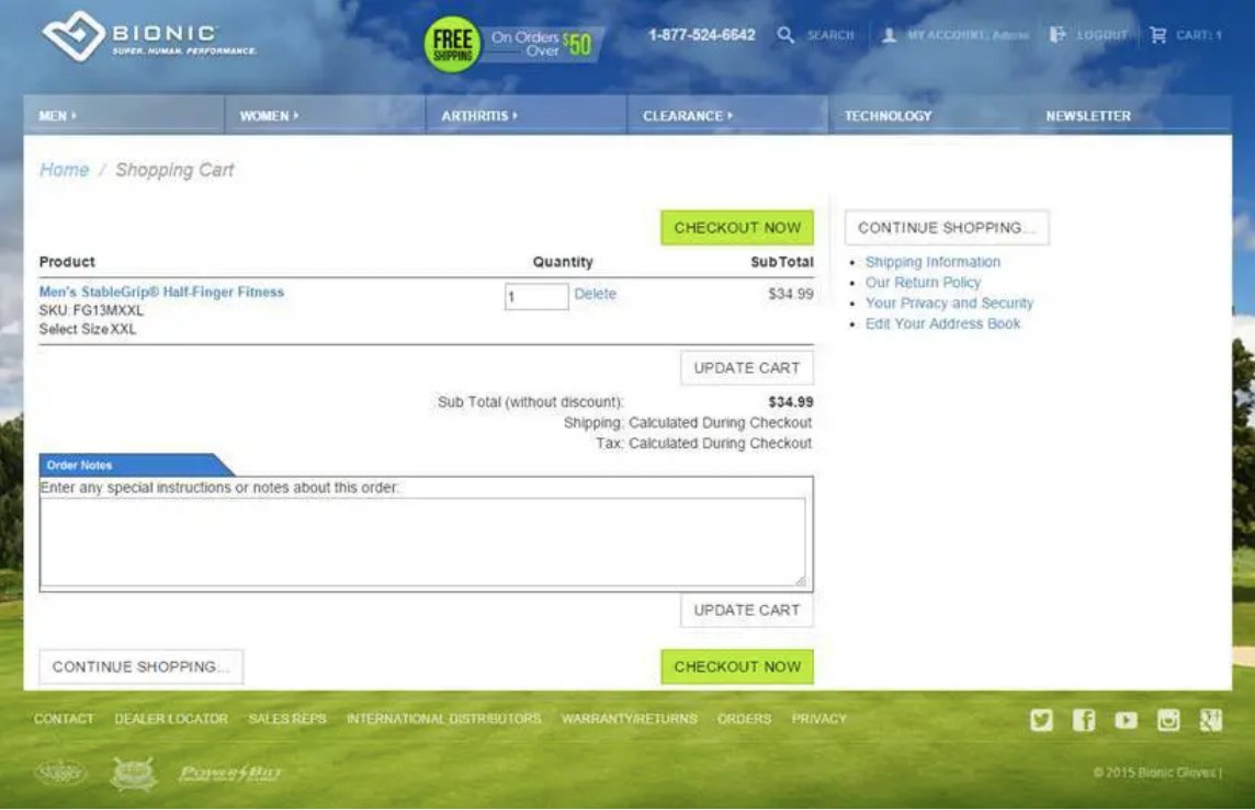
The variation (without the “gift card” and “special offer”) was declared the winner, and the test proved the team’s hypothesis. The variation helped increase the total revenue by a whopping 24.7% and the revenue per visitor by 17.1%. The team realized that by giving an option to add a gift code at the checkout page, they were essentially encouraging customers to leave their site in search for a promo code. This would ultimately lead to more and more customers abandoning carts and massive losses in terms of sales. By completely doing away with any such option, they were able to retain visitors in the checkout process and successfully drive them towards the completion of the purchase process.
Conclusion
With the global eCommerce industry growing at a meteoric pace and catalyzing relentless competition, your visitors now have more options than ever and are likely to be harder to retain and convert. Therefore, whether it’s a newly set up online store or one of the greatest eCommerce chains in the world, cart abandonment continues to be a colossal challenge for eCommerce marketers to battle as a part of their growth strategies.
The silver lining, however, is that there is tremendous potential for improvement and abundant optimization opportunities for you to unlock to constantly outdo your shopping experience, engage better, fix leaks in your conversion funnel, and eventually, mitigate cart abandonment.
So, as long as your experimentation and optimization efforts are consistent in streamlining your online store’s shopping experience, you can rest assured that you are on the right path to systematically moderate cart abandonment.
Frequently asked questions on cart abandonment
An abandoned cart is the phenomenon of a visitor browsing an online store, adding one or more items to their cart, but leaving the online store without making a purchase.
You can’t practically stop cart abandonment and bring it to 0%. Instead, you can lower the cart abandonment rate by retargeting abandoners & re-engaging with them to remind them of what they’re missing out on. You should entice them through various marketing channels such as push notifications, email, and Ads, and get them back to your online store to complete their purchase.
On average, 69.57% of online shopping carts are abandoned in a year. To get more details and stats on this matter, read our Cart Abandonment ebook.
Shopping cart abandonment is a huge problem for retailers as it directly affects their conversion rate and revenue scale. On average, nearly 75% of online shoppers who add items to their cart don’t complete their purchase in one go. This means that the retailer fails to provide the right experience to its customers to take action immediately.
Common reasons why prospects and customers abandon their carts are as follows:
– Too long or confusing checkout process
– Hidden, unexpected, or high costs
– Mandatory account creation for checkout
– Payment security concerns
– Low purchase intent
– Comparison shopping
– Lack of desirable payment options
– Ambiguous or unsatisfactory return or refund policy
– Unsuitable delivery timelines
– Site/app performance issues
– No readily available or applicable offers or coupons
– Restrictions on quantity
Here are some common effects that cart abandonment has on a business.
– Reduced conversion rate: As per market statistics, nearly 69.57% of people abandon their carts for several reasons. Such abandonment directly affects a business’s conversion rate, pushing the company’s revenue graph downwards.
– Loss of revenue: In today’s highly competitive market, where people can browse through numerous sites for one single SKU, converting a visitor into a paying customer is difficult. So, every cart abandoned on your website directly implies a loss in your revenue.
– Negative user experience: When your business has a high cart abandonment rate, it means either your site is hard to navigate, does not offer the exact product, is not user friendly, or has a lengthy checkout process. Each of these plausible reasons leaves a negative impression in the minds of potential customers, causing them to abandon your site.
– Lost customer lifetime value: Every customer that abandons their cart on your website is worth more than just their first purchase. Losing a possible customer can cost your business thousands due to low customer lifetime value from a fair calculation standpoint.
Besides these, there are many other effects of shopping cart abandonment on a business. Identifying the issues at an early stage and fixing the problems is one of the most effective ways to grow a loyal customer case and business revenue.
According to a study conducted by Baymard.com, the average cart abandonment rate across all industries is 69.57%. Over the last decade, the average abandoned cart rate has varied between 60% and 80% depending on the industry, year, and more.
Ideally, the cart abandonment rate is calculated by dividing the total number of completed transactions by the total number of shopping carts created by customers. Then, subtract the obtained value from 1 and multiply it by 100.
Formula: CAR (in %) = (1- CT/CC)*100
Cart abandonment is one of the most challenging issues for online retailers. On average, an eCommerce store loses about 75% of its sales due to cart abandonment. Some industries experience an even higher cart abandonment rate, as high as 83.6%. Common reasons behind cart abandonment are as follows:
– High additional costs such as shipping charges, taxes, etc.
– Forced account creation to complete purchase transactions
– Complicated and time-consuming checkout process
– Site security concerns
– Limited shipping options and slow delivery
– Website performance issues
– unsatisfactory return policy
– Limited modes of payment
– Products available at a better (lower) price on other websites
What is a good abandoned cart recovery rate?
According to research by Moosend, the average cart abandonment email open rate is 45%, while the average click-through rate is 21%. A healthy cart abandonment recovery is anywhere above 10%.


