This series is dedicated to spotlighting some of the talented content creators who also happen to be skin care fans! We previously featured Then I Met You™ Art Show winner, Juan Cazares, talking with him about what inspired his photography, and his thoughts and tips on Korean skin care. Up next, we’re excited to feature three more of the art show finalists, Chantel Sanchez, Vanessa Du and Michelle Rigell.
Tell us a little bit about yourselves, and your journey into discovering your talent for art.
Chantel: Hello! My name is Chantel Sanchez. I’m a designer and illustrator born and raised in Kansas. I love working with bright color palettes, playful illustration, and hand lettering. When I’m not creating I enjoy attending concerts, traveling, and exploring new places. During quarantine, I took it upon myself to branch out from my usual flat illustration. I tried to find a way to incorporate texture into my style. I’m also currently trying to learn how to animate in After Effects. Editor’s Note: You can find Chantel on Instagram at @chantelsanchez_
Vanessa: My name is Vanessa Du, I am from Taiwan, now living in Los Angeles. I’ve been in the US for four years pursuing my passion in art. I’ve studied graphic design, studio art, and would love to learn illustration as well. My dream is to work as a freelance illustrator and have my own small business. During the quarantine period, I got my very first iPad Pro, downloaded the Procreate app, and I’ve been learning and practicing digital illustration since then. I also started an Instagram account dedicated to my artworks during this time. And, since I have a lot of free time now, I can practice illustration every single day. Editor’s Note: You can find Vanessa on Instagram at @artthruvanessa
Michelle: My name is Michelle Rigell, I am a contemporary realism artist born and raised in Atlanta who works in acrylics. I currently live in St. Louis with my husband and our dog, Neo (yep, from The Matrix). My current focus is my 1000 Crane Project, painting origami cranes mostly made from candy wrappers that I used to love when I was a child. I am also the assistant director for Arts As Healing Foundation, a nonprofit organization that brings the therapeutic benefits of art to cancer patients and those with chronic illnesses. Quarantine unfortunately hit me much harder and more negatively than I had anticipated. Usually, I only like to focus on one big project as a time and have a goal in mind for each piece, but I’ve been trying to be more playful with my art, experimenting with other mediums. It’s been a good time to learn to be more kind and patient with myself. Editor’s Note: You can find Michelle on Instagram at @mabelle_rigell_art
What was your main inspiration for participating in the Then I Met You™ Art Show?
Chantel: I was inspired to participate in the Then I Met You Art Show when I saw the email letting everyone know there were three days left to enter. I’ve followed Then I Met You’s journey from the beginning, I love the simple design aesthetic created for the brand. The skincare community is very supportive and I wanted to contribute to using my skills.

Vanessa: I only learned about the Then I Met You Art Show the day before the deadline. I didn’t have much time to brainstorm ideas and work on it, but I really wanted to participate. I love art and I love skincare, so I thought this art show is a perfect way to show who I am as an artist.
Michelle: To stay focused and creative, occasionally I have been participating in art challenges and contents on Instagram. I did a marker sketch of the Living Cleansing Balm for fun because I fell in love with the packaging, and then a month later, Then I Met You announced they were hosting an art show! It was so perfect and meant to be, so I decided to turn the marker sketch into a painting.
What’s your creative process like? Are there any rituals you follow when getting ready to create something?
Chantel: My creative process…
- Read the project brief carefully
- Research and create a mood board
- Clear workspace and organize everything needed to start
- Pick a Spotify playlist, usually a Lo-Fi playlist
- Sit down, sketch ideas and narrow it down
- Work on the final version until satisfied
Vanessa: I can work anytime, anywhere, I just take my iPad with me. I often just sit on the sofa with my favorite TV show or podcast on. For my creative process, I start by looking for inspiration and reference photos. I just sketch using the iPad and the Procreate app, then color, shade, and add details. I find adding shadow and highlight really finishes a piece very well.
Michelle: For my current series (1000 Crane Project), I prefer to paint from still-life setups that I make and arrange, supplemented with thumbnail sketches. I also take photos because the cranes are tiny. I always have to have music or a podcast on, and I prefer to work with a lot of daylight.
At Then I Met You™, our mission is to inspire people to cultivate jeong – the Korean concept describing a deep, emotional connection you can build over time with people, places and things – through our products. The collection is meant to remind you to slow down and make time for the things that matter most, which often includes the soothing ritual of skin care. Tell us about your skin care routine. Are there any steps in your routine that you savor when taking that time for yourself?
Chantel: My skincare routine starts with pulling my hair back into a ponytail and putting on my favorite headband. I start with an oil-based cleanser and then continue with a water-based cleanser. Next are toner and essence, finally a moisturizer. I try to be consistent with sunblock in the mornings. I’m trying to keep it simple for now. I grew up not knowing how to take care of my skin but that changed as [my] skincare community grew. I’m happy that people share their knowledge and help each other.
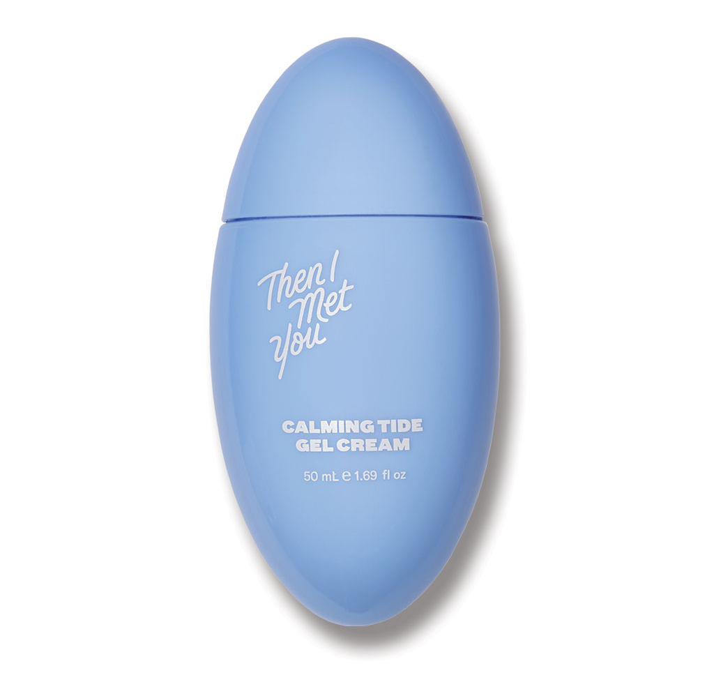
Vanessa: My skincare routine is very simple. At night, I double cleanse with the Then I Met You Living Cleansing Balm and Soothing Tea Cleansing Gel. Then, I put on the Naturium retinol serum. And, finish up with the Then I Met You Calming Tide Gel Cream™. In the morning, after working out, I wash my face with the Then I Met You Soothing Tea Cleansing Gel, put on the Naturium Vitamine C Super Plus Serum, apply the Then I Met You Calming Tide Gel Cream. And, I finish with an SPF, my current favorite is the Purito Unscented Centella Sunscreen.

Michelle: My mom bought me my first skin care set from Laneige when I was in middle school. She used to make homemade masks for me sometimes from grated cucumbers and sometimes from milk. If she hadn’t insisted, I probably would not have kept up with skin care as an adult. Now I find myself nagging my husband to pay more attention to his skin and recently convinced him to add a couple more steps to his routine. It’s become another activity we can do together in quarantine. My favorite products currently are the Then I Met You Living Cleansing Balm, Klairs Supple Preparation Unscented Facial Toner, Hanskin Hyaluron Skin Essence, and Drunk Elephant Protini Polypeptide Cream. And I can’t go without my CosRX and Acropass patches to fight off the return of my hormonal acne.
What’s your favorite Then I Met You™ product and why?
Chantel: My favorite Then I Met You product is the Living Cleansing Balm! I love how soft it is and how it melts off your makeup and sunscreen. It takes off the day’s grime and makes you feel refreshed.
Vanessa: My favorite Then I Met You product is definitely the Calming Tide Gel Cream. I have been looking for a perfect moisturizer for warmer days. Most gel creams are not occlusive enough, and I would wake up with dry skin. If I use something more occlusive, it clogs my pores. The Calming Tide Gel Cream is a perfect combination of lightweight and long term hydration and moisture. Also, I’ve used a lot of gel creams that irritate me which makes my skin heats up, but the Calming Tide Gel Cream™ does not. It is very soothing and the application is very smooth and comfortable. And, the packaging is perfect, way more hygienic than jar packages, easy to handle and it’s beautiful on the shelf.
Michelle: My favorite Then I Met You product is the Living Cleansing Balm. I love the texture of it from when you first scoop it up to how it melts into oil. It’s not harsh and doesn’t strip my skin dry. The color is beautiful, and the smell reminds me of my home growing up.

Any final tips you want to give aspiring artists or those who want to get into art?
Chantel: If you are an aspiring artist my advice is to keep going. It’s not an easy path to follow but always keep learning new things and one day you will make it to your goal. Make art not solely for the aesthetics but for a message you want to promote.
Vanessa: Do not compare yourself with other artists. The professionals you see also started as a newbie at some point. And, we only see their beautiful works that are published, not the years of hard work. So, do not compare with others, don’t be too harsh on yourself, and practice everyday.
Michelle: Art is an emotional process because you tend to put your whole self into what you are creating. You will go through a rollercoaster of emotions, but all of this is normal and part of the process. The most important thing is to find ways to keep creating and learn when you step back and take a break. And be involved in your art community. Art can often be a lonely endeavor, so surround yourself with artist friends and organize painting/drawing meetups.
Thank you Chantel, Vanessa and Michelle!
Want to participate in the next Then I Met You Art Show? Sign up for the Then I Met You™ newsletter at thenimetyou.com to stay up to date on all Then I Met You™ news! In the meantime, always feel free to share your creativity with their team by using the hashtag #thenimetyou and tagging @thenimetyou on social media.


