Last week, we introduced Soko Glam’s complimentary Skin Concierge service and shared Matt Woodcox’s experience with Skin Concierge. Below, Despina, a licensed esthetician and creative writer, takes us on her journey with Skin Concierge.
Still fresh in the world of skin care without knowing much before I became an esthetician, my introduction to a proper skin care routine was through Korean skincare, and Soko Glam was the first place where my love for K-beauty flourished. The formulas, innovation and steps intrigued without overwhelming me, considering I was just learning the concept of double cleansing.
I’m so excited to walk you through my experience with Soko Glam’s newest service, Skin Concierge, a complimentary service to help guide you through and build a skin care routine, or for anyone wanting to learn more about skin care in general.
The concept of a one-on-one direct conversation with a Soko Glam Skin Care Expert was so intriguing to me as it’s an accessible form of communication for anyone who wants to learn more about their skin in a personable manner.
https://www.instagram.com/p/B0UaRxEnxv8/?utm_source=ig_web_copy_link
Firstly, the skin quiz was super personalized and easy to navigate through. As an esthetician myself, the questions they asked mirrored what I would ask clients of mine to get to know their skin better.
Secondly, booking my skin consultation was quick and easy. As someone who works on a tight schedule these days, it made me happy to know I’d be able to choose my own time with my skin care expert for a 20-minute, one-on-one text message session at my convenience. (And they text you right on time!)
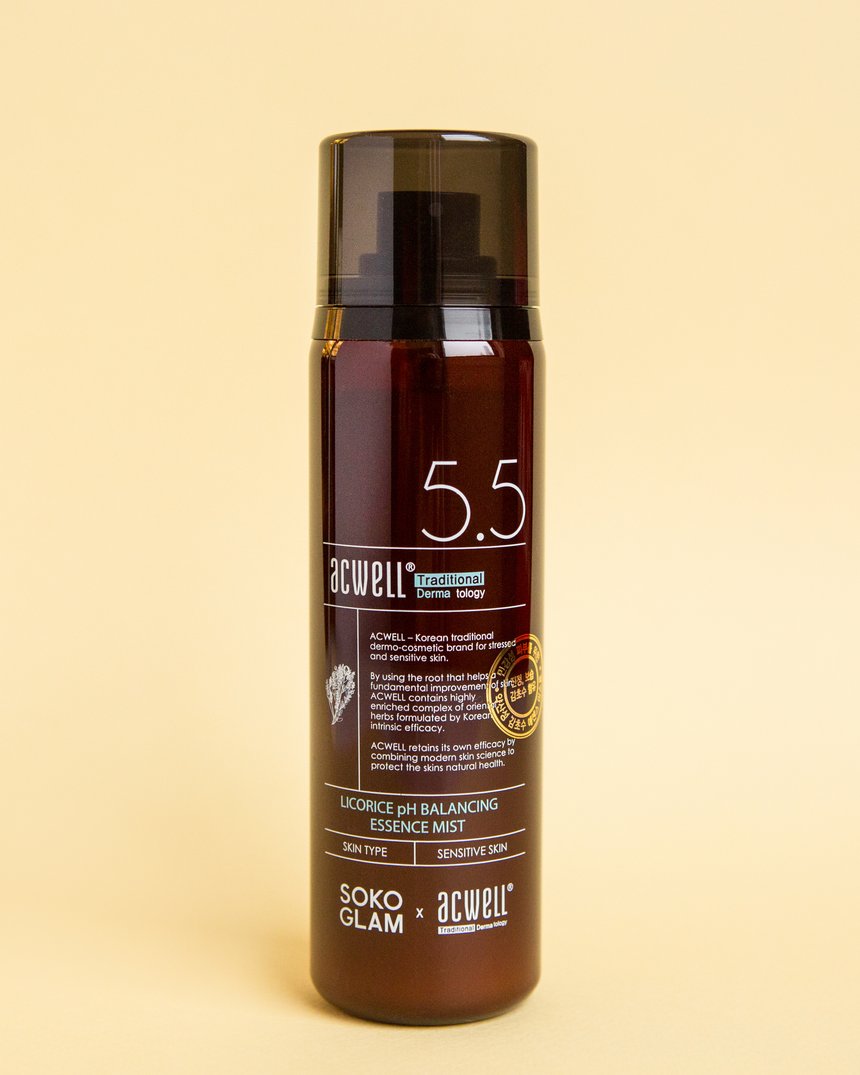
The day of my skin consultation, I just kept looking at my shelf in excitement for the products I’d be recommended by my skin care expert. Technically, no one knows my skin better than me… but Charlie, Charlie came close. It was a pleasure chatting with her as she asked me different questions based on my skin type, needs and wants. She recommended five products to incorporate into my routine and help with my dry skin. The recommendations ended up fitting in so effortlessly and effectively, Acwell’s Licorice pH Balancing Essence Mist being my favourite to help soothe my redness flare-ups.
My overall experience with Skin Concierge was so pleasant and refreshing as it was something I’ve never experienced or seen before. Even as a licensed professional in esthetics, I’m always open and urge the importance of an open mind when it comes to skin care and discovering new products, especially K-beauty with all its innovation.
Almost four years later, I hold Soko Glam close to my heart, particularly because of how much of an impact Soko Glam had when I started getting into skin care and looking for a routine. To this day, I still shop through Soko Glam.
Their Skin Concierge service is a great way to explore a routine whether you’re already well versed into the skin care world or just getting started in it. 20/10, I would recommend.
Follow Despina on Instagram (@desseydoll) and discover her online skin care journal, Skin Poetry.


