In the realm of skincare, an ancient secret has resurfaced to revolutionize our beauty rituals: the power of fermented ingredients.
For thousands of years, cultures across the globe have harnessed the power of fermentation, and now, I find myself delving into the captivating world of fermented skincare. In my exploration of fermented skincare, I had the privilege of uncovering the secrets behind haruharu wonder’s Fermented Black Rice Line.
The journey starts with handpicked, 100% Korean-grown, organic black rice, carefully selected for its exceptional efficiency and skin-loving properties. Through a meticulous fermentation process conducted at low temperatures, the rice undergoes a transformation, where its essence becomes concentrated with extraordinary benefits. The fermented black rice is then carefully dried, preserving its potency, before undergoing an extraction process using high pressure and temperatures. The result? A potent elixir known as the fermented black rice extract, ready to work wonders on the skin.
Speaking with the visionary founder, Jae Won Jeong, her passion for fermentation becomes palpable. “Like Superfood! Fermented ingredients like Black Rice and bamboo shoot bark extracts support the skin’s moisture barrier for your dewiest skin yet,” she enthused. It’s true, the power of fermentation magnifies the antioxidant properties of these ingredients tenfold. Black rice, renowned for its antioxidant content, becomes even more potent after fermentation, with an astounding 30 times more antioxidant power than its non-fermented counterpart.
Now that we’ve explored the fascinating world of fermentation and its remarkable benefits for the skin, it’s time to take a deep dive into haruharu wonder’s Fermented Black Rice Line.
Step 1:
🫒 Black Rice Moisture Deep Cleansing Oil $22 🫒
Effortlessly removes impurities, maintains moisture levels, and nourishes the skin with its gentle, unscented formula enriched with 100% natural oils and essential ingredients.
Step 2:
🌿 Black Rice Moisture 5.5 Soft Cleansing Gel $16 🌿
This unscented, moisturizing gel cleanser boasts an optimal pH level, purifying your skin while maintaining its barrier and achieving a harmonious balance.
Step 3:
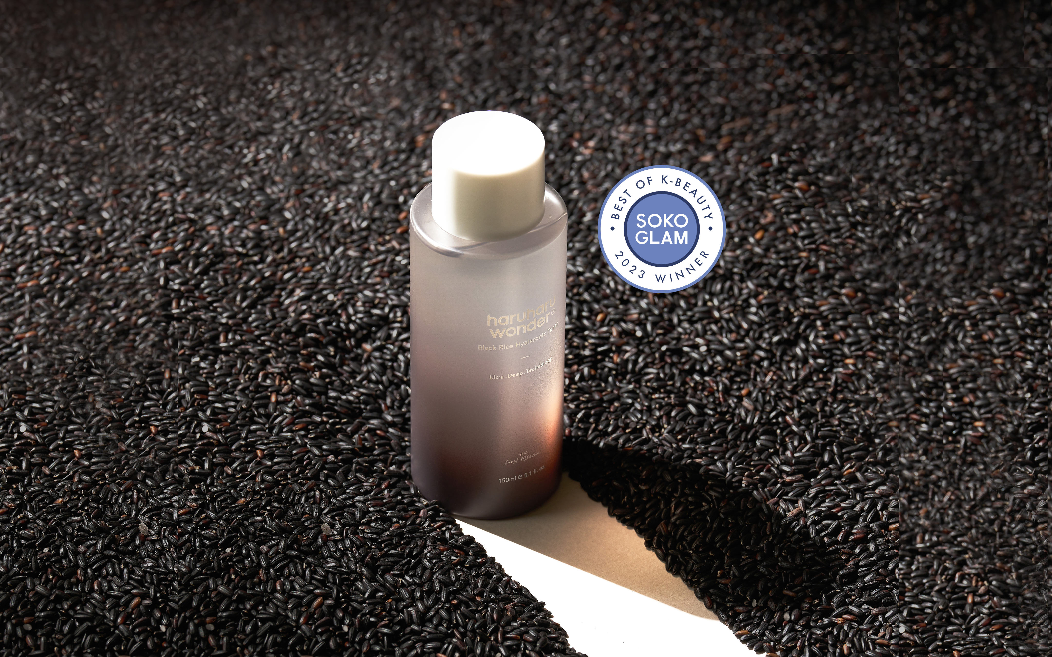
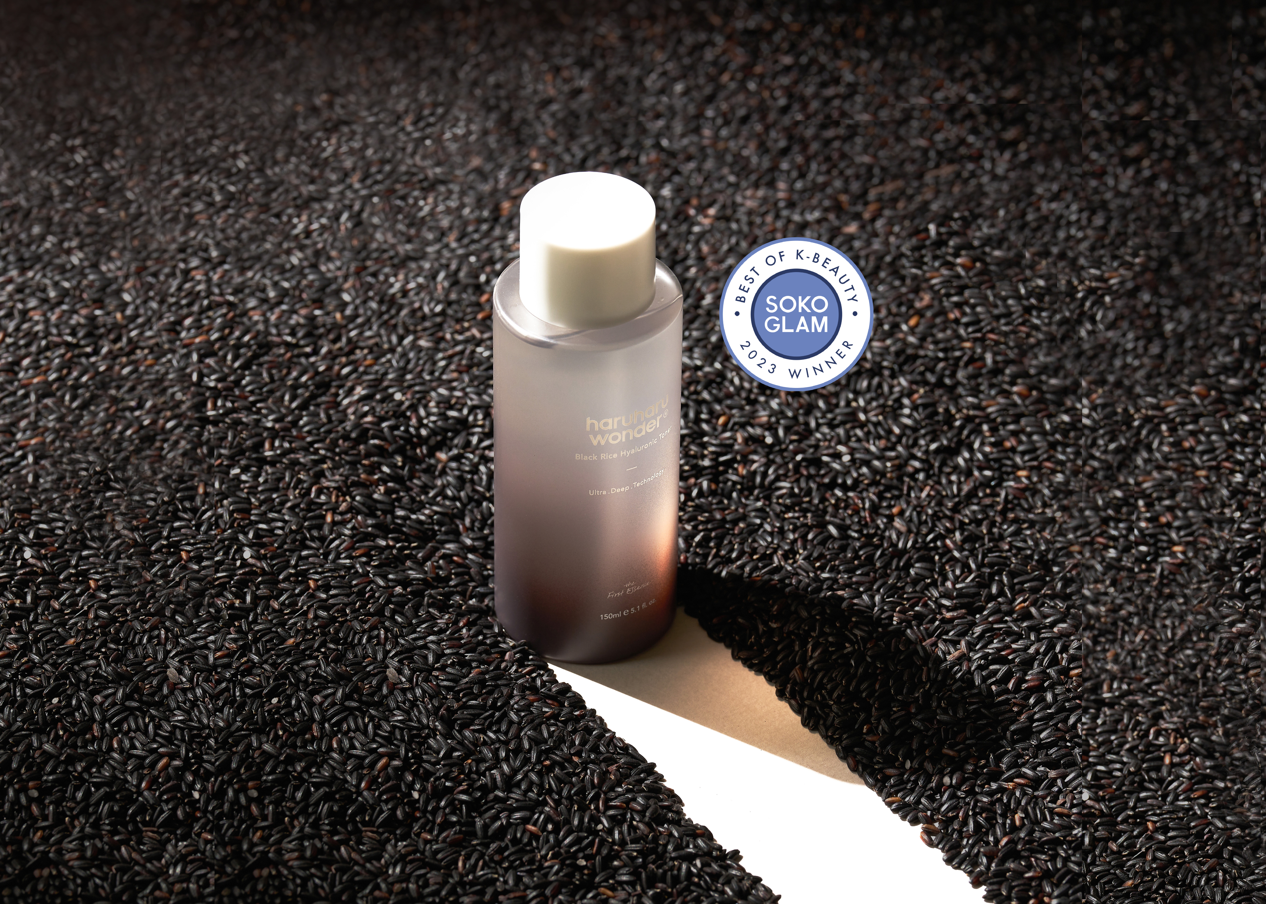
🍚 Black Rice Hyaluronic Toner $22 🍚
A game-changer, with its potent blend of fermented rice extract, red ginseng extracts, and hyaluronic acid, empowering the skin to help regenerate and renew for a revitalized complexion.
Step 4:
💐 Black Rice Bakuchiol Eye Cream $17 💐
Jae Won Jeong adds “Proven in a dermatological trial to improve dark circles, reduce fine lines and wrinkles, and also reduce eye area hyperpigmentation.” All thanks to its potent combination of Bakuchiol and Fermented Black Rice Extract.
Step 5:
🌿 Black Rice Hyaluronic Cream Unscented $19 🌿
This lightweight cream enriched with fermented black rice, bamboo shoot barks, and skin-friendly oils delivers lasting hydration and enhances skin tone, texture, and firmness while indulging skin with a heavenly surge of antioxidants.
As I explored the world of skincare alchemy, I was astounded by the transformative power of haruharu wonder’s patented fermented black rice ingredient. Witnessing the magic unfold as microorganisms worked their wonders, I couldn’t help but be captivated by the remarkable benefits of their Black Rice line. I wholeheartedly invite you to embrace the captivating potential of haruharu wonder’s fermented black rice, now available at Soko Glam, and embark on a skincare adventure that will genuinely transform your complexion.
