Welcome to Dear Soko, a series dedicated to answering your biggest skin care questions with advice from Soko Glam’s skin experts. Whether you’re confused about specific ingredients or what you need to do to achieve healthier skin overall, our experts are here to guide you!
This week’s question came from Annika who asked: “Is it ok to use an exfoliating toner for my exfoliation step and then also use a regular toner? Or is it better to choose between using both a regular exfoliator and toner or just an exfoliating toner?”
Here, a Soko Glam skin expert’s answer:
—
Toning is my favorite skin care step! It leaves my face refreshed and my skin nicely plumped. I also find that there’s nothing more satisfying than swiping a cotton pad across my face with product to ensure it’s truly cleansed.
As an acne-prone teenager, I was only really familiar with astringents like witch hazel or alcohol-based products. As I found myself using more K-beauty, my routine became dominated with hydrating or cleansing toners. But in the past year, some of my favorite toners have been exfoliating toners. I love how hardworking and effective they are and in many cases, I don’t have to sacrifice using my other favorite acids or exfoliators along with them!
RELATED: The Most Common Questions About Toner
It’s best to use a traditional toner twice daily in our routines to balance our skin’s pH after cleansing and prep our face with a light layer of hydration for the rest of our routine. But exfoliating toners have slightly different rules; how often you’ll want to use it depends on the potency of the product.
Toners with lower percentages of acids, usually 1% and lower, can be used as regular toners. These toners are mostly hydrating toners with a low percentages of acids that offer light and gentle exfoliation. One of our favorites is the new Then I Met You Birch Milk Refining Toner.
The benefit of using this type of toner is that it’s great for maintaining and improving your skin over time. You can usually use a more potent exfoliating product in your routine along with these toners a couple of times a week.
You’ll want to keep your own skin type and sensitives in mind when testing out any new exfoliating products of course and take it slow to find what your skin likes best, but generally all skin types can benefit from mild daily exfoliation.
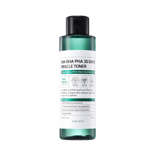
On the other end of the spectrum we have toners with higher percentages of acids from 2% to even as high as 10%, such as the Some By Mi AHA-BHA-PHA 30Days Miracle Toner. Due to their potency, you probably won’t need another exfoliating step in your routine. If you do want to use another exfoliator along with these types of toners, especially when first starting out, you’ll want to alternate the two products in your routine and avoid layering to prevent irritation. If the toner has a high percentage of acids it may be best to use the toner a couple times a week and use a non-acid toner the rest of the week. You can even layer your non-acid toner with your acid toner for an extra layer of hydration.
Once your skin gets used to the active ingredient however, you may find that you can use the acid toner everyday without issue. The benefit of using a potent acid toner is how quickly you’ll see results compared to the slow and steady method of a mild acid toner.
All in all, what kind of acid toner will work best for you will depends on your own skin type and skin goals. Exfoliating toners can help you to streamline your routine and a huge benefit is that they get you exfoliating more regularly and easily. With any exfoliation you’ll be supporting your skin’s cell turnover rate for a youthful and radiant look to the skin and even helping to prevent breakouts by breaking up excess sebum daily.
Read more about acid toners and how to use them here!


