We first introduced you to the Korean hair routine back in 2015, and since then, we’ve received comments from people who were super intrigued but also curious about whether the routine would work on curly hair. Yes, it’s possible! Here’s how:
First of all, let me explain what the Korean hair routine is. Well, similar to the 10 step skin care routine, Koreans take hair routines very seriously. This is why there are tons of products—from hair serums to essences to even sheet masks—for your hair. This approach actually makes it perfect for curly hair because let’s face it, when it comes to curly hair, it takes a lot of work to go from frizzy to beautifully defined curls.
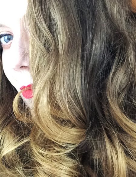
Also, let me show you the kind of curls I have:

And now, let me break down my steps:
No poo
I don’t shampoo my hair. I’ve been a part of the “no poo” club for years now and can testify that it’s changed my hair for good. Some of you out there may be a bit disgusted reading this, but let me clarify: I use a 1:2 ratio of apple cider vinegar and water to cleanse my scalp and it has become so much healthier because of it.
Once a week, I combine half a cup of raw apple cider vinegar with a cup of water and pour this mixture into a spray bottle. While it’s dry, I drench my hair in this concoction (really focusing on massaging it into the scalp) and let it sit for 10-15 minutes before jumping in the shower to rinse it out.
Apple cider vinegar contains alpha hydroxy acids which help to get rid of all the excess buildup (it’s also anti-fungal and anti-bacterial so it helps to treat dandruff!) which is important for curly hair as we tend to use a lot more products than the average person. Besides helping to cleanse, it works to restore your scalp’s pH level, making your hair smoother, shinier and easier to style.
Hydrating conditioner
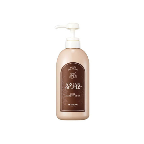
I follow up with one of my favorites, the Skinfood Argan Oil Silk Plus Conditioner. Anytime I see see a product that has argan oil in it I run to try it (you’re going to begin to see a theme here!) since it’s amazing for curly hair. This Skinfood conditioner is great because it’s a reconstructive hair conditioner infused with silk extract and vitamin E-rich Moroccan argan oil, which work in tandem to lock in moisture, promote hair growth, and work to mend split ends.
I use quite a bit of conditioner (5-6 pumps at least) and rake it through my hair with my fingers—this helps to detangle the hair and evenly distribute the product. I tend to focus the conditioner on the ends of my hair because using too much on my scalp area can weigh it down. While I’m finishing up in the shower, I tie my hair up in a bun and let the product sit in my hair like a mini-treatment.
Volumizing essence
For those with a similar curl pattern to mine (I hover around a 3A/B—you can find out your type here), then you know your hair can easily get weighed down the longer it gets, so I always opt for a volumizing spray to add a good boost. The Skinfood Apple Mango Volume Essence Mist is great for this, because it’s actually a serum that nourishes limp hair. It has apple and mango extracts, as well as hydrolyzed keratin, which all work to improve volume and give hair beautiful shine. Ever since I started using it, I’ve noticed such a difference in the overall look of my hair, AKA so much volume (plus, it smells amazing!). I’ve gotten so many compliments about my hair since using this.
The first thing I do post-shower is spritz this mist in my hair, focusing mainly on massaging it into the scalp area.
Lightweight leave-in
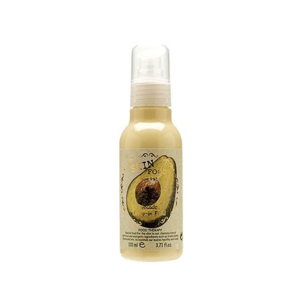
The Skinfood Avocado Leave-In Fluid is a great leave-in conditioner for days when my hair doesn’t need much hydration. It’s formulated with avocado and macadamia oil to nourish and moisturize dry, damaged hair, and I like that it’s lightweight and doesn’t weigh my curls down.
I rake 3-4 pumps through my hair like I do with most of my products, and make sure to evenly distribute it. This even distribution is important because any sections without product will tend to frizz and ruin the curl definition. Tip: Divide your hair into sections to apply products so you don’t risk the chance of missing a spot.
For those with denser curly hair patterns, I’d go for something much richer since this can even be too light for my hair on days where my curls are dying for some intense moisture. On those thirsty days, I tend to use the Skinfood argan oil conditioner as my leave-in since it helps to nourish and lock in moisture.
No-crunch styler
For years, I shied away from hair gels because I didn’t want to re-live my not-so fabulous crunchy hair gel days of middle school. But those crunchy days are gone with the Shea Moisture Mongongo & Hemp Seed Oils High Porosity Moisture-Seal Styling Gel with Baobab Protein & Apple Cider Vinegar and the Devacurl Ultra Defining Gel. (If you have any K-beauty hair gel recommendations, please let me know in the comments!) These work great at defining my curls and creating a barrier from frizz and humidity.
I use a decent amount (about the size of two quarters) and smooth the gel over my hair instead of raking it. Avoid raking at this stage because you’ll separate the chunky curls into single strands, which will can make the hair look stringy and not as defined. After smoothing the gel onto my curls, I scrunch my hair multiple times (this helps to define the curls). I also tend to use a microfiber towel and scrunch it some more with that to soak up any excess gel.
Smoothing serum
To protect the hair that I put so much work into creating, I use the Skinfood Argan Oil Silk Hair Essence, which is a hair serum full of concentrated ingredients that feed the hair with nutrients. This one is an oil-based essence that gently coats damaged, frizzy hair to add softness and shine. I take one to two pumps of this and smooth it only my dry hair, focusing on the ends to lock in moisture and add nice shine.
Deep treatment:
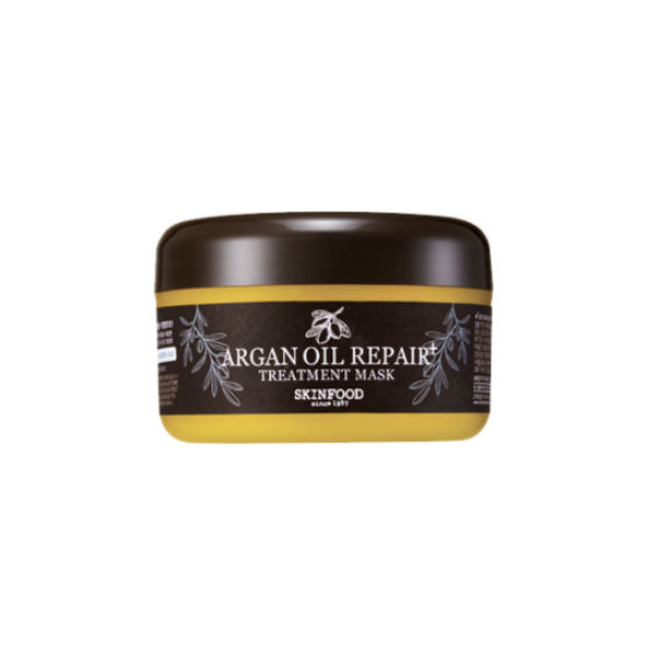
I like to intensely moisturize my hair at least once a week, and when I do, I reach for the Skinfood Argan Oil Repair Plus Treatment Mask. It’s an ultra rich reconstructive mask packed with ceramides, argan, camellia oil, and silk powder to treat dry, brittle hair and leave it soft and frizz-free.
The instructions say to leave it in for 5-10 minutes, but I’d recommend at least 30 minutes to an hour for parched hair since you won’t be able to see much of a difference in that short timeframe.
Drying my curls:
A lot of curly girls blow dry their hair with a diffuser for maximum volume, but after all that work I’m way too lazy to spend upwards to an hour blow drying my hair (my hair takes forever to dry). I literally just go to sleep post-styling. My hair doesn’t get completely destroyed because I use a silk pillowcase which helps to avoid creating frizz and damaging the curls.
This whole routine (minus the treatment) is what I do each time I wash my hair. Despite how daunting it may sound, it really only takes 5 to 10 minutes, max. It’s totally worth it to put in the effort to have beautiful shiny and defined hair!
P.S.: Shout out to one of The Klog’s readers, Karla, who inspired this foray into a Korean hair care routine for curly hair!


