Welcome to Klog Chats, a series dedicated to answering your biggest skin care questions with advice from skin experts. Whether you’re confused about specific ingredients or what you need to do to achieve healthier skin overall, our experts are here to guide you!
This week’s question is: “How do you even use hyaluronic acid in the winter if it draws in moisture from the air? The air is super dry this time of year!”
Dry air can also mean chapped lips and rosy cheeks. As hyaluronic acid is great for plumping up the skin and providing hydration here’s how we can use it in our skin care routines as the temperatures continue to drop and we remain inside.
Hydrating or moisturizing ingredients can be classified into two categories: humectants and occlusives. As hyaluronic acid is an humectant, it pulls moisture to the upper layer of your skin for an instant hydrating effect. Hyaluronic acid does attract water but this does not always need to be from the air. So even if the air is dry, no worries, as hyaluronic acid is more likely to pull water up from the deeper levels of your skin to hydrate the surface!
RELATED: Are You Moisturizing With the Right Ingredients For Your Skin Type?
What’s important to remember about the air, however, is that your skin can lose hydration to it through evaporation in a process called trans-epidermal water loss. This is why after using an humectant, it’s important to use a product that includes occlusive ingredients afterwards to seal the moisture in.
Some common occlusive ingredients are petrolatum, cocoa butter, or some oils or waxes. These ingredients are hydrophobic which means they repel water. For that reason, they create a protective barrier on the skin preventing water from passing through and evaporating into the air.
All that is to say, you can absolutely use your hyaluronic acid serum in the winter, just make sure to layer on an occlusive moisturizer on top for skin that stays hydrated!
With that in mind, here are a couple of product pairings that are great for all skin types to try:
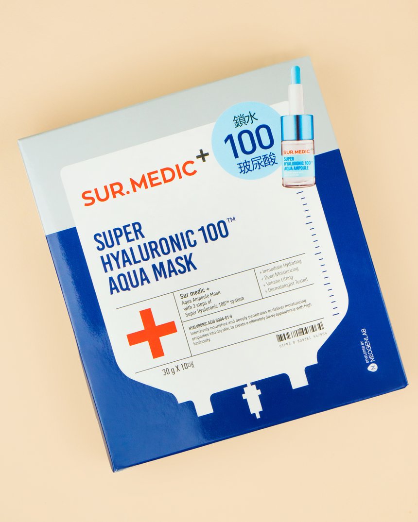
SUR.MEDIC+ Super Hyaluronic 100TM Aqua Mask and Olivarrier Fluid Oil 100% Squalane OR The Plant Base Waterfall Moist Balanced Hyaluronic Acid 100 and Etude House SoonJung 2x Barrier Intensive Cream.
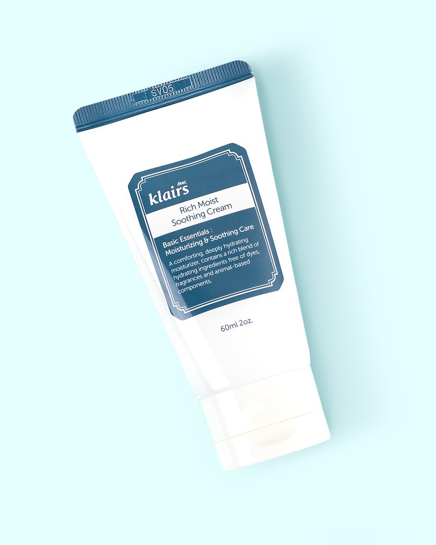
Or, look for a product that contains both humectant and occlusive ingredients like the Klairs Rich Moist Soothing Cream. It contains hyaluronic acid, a humectant, plus shea butter and jojoba oil, both occlusives.
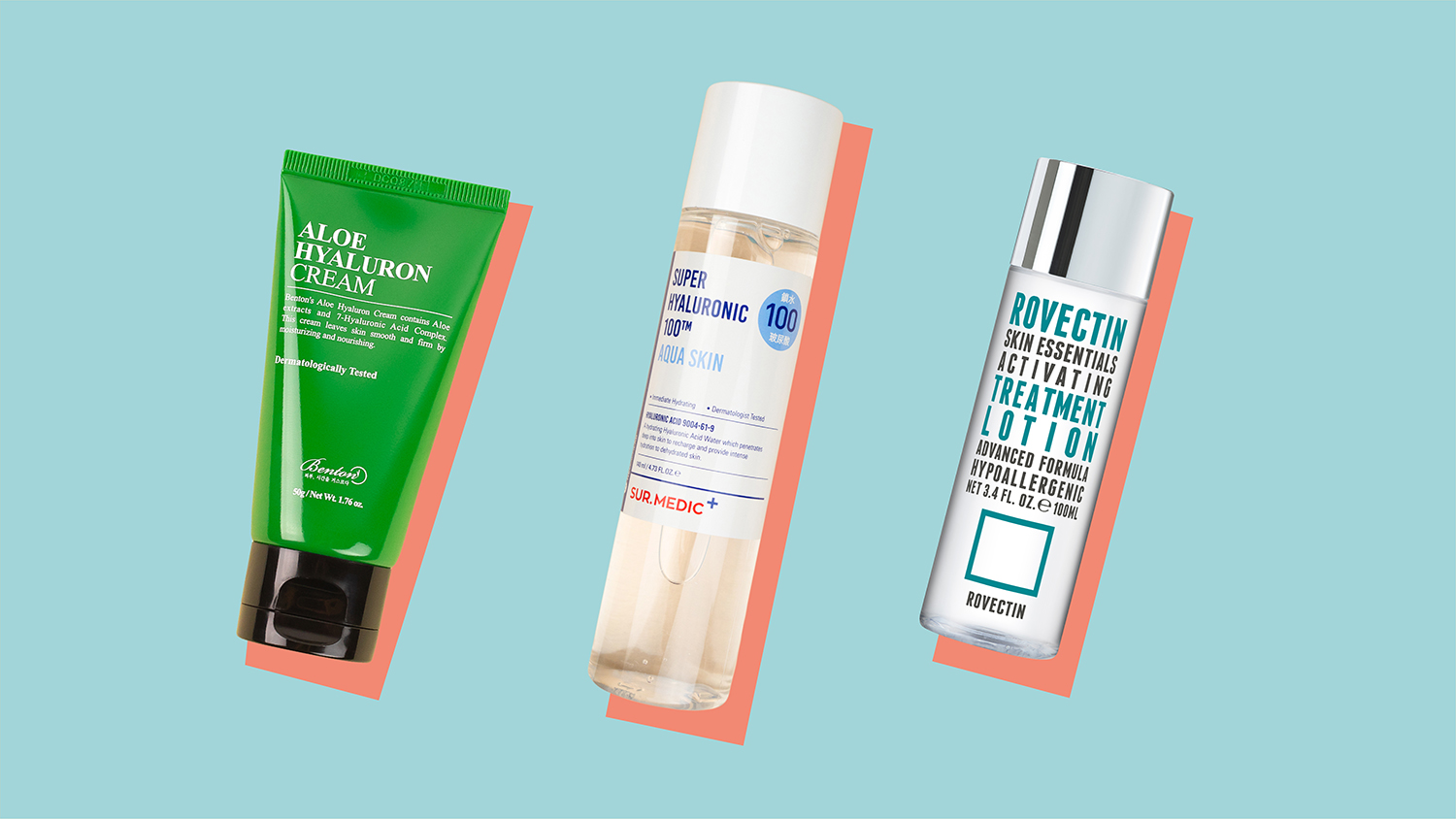
Still looking for a hit of hydration? Check out SUR.MEDIC+ Super Hyaluronic 100TM Aqua Skin, Benton’s Aloe Hyaluron Cream, or Rovectin’s Skin Essentials Activating Treatment Lotion.


