From our dinner plates to the products in our vanity cabinets, superfoods not only help keep us healthy, but also our skin. Here, we break down what superfoods are, the skin care benefits they have, and our favorite products that contain these powerhouse foods.
What are superfoods?
Hearing the term ‘superfood’ probably brings to mind images of rare plants and fruits found in an unknown land. However, if you’re drizzling honey or adding avocado to your food, then you’ve already taken steps to incorporating these superfoods into your lifestyle.
“‘Superfood’ is a trendy buzz term to indicate that a food has high nutritional value. While you may think that superfoods come from exotic plants deep in the jungle, think again. Superfoods are far more commonplace than you may think. Foods with great nutritional value can be found right in your grocery store: mushrooms, green leaves, dark berries, bananas, nuts and seeds to name a few. Foods that have a high nutritional value can help with disease management and/or prevention,” says Amanda A. Kostro Miller, a licensed dietitian who serves on the advisory board for the healthy living editorial site, Fitter Living.
RELATED: Ingredient Spotlight: Ellagic Acids
Superfood Skin Care Benefits
Many fruits, vegetables, oils, and spices have earned the “superfood” title simply because of the multiple benefits that serve to protect and build healthy skin.
“Superfoods are nutritionally-dense fruits and vegetables, healthy oils, and [healthy] spices, that contain amino acids, anti-inflammatories, and antioxidants. These superfoods help build firm skin, defend against environmental stressors, and promote optimal skin metabolism. They supply skin with a broad mix of antioxidants that protect against inflammatory reactions that destroy collagen and give skin that glow we all seek out,” explains cosmetic dermatologist Dr. Annie Chiu of The Derm Institute in Redondo Beach, California.
Though superfoods is a general term, it is important to note that these foods do not have all the same benefits and are divided into specific categories based on their functions and chemical properties.
In fact, some foods provide multiple benefits in addition to their basic functions. Listed below are some superfoods commonly found in skin care:
Green tea, pomegranate, and berries.
These colorful plants are the key ingredients found in drinks like smoothies and shakes, but did you know that they can help prevent common ailments and signs of aging? Green tea, pomegranate, and blueberries are rich in antioxidants, chemical compounds that help to protect the skin from damage caused by free radicals that are responsible for the emergence of wrinkles and declines in collagen production. Think of antioxidants as the body’s police officers that stop free radicals in their tracks before causing damage to the body and skin.
“Antioxidants are free radical scavengers, meaning they go around to prevent and fix DNA damage that eventually leads to cancer. Antioxidants also help reduce free radicals which cause inflammation in the body and breakdown of the building blocks of the skin: collagen and elastin,” says San Francisco-based dermatologist Dr. Caren Campbell.
Avocados and honey.
While they may serve as tasty toast toppings during brunch, avocados and honey are also hydrating superstars, adding much-needed water to the skin. According to Dr. Peterson Pierre of the Pierre Skin Care Institute, avocados’ chemical properties not only hydrate the skin, but they also placate inflammation associated with skin concerns.
“Avocado oil has high levels of vitamins B and E and is rich in fatty acids and many other nutrients that can nourish and moisturize the skin. It also contains oleic acid which promotes collagen production and accelerates the healing process. The antioxidants and vitamins have anti-inflammatory properties which can help acne, dandruff, and eczema,” he says.
Similar to avocados, honey also hydrates the skin and contains antioxidants that protect the skin from the harmful effects. When used topically, honey has antibacterial and anti-inflammatory properties.
“It’s a humectant so it draws moisture into the skin, and it aids in wound healing by maintaining a moist wound environment and providing a protective barrier. It has long been used in traditional medicine for cuts and burns. Honey is also rich in antioxidants, which helps fight free radicals from sun, pollution and stress that may damage the skin. Its organic acid content provides gentle exfoliation, and the vitamins and amino acids may impart anti-aging properties as well,” explains NYC board-certified dermatologist Dr. Hadley King.
Papaya and Pineapple.
These tangy fruits of the tropics are known for their exfoliating and hydrating properties. They are also renowned for having traces of natural AHAs. “Pineapples and papayas are fruits with a high water content along with a significant amount of antioxidants. The antioxidants found in these two fruits support the body of ridding itself of toxins that can lead to signs of aging and skin damage. Pineapples are the only food source that contains bromelain, an enzyme, with significant antioxidant benefits,” says Lisa Richards, nutritionist and author of The Candida Diet.
Meanwhile, “Papaya contains an enzyme called Papain that can help exfoliate dead skin cells on the surface,” says cosmetic chemist, Ron Robinson, of BeautyStat.com. Pineapples and Papayas contain glycolic acid, which is a natural source of AHA, which help to improve skin texture and tone, unclog pores, and smooth fine lines and wrinkles.
Grapeseed Oil and Olive Oil.
For centuries, oils have been a quintessential aspect of beauty routines, and they still continue to be used in many skin care products today – for a good reason. Richards says, “Both oils contain beneficial fatty acids which help to enhance the elasticity of skin. [Additionally,] grapeseed and olive oil contain vitamin E and fatty acids which are antimicrobial, antioxidant, and anti-inflammatory. These three characteristics assist in boosting skin health and vibrancy.”
Products That Include Superfoods
Whether you’re looking to prevent signs of aging, add a burst of hydration, or naturally exfoliate the skin, there are several K-beauty options to choose from that utilize the powers of superfoods.
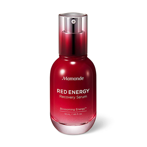
If you’re looking to reduce signs of aging… we recommend the Mamonde Red Energy Recovery Serum. This serum contains pomegranate, a superfood rich in antioxidants, and another powerhouse ingredient: vitamin C. The antioxidants and vitamin C found in this serum complement each other by reviving the skin’s glow and preventing the onset of aging caused by free radicals.
If you’re looking to deliver more hydration to your skin… consider the Skinfood Royal Honey Propolis Enrich Essence. This honey-based essence consists of 63% propolis extract. Propolis is the proper term for the brown resin that bees use to construct their hives and is just as potent of an ingredient as honey. Propolis works in conjunction with royal jelly extract to create a formula that nourishes and strengthens the skin barrier, leaving the skin with a soft, smooth texture.
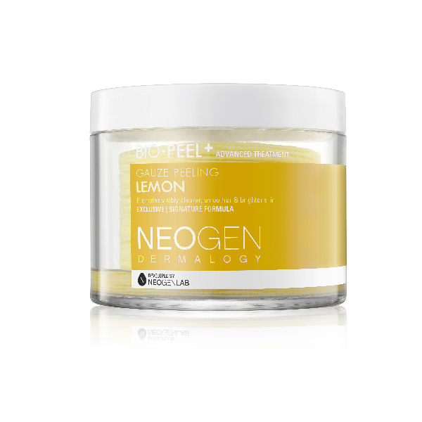
If you’re looking for a gentle exfoliator… the Neogen Bio-Peel Gauze Peeling Lemon is a great starting point. These exfoliating pads feature lemon, orange, and papaya extracts to slough away dead skin cells and unclog pores.In fact, these pads exfoliate the skin both physically and chemically. Pro tip: use these pads in your post-workout skin care routine to prevent acne from developing on your back, arms, and chest.


