Today, we’re talking about how to resist picking your skin.
Picking at my skin is definitely my biggest skin care guilty pleasure. It’s so satisfying, but it truly causes a lot more harm than good. As someone who’s always been a serial picker, I’ve dealt with (and am currently still dealing with) my fair share of acne scars and hyperpigmentation. But, I have gotten a lot better at kicking the habit by incorporating some everyday practices into my routine to stop me from squeezing a pimple as soon as I see it.
For example, something that’s helped me a lot lately is putting post-it notes on my mirror with reminders to keep my hands away from my face. This has been effective for me because it will genuinely stop me in my tracks as soon as I’m about to pop a pimple, or I’ll pause if I’m in the middle of picking to think and reconsider. But even though this strategy has been helpful in clearing my skin, there are still moments when I see a whitehead and just can’t resist the urge to pop it (especially if it’s bigger or has already come to a head). This made me wonder… how does everyone else actually stop themselves from picking at their skin?
To help with my dilemma, I decided to ask other Soko Glam staffers for their own suggestions. Below, find their tips and tricks and then share yours below!
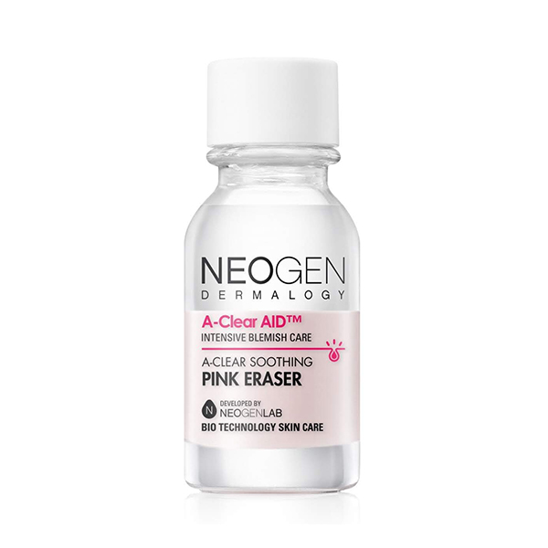
Apply a pimple patch or spot treatment.
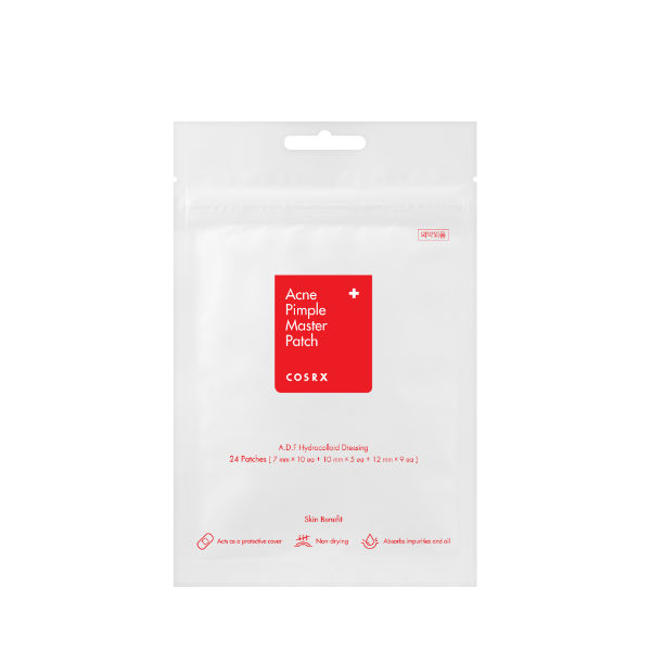
“My anti-picking trick is to put a COSRX pimple patch on budding pimples, not just ones that are already popped. It prevents my hands from scratching the surface and introducing bacteria, even if I unconsciously touch my face,” – Vivian Loh, graphic designer
RELATED: The Spot Treatments For Different Types of Acne
“[Pimple patches] make it so much more bearable, and they really do work. I particularly will get cystic acne near where my glasses touch my face, and I often will put a pimple patch over the area even if I don’t see a ‘head.’ It really helps to soothe it and keep it from getting irritated further,” – Sara Gardner, brand marketing manager
Keep skin hydrated.
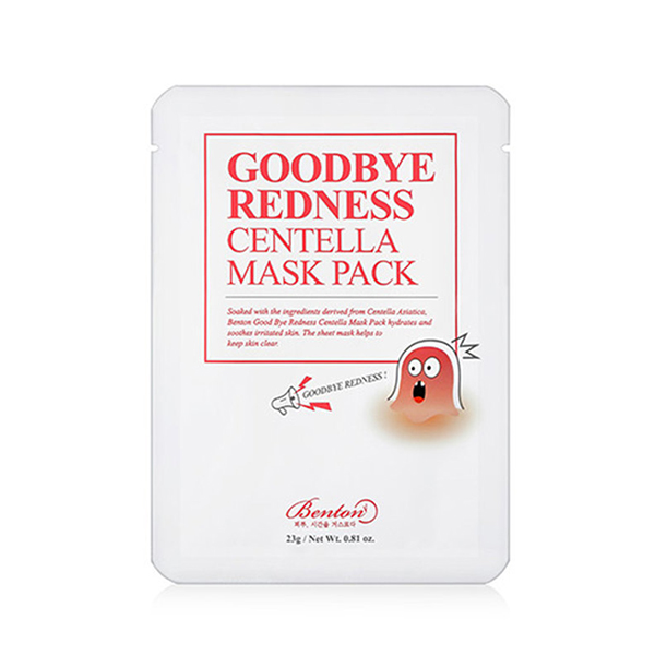
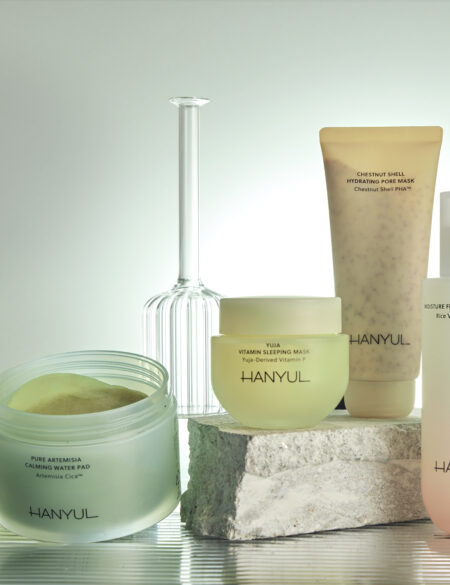
“I notice my skin gets itchy when it’s dry so I try to use a very hydrating product or mist throughout the day [so I’m not tempted to touch it]. I also find that ingredients like centella asiatica help a lot.” – Vanessa Nguyen, junior graphic designer
Don’t use a magnifying mirror.
“I have a double-sided mirror, and there was a period when I would sit in front of the magnified side and the next thing I knew 30 minutes had gone by and my face would be red and swollen from my picking at any tiny blemish or blackhead I could find. During this time I was getting consistent breakouts on and around my chin and I realized that picking was just making things worse. I forced myself to stop using the magnified side of the mirror (this took some time and major self-control), and as a result I stopped picking as much. Low and behold, breakouts have become a much less common occurrence.” – Sarah Ferguson, content manager
Think of the effect it can have on your skin.
“Whenever I see a pimple or blackhead flare up on my forehead, I always approach it with the mindset that picking at it will only make it worse, resulting in an even bigger scar or hyperpigmentation.” – Sara Miranda, PR and events intern
RELATED: The Reason Why You Keep Getting Pimples in The Same Place
“Before I pick, I try to think and remember how inflamed and red my face looks afterwards, and how unhappy I’ll ultimately be with my skin after picking – even if it might be instant gratification in the moment.” – Sara Gardner


