What does apple cider vinegar do for your skin? And is it really the holy grail of beauty products that some all-organic experts fans claim? Since it’s really easy to become overwhelmed when searching for a new product, Ingredient Spotlight is here to break down the basics. Here we’ll teach you how an ingredient works and leave you with product recommendations to help you with your search.
If you spend much time scoping out health and beauty boards on Pinterest, you’ve no doubt run across dozens of posts hailing apple cider vinegar as a wonder ingredient. It clears your skin! It burns fat! It cures acid reflux! And athlete’s foot! And maybe cancer! Sound too good to be true? Since we love a good beauty DIY as much as the next skincare hoarder, we had to investigate.
What is apple cider vinegar?
First off, a couple of things you should know about apple cider vinegar (that’s ACV to the cool kids). At its most essential, ACV is the product of apples, generally crushed/juiced, and allowed to ferment. In an initial fermentation, bacteria cause the sugars in the apples to convert to alcohol, which then goes through a second fermentation process where the alcohol is broken down and converted into acetic acid.
If all of that gave you flashbacks to failing high school chemistry, it’s okay; as complicated as fermentation may sound, it’s actually a very simple process that mostly relies on leaving the apples alone to do their thing (if you’ve ever left a bottle of wine on the counter too long only to come back and find it’s gone all vinegary, congratulations, you’ve experienced fermentation.) That all-natural element is a big part of the appeal for some fans of ACV, since it makes a potent product without a lot of additional processing and ingredients.
How potent exactly? ACV generally hits somewhere in the 3-5 pH range (the exact intensity varies from brand to brand and sometimes batch to batch) with around 5-6% acetic acid. Since human skin hovers around the 5 pH mark (7 is considered neutral, which means your skin is slightly acidic), ACV is considered skin-friendly because of its relatively close pH, but its higher levels of acid content make it better at killing off microbes that you don’t want around (that’s why vinegar is used in food preservation methods like pickling.)
What does ACV do for your skin?
As you might have guessed, ACV’s acid content makes it a good candidate for warding off skin issues caused by bacteria like the acnes bacteria that leads to some zits and fungi (think: yeast) that can cause irritation like athlete’s foot or dandruff. “Apple cider vinegar is useful in treating skin conditions because of its antimicrobial properties,” says dermatologist Joshua Zeichner, though he also warns that while it’s relatively safe, it may be overwhelming for some skin types.
Because it’s acidic, ACV also helps to exfoliate the skin, and can have brightening benefits by working to sweep away brown spots caused by sun exposure. There are also theories that the amino acids naturally present in ACV can help with healing and maybe even promote collagen, but there haven’t been enough academic studies yet to say so for sure.
How to use apple cider vinegar:
If ACV sounds right up your alley, working it into your routine is pretty easy. To help mitigate acid overload, most experts recommend diluting ACV with water before integrating it into your skin care regimen. Try mixing one tablespoon of ACV (the unpasteurized kind with the weird looking brown “mother” floating at the bottom is usually the least processed and contains more of the natural minerals from the fruit) with two cups of water and sweeping it over your face as a toner.

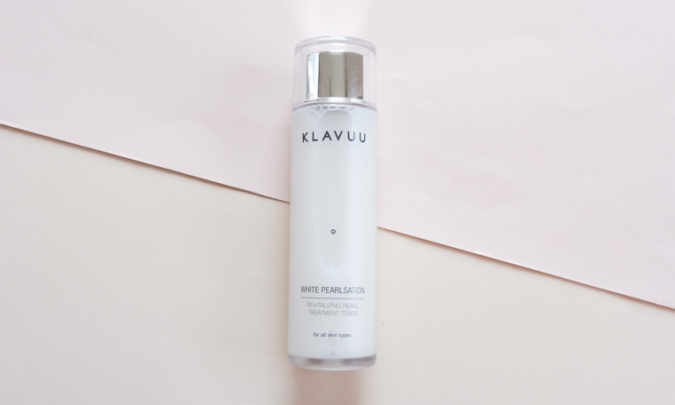
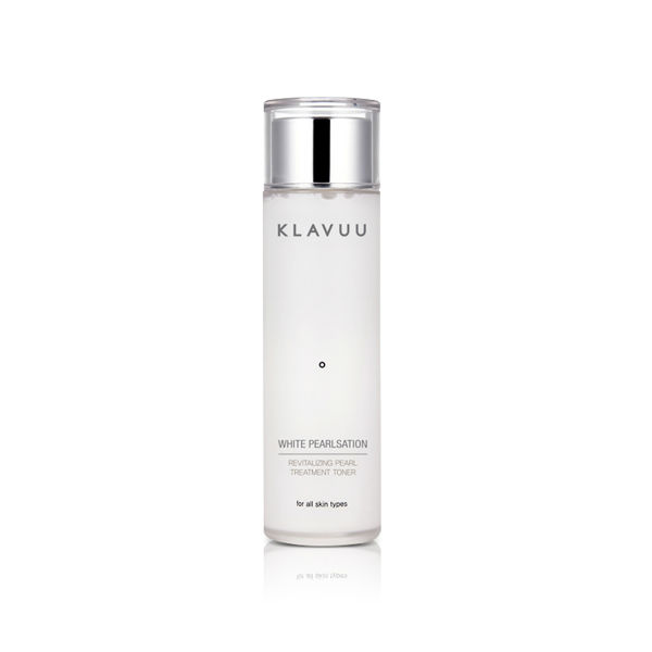
Want something a little less DIY? The Klavuu White Pearlsation Revitalizing Pearl Treatment Toner is packed with apple fruit water, as well as kelp and pearl extracts to help brighten and plump skin. And if you’re looking for shinier, flake-free hair, try a rinse of equal parts ACV and water. Pour it over your hair, paying special attention to working it into the scalp, then rinse with clean water.
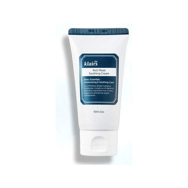
Whether you’re using it on skin or hair, just make sure that you’re following up ACV with a good conditioner or moisturizer (boost your skin’s barrier with the ceramides in the Klairs Rich Moist Soothing Cream) to help replace the natural oils that acetic acid may break down. Of course, as with any product, keep an eye on how your skin is reacting: red, itchy, or peeling skin is your body’s personal stop sign.


