If you’ve ever noticed mushrooms on the ingredient list of your favorite skin care products, don’t be alarmed — mushrooms have been used in skin care for thousands of years, and they harness powerful anti-aging, brightening and hydrating benefits. Read on to learn more about this multi-talented ingredient.
According to Dr. Jenelle Kim, Founder and Formulator of JBK Wellness Labs, doctor of Traditional Chinese Medicine, and Master Herbalist, “mushrooms have been used for their potent beauty and health benefits for centuries and are a staple in Traditional Oriental Medicine (TOM).”
Why, we hear you ask? “Mushrooms are some of the most powerful anti-aging ingredients available for the skin,” she explains. Believe it or not, used topically, mushrooms are an antioxidant, anti-collagenase, anti-elastase, anti-inflammatory, and anti-microbial and are considered to have skin-brightening and hydrating properties.
Types of Mushrooms
As Dr. Kim points out, there are tens of thousands of mushroom varieties out there, but when it comes to skin care, you only need to take note of a few.
Matsutake
Also known as Songyi or pine mushrooms, matsutake mushrooms are “renowned for having anti-inflammatory and anti-aging benefits that help to prevent degradation of the extra-cellular matrix,” Dr. Kim reveals. Found in the Beauty of Joseon Repair Serum, they are also praised for their ability to stimulate collagen synthesis and improve skin elasticity.
Reishi
Many believe reishi mushrooms are the oldest mushrooms in herbal medicine. “In traditional Chinese medicine it is known as Ling Zhi, which is translated as the ‘mushroom of immortality,’” Dr. Kim tells The Klog. Known for its moisturizing, detoxifying, antioxidant and anti-inflammatory properties, “It is full of polysaccharides, which helps boost the skin’s ability to retain water.”
Boasting beta-glucans, which Dr. Kim explains “are natural sugars that penetrate the layers of the skin to help moisturize dryness,” reishi mushrooms also fight signs of aging and soothe skin imbalances.
Cordyceps
Cordyceps are often referred to as caterpillar fungus. Containing “powerful concentrations of anti-aging compounds,” they are touted for their ability to “reduce the appearance of wrinkles and age spots, eliminate dead skin cells, rejuvenate the skin and rebalance blemishes.”
Tremella
Better known as snow mushrooms due to their appearance, tremella mushrooms are famous for their moisturizing benefits. “It holds up to 500 times its weight in water, which makes it comparable to hyaluronic acid for skin hydration,” says Dr. Kim, adding that their particles are smaller than hyaluronic acid, meaning they can penetrate the skin deeper. They are believed to work wonders on hyperpigmentation and age spots.
Mushrooms In Skin Care Products
“One of the most important things to note when it comes to product formulation is that mushrooms, like any active ingredient, need to work synergistically with other ingredients within the formula,” Dr. Kim explains.
In other words, it needs to be paired with ingredients that don’t cancel out their benefits. “This is what makes a formula effective and balanced for the skin, which is why it is vital for the formulator to truly understand the nature of the active ingredients within a formulation – their quality, dosage, and overall effects,” Dr. Kim concludes.
Below are a few of The Klog’s favorite mushroom-infused products:
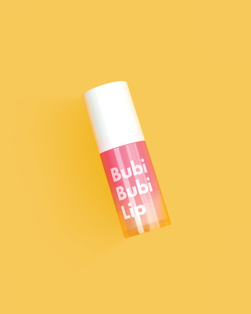
If you haven’t had a chance to try the Unpa Bubble Lip Scrub yet, you should. Unlike traditional lip scrubs, this lip scrub gently exfoliates the delicate skin on your lips with a unique bubbling effect (and yes, your lips will actually bubble!). The hero ingredient in this innovative lip scrub, sclerotirum gum (a natural thickening agent), is derived from the fermentation of reishi mushrooms. Just one use will leave your lips hydrated and incredibly soft.
RELATED: The K-Beauty Lip Mask That Naturally Exfoliates and Hydrates with Bubbles
The Beauty of Joseon Repair Serum contains matsutake mushroom extract, but coupled with snail mucin filtrate and Korean herbal ingredients like ginseng and licorice root, it boasts major anti-aging and skin rejuvenating benefits. The serum improves cell turnover, evens out dull skin tone and plumps fine lines and wrinkles. The result? A healthy and glowing complexion.
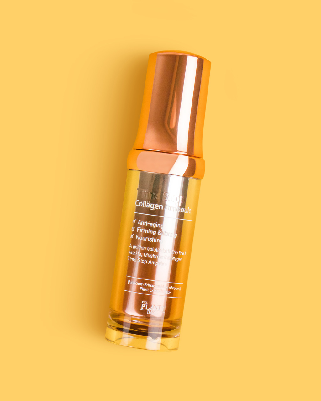
The Plant Base Time Stop Collagen Ampoule is formulated with 76.52% mushroom extract. This ampoule contains a blend of three different types of mushrooms (tremella, lion’s mane and split gill fungus) to improve skin elasticity and reduce the appearance of fine lines and wrinkles.


