What is lactic acid? Since it’s really easy to become overwhelmed when searching for a new product, Ingredient Spotlight is here to break down the basics. Here we’ll teach you how an ingredient works and leave you with product recommendations to help you with your search.
By now, you know about our love-love relationship with skincare acids: they love your skin, and we love them back. But with so many types of acids turning up in beauty products (ascorbic, salicylic, glycolic, citric, mandelic) it can be intimidating to try and pick one to work into your routine. In our ongoing quest to give you all the info you need for your very best skin ever, we’d like to introduce you to one of the backup singers of the skin care acid world: lactic acid.
What is lactic acid?
If you’re an exfoliation nerd (a buffing buff, if you will), lactic acid probably sounds familiar. On a basic level (get it? Basic? #chemistryhumor) lactic acid is an alpha hydroxy acid, aka AHA. It’s naturally produced during bacterial fermentation, like the kind that occurs in the making of your favorite cheese and yogurt; that’s right, your fave DIY yogurt mask? It’s chock full of lactic acid.
What does lactic acid do?
Like all AHAs, lactic acid goes to work on the weak bonds that keep dead skin cells stuck in place, gumming up your otherwise bright glowy complexion. Lactic acid breaks those down, allowing the dead skin cells to come off and your fresh skin cells to shine through. “This exfoliation helps correct uneven skin tone and brighten skin. It can also help minimize signs of aging as well as reducing acne and hyperpigmentation,” says dermatologist Annie Chiu.
Lactic acid also has a secondary function: hydration. “Lactic acid hydrates skin by building lipid barriers in outer layers of skin,” explains Chiu. And since lipid barriers are essentially your skin’s version of castle walls, building them up does the double-duty of helping block irritants and other baddies from sinking in while also locking moisture in for maximum dewiness.
What skin types can use lactic acid?
Technically everyone; it all comes down to concentration. Super powered doses (anything between 10-70%) work as chemical peels and are best only used once a week or less, but milder doses (in the single-digit percentage range) can be integrated into part of a daily routine.
Acne prone types and those looking to iron out pesky fine lines are especially good candidates since regular chemical exfoliation can help keep pores clear and boost cell turnover (which also makes it a top choice for folks with acne scars or discoloration.) As with most ingredients, acids in particular, sensitive types should be the most cautious when folding lactic acid into their skincare regimen.
If you’re pinkness prone but still keen to get in on the lactic game, try incorporating a product with a low lactic acid percentage (keep an eye out for versions with the word “daily” on them) every third night for a week. If your skin tolerates it well you can slowly ramp up to every other night, and so on until your skin has fully adjusted. We really love the Sunday Riley Good Genes All-In-One Lactic Acid Treatment as a starter product.
Anything else to watch out for?
“Remember that anytime you exfoliate, you leave your skin more vulnerable to sun, so be sure to protect it daily, not just for a couple of days post exfoliation,” Chui advises. She also warns that when it comes to acids, more isn’t necessarily better. “Look at ingredients and be sure you aren’t including more exfoliants in your routine, too much exfoliation could cause irritation.”
Where should you get it?
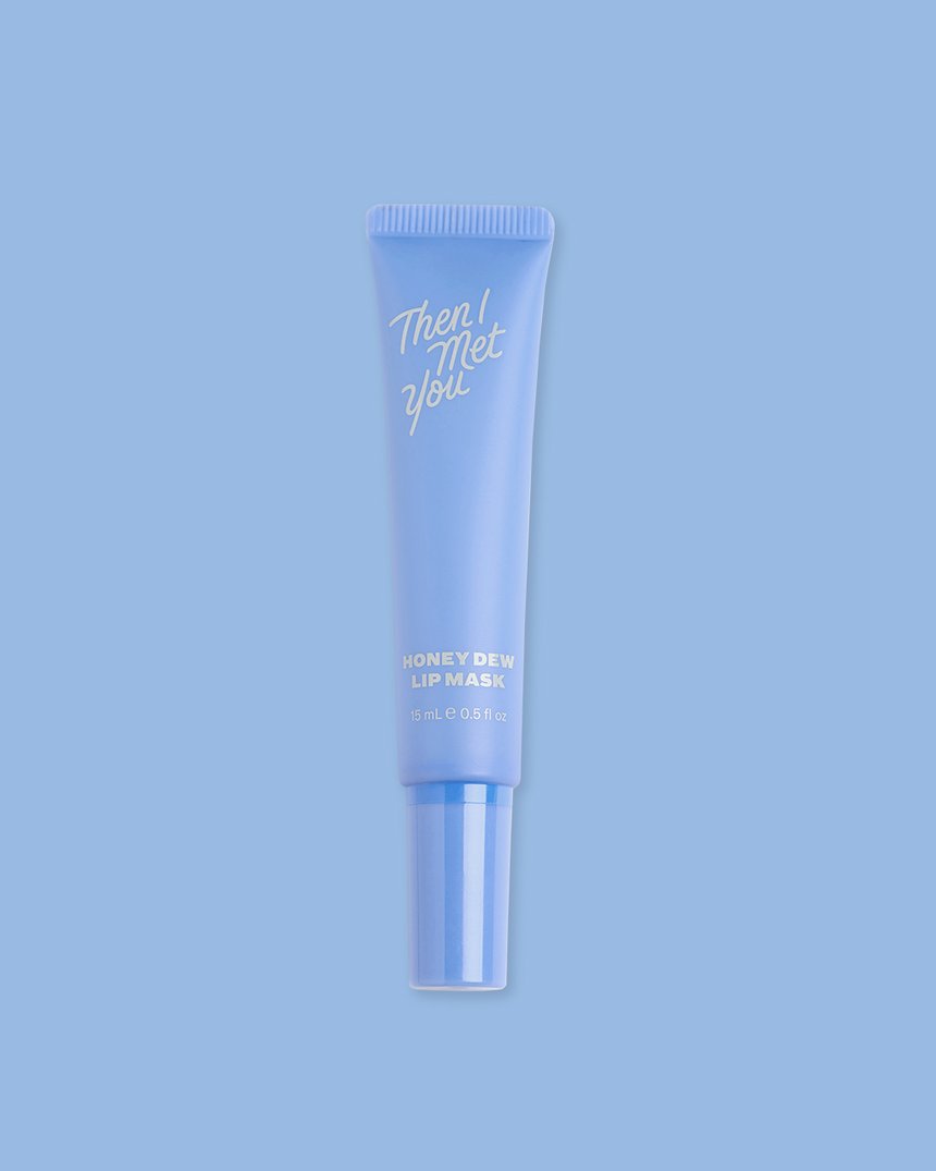
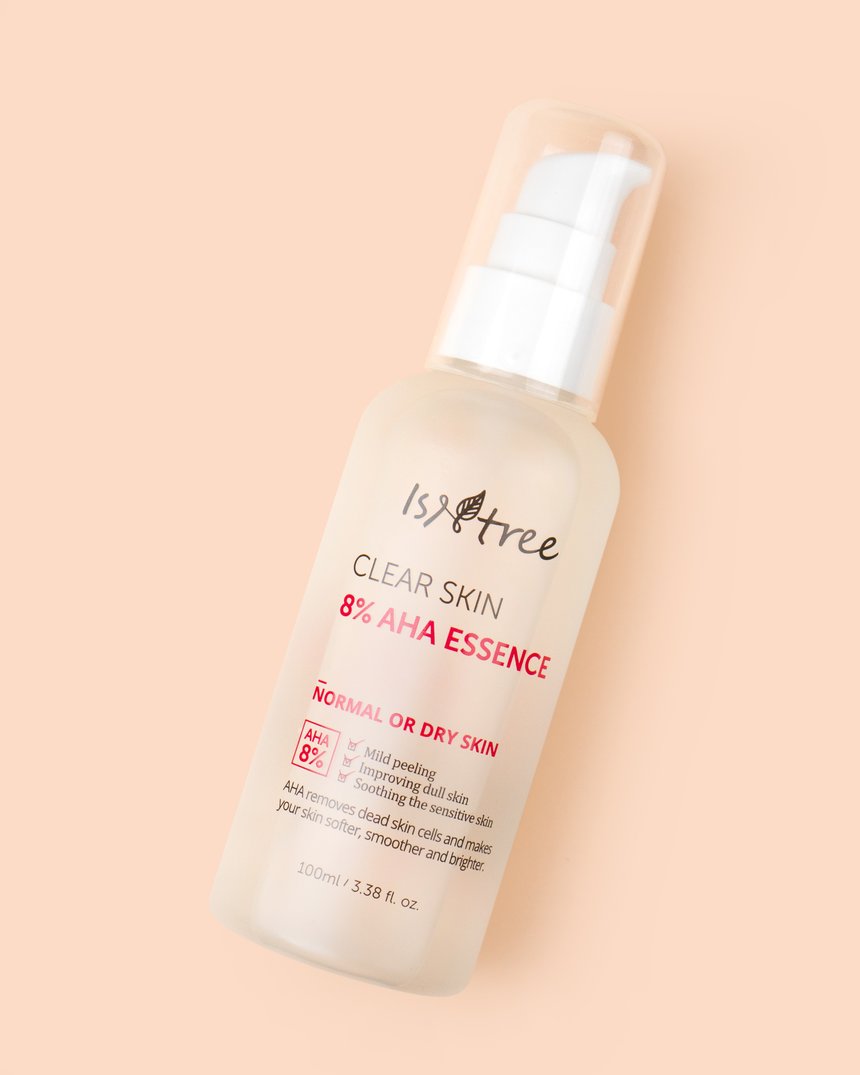
The quickest and easiest way to work lactic acid into your skincare routine is through a daily toner, which will keep your dosage low enough to ward off sensitivity but high enough to get the effects you’re looking for. We like the Isntree Clear Skin 8% AHA Essence, which clears away dead skin and product residue with a blend of AHAs, including lactic acid to exfoliate and hydrate. The Then I Met You Honey Dew Lip Mask is ideal for those looking for an exfoliating lip mask that’s also hydrating!
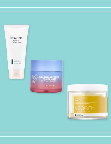
Looking for a heftier exfoliating payoff? In the Neogen Bio-Peel Gauze Peeling Lemon Pads, glycolic and lactic acids team up with lemon extract to create a smoothing twice weekly peel that also infuses skin with brightness. Just slip your fingers into the pouch of this gauze pad and buff your way to flawless skin.


