What K-beauty products should be in your arsenal if wrinkles and anti-aging are on your list of skin concerns? Read on below for our top picks.
Lines, wrinkles, and the like may be inevitable, but you can slow down the process by stocking your skin care routine with the right products. Some of the youth-preserving ingredients we swear by are antioxidants, AHAs, vitamin C, and hyaluronic acid. You’ll find them, and more effective ingredients, in the K-beauty products highlighted below.
RELATED: What to Do When You Get Your First Wrinkle
Whether you’re looking to revamp your entire regimen or just introduce a new powerhouse product or two, read on below for a full routine’s worth of anti-aging options.
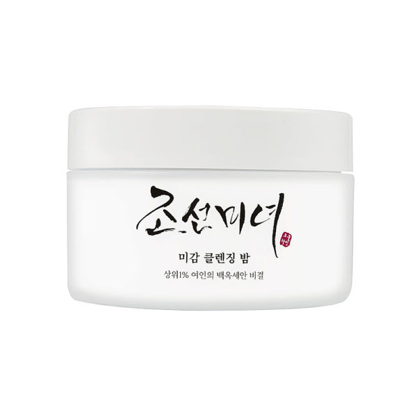
Oil Cleanser: Beauty of Joseon Radiance Cleansing Balm
When skin ages, it can become sallow and less even in texture. This cleansing balm contains rice water and fermented grains that boost cell turnover, revealing brighter, smoother skin. The formula also contains chrysanthemum extract, a source of anti-aging vitamin A.

Foam Cleanser: Klavuu Pure Pearlsation Revitalizing Facial Cleansing Foam
Give your skin a “treat yourself” moment with this pearl extract-infused cleanser. Pearl extract offers multiple benefits that are helpful for those seeking a more youthful-looking complexion. It’s brightening, soothing, rich in free radical-fighting antioxidants, and can aid in stimulating collagen. Another star ingredient in the creamy formula is algae extract, which is also a source of antioxidants, as well as hydration.
Exfoliator: Neogen Bio-Peel Gauze Peeling Wine
Resveratrol is the antioxidant in red wine that gives the beverage its supposed heart-healthy benefits. It’s also an excellent skin care ingredient. In addition to protecting against free radical damage, it’s also a naturally-occurring AHA (alpha hydroxy acid) that exfoliates skin.
These gentle yet effective pads are drenched with the ingredient, along with pore-cleaning and exfoliating lactic acid.
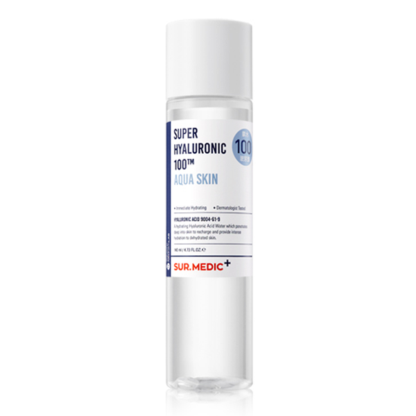
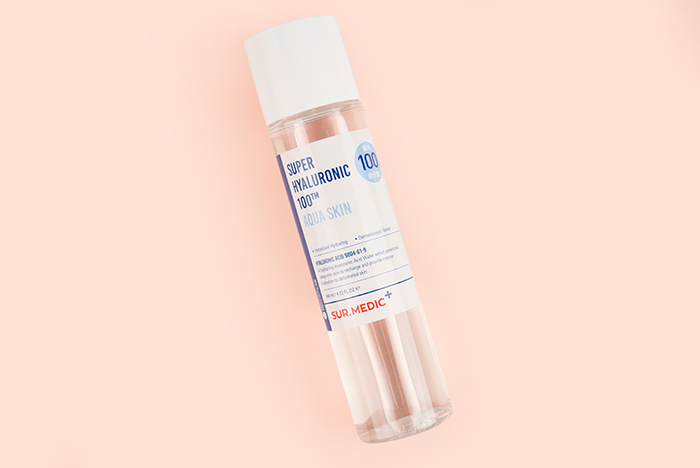
Toner: Neogen SUR.MEDIC+ Super Hyaluronic 100TM Aqua Skin
As skin ages, it cannot retain moisture as well as it used to, resulting in a loss of elasticity, wrinkles, and a less plump appearance. With its ability to retain over 1,000 times its weight in water, hyaluronic acid can help prevent these issues by keeping skin hydrated.
This toner contains a combination of hyaluronic acid molecules for even better results, in addition to brightening camu camu, and firming ginseng root extract.
Essence: The Plant Base Pore N Tightening Essence
K-beauty products are known to be gentle and sensitive skin-friendly, so you won’t often find an ingredient like retinol in them. This essence is an exception. The formula features a cocktail of anti-aging vitamins including vitamins A (retinol), C, and E, yet is not harsh or irritating. It also contains tannin extract and EVERMAT, a patented ingredient, to minimize the appearance of pores.
Serum: CosRX Triple C Lightning Liquid
This serum is considered a holy grail product for a reason. It contains 20.5% pure vitamin C, which in addition to preventing signs of aging from forming, treats pigmentation and brightens. It should be a staple in any anti-aging regimen.
Sheet Mask: Atrue Real Black Tea True Active Mask
The very first ingredient (i.e. the most concentrated) in this sheet mask is black tea ferment. Black tea is an antioxidant that can help protect skin from UV damage and environmental pollutants that cause signs of aging to form and thanks to its caffeine content, it can also tighten and tone skin.
Consistent use will offer the best long-term results, however you can expect a brighter and more hydrated complexion after just one 20-minute sheet mask session.
Eye Cream: Erborian Ginseng Infusion Total Eye
In your 20s, hydration is the name of the game when it comes to eye cream. Beyond that, it’s time to up the ante. This formula is hydrating, plus it contains ginseng extract, an ingredient that has been shown to firm and smooth the appearance of fine lines. It also boots circulation, a trait that helps de-puff and minimize dark circles around the eye area.
 Moisturizer: Dewytree Ultra Vitalizing Snail Cream
When skin is dehydrated, fine lines and wrinkles are more apparent and it’s more prone to forming new lines. This is why moisturizer is a key component in any day or night skin care routine. This ultra-nourishing formula contains ingredients like trehalose and betaine that help skin retain moisture, in addition to snail mucin (a natural source of hyaluronic acid), and wrinkle-fighting adenosine.
SPF: Tony Moly My Sunny Watery Essence SPF 50/PA+++
Sunscreen is arguably the best defense against signs of aging, which is why we recommend wearing it every single day. This is the perfect everyday formula because it’s lightweight, fast-absorbing, and offers SPF 50 protection. Plus, it contains hyaluronic acid and aloe vera for bonus hydrating and soothing benefits.


