It’s the best sale of the year — for a very limited time!
Black Friday is basically here are Soko Glam’s celebrating with their biggest Cyber Weekend sale yet!
Soko Glam’s Skin Care Wonderland Sale continues with a sitewide 30% OFF everything* (using code SGWONDERLAND30), but they’re kicking it up a notch for Cyber Weekend (which for Soko is starting 11/23) and offering 40% OFF orders of $195+ with code SGWONDERLAND40.
But that’s not all! From 11/23-11/29, gift sets will be included in the sitewide sale for the first time ever. If you’ve been waiting to fill your cart, this sale is definitely the time to score some amazing deals.
Here are our top picks to grab for everyone on your list (and of course, treats for yourself, too!)
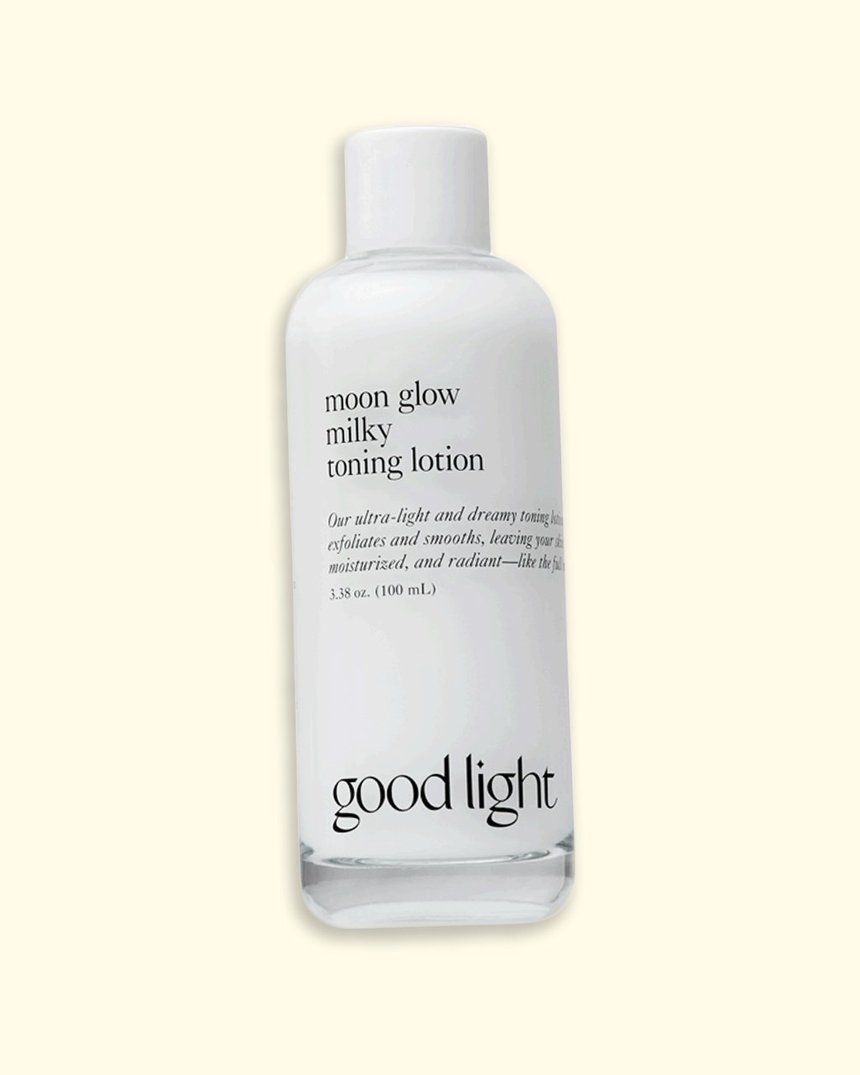
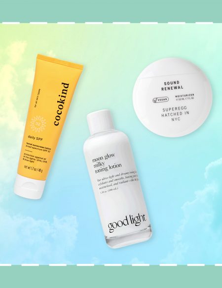
good light Moon Glow Milky Toning Lotion
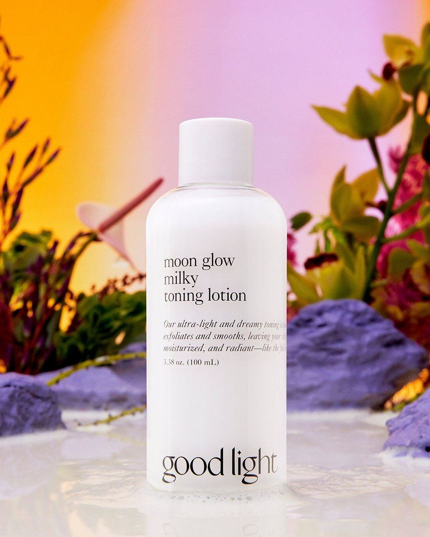
You may have seen this good light superstar popping up all over TikTok, and for good reason. Combining gentle AHA exfoliation with deeply hydrating snow mushroom and moisture-locking ceramides, this toner alleviates redness, reduces pore size and balances oil production. It’s a perfect treat for winter-dull complexions and makes a great gift when paired with Klairs Toner Mate 2 in 1 Cotton Pad, because who doesn’t love the gift of good skin?
$22 $15.40 with code SGWONDERLAND30 until November 29th*
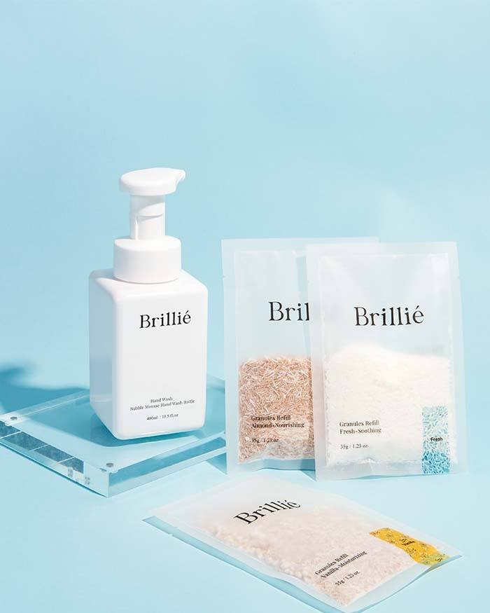
If you’re seeking the perfect host gift, look no further than this eco-friendly set. Designed to reduce single-use plastic, Brillie has created powdered hand washes that activate when you add water. Simply add the solution of your choice to their stylish refillable bottle, mix with water—et voila!—a luxurious hand soap that lathers into a creamy foam for clean and comfortable hands. This set includes a starter bottle and three pouches in Almond, Vanilla and Fresh scents.
$20 $14 with code SGWONDERLAND30 until November 29th*
Chasin’ Rabbits Limited Edition Set

This might be the cutest set out there, and while we recommend giving it as a gift, we won’t blame you if you keep it for yourself. Featuring three of our favorite Chasin’ Rabbits products (in full-sizes!), this set stars the Mindful Bubble Cleanse, a head-to-toe purifying charcoal cleanser, Magic Beauty Shroom, a hybrid essence for healing and hydration, and Green Golden Ruler, a yogurt-like cream packed with antioxidants and probiotics for a more balanced complexion. Packaged together with a tie-dye dust bag, stickers and a super-soft headband, this set is the perfect introduction to the Chasin’ Rabbits line.
$85 $59.50 with code SGWONDERLAND30 until November 29th*
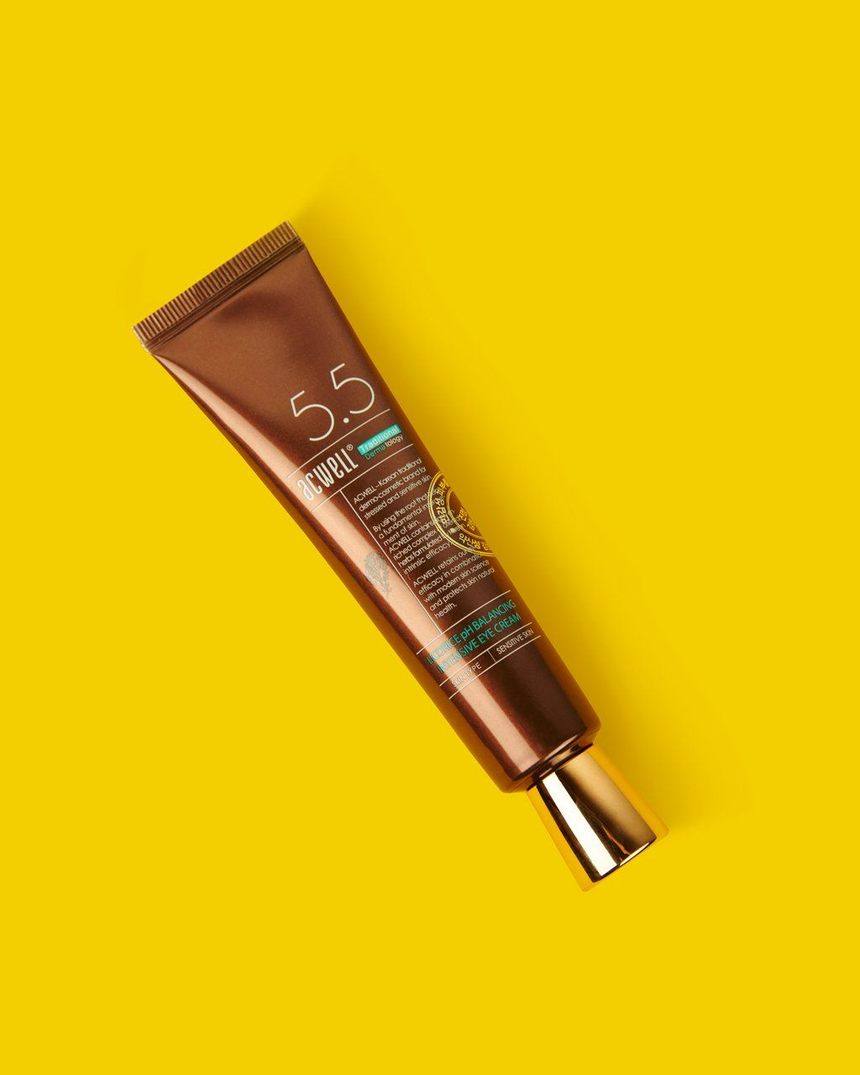
Acwell pH Balancing Intensive Eye Cream
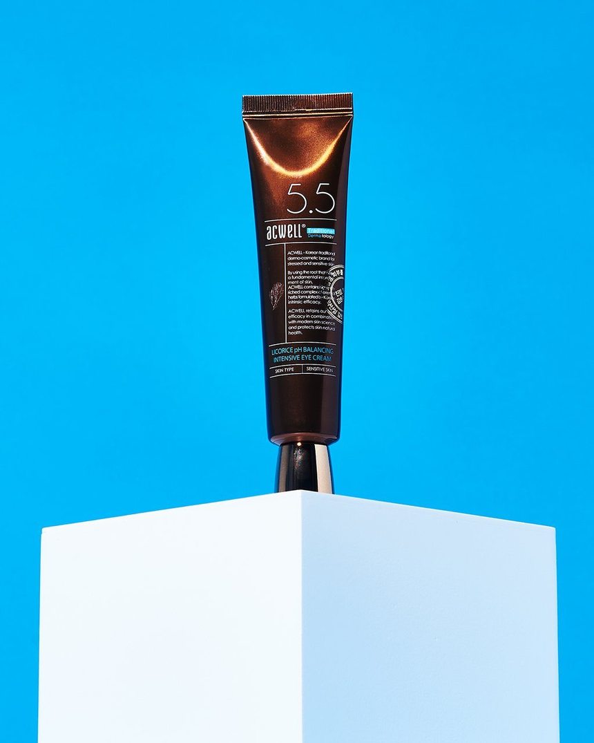
This is definitely a holy grail eye cream. The hydrating Licorice pH Balancing Intensive Eye Cream formula features licorice water and licorice extract to brighten dark circles and hyper-pigmentation.
This brightening dream is a great way to start the day, as it features caffeine to help depuff after a good night’s sleep.
$30 $21 with code SGWONDERLAND30 until November 29th*
Neogen Day-Light Protection Airy Sunscreen
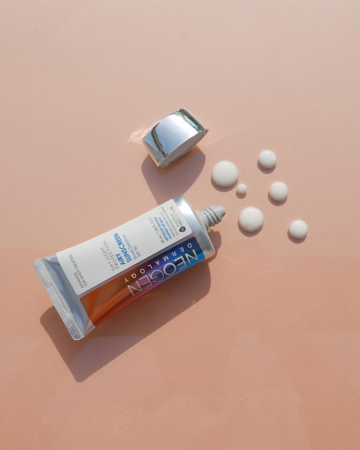
The winter days may be shorter, but that doesn’t mean it’s time to skip out on SPF. This lightweight new sunscreen from Neogen is a treat to apply with its fast-absorbing, airy finish. Featuring 20 kinds of plant extracts, it hydrates and calms without clogging pores or leaving a white cast. At a savings of 30% off until November 29th, you can grab a tube for yourself and your besties, because gifting sunscreen says, “I love you, and I want you to protect your gorgeous self!”
$32 $22.40 with code SGWONDERLAND30 until November 29th*
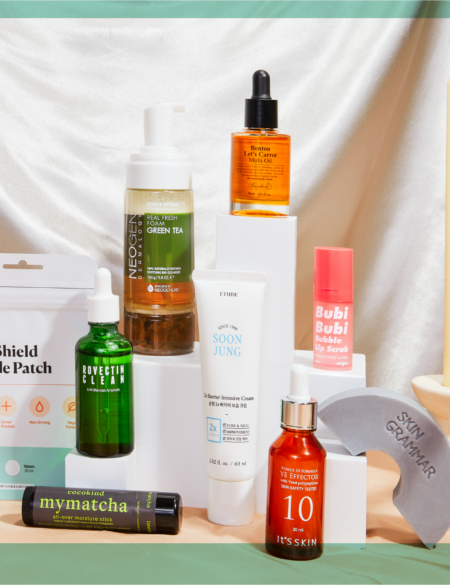
Unpa Bubi Bubi Bubble Lip Scrub
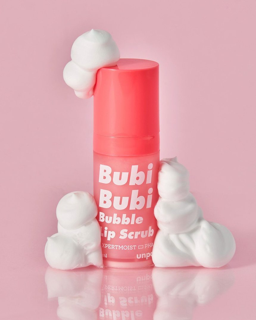
Recently repackaged and reformulated for even more bubbles, this innovative lip treatment is the perfect stocking stuffer (but maybe grab one for yourself, too). With its unique bubbling effect, it gently exfoliates dead skin cells away without being abrasive, while shea butter, olive oil and ceramide NP nourish so lips are left soft and protected.
$12 $8.40 with code SGWONDERLAND30 until November 29th*
What caught your eye during this Cyber Weekend Bonanza? Let us know in the comments!
*SGWONDERLAND30 30% OFF and SGWONDERLAND40 codes do not apply to Then I Met You or books. Gift set discounts only valid 11/23-11/29. Sale ends November 29th, 2021.


