Salicylic acid is one of the most popular and effective ingredients for keeping skin clear, but one skin care newbie with dry skin learned the hard way that using an acid too frequently and incorrectly can do more harm than good.
Salicylic acid-based face washes are great for many people, specifically oily and acne-prone skin types, but for others, they may not be the best choice. After my first facial in July of 2018, I learned that the face wash I was using for years was putting me into the “others” category.
Since I did not have a basic education about skin care and had no idea about the various skin types, I decided that going to a facialist would be a good place to start. At the beginning of my appointment, I shared my primary skin concerns with my skin therapist: dry, flaky patches and spots of bright redness.
After examining my face and the thickness of my collagen, she concluded that my skin type is dry, which I was making even more dry with my go-to face wash. Even though it was a relief to restore some hydration to my face within a matter of fifty minutes, that was only the first step in the battle of reverting the several years of damage and lack of care to my skin.
RELATED: What I Learned After Over-Exfoliating With a Popular Product Caused the Worst Breakouts of My Life

My skin is now smoother, and more hydrated and radiant than ever.
I had to make some big changes to my daily skin care routine based on product recommendations from my skin therapist. For starters, I had to get rid of my cost-effective salicylic acid face wash in favor of one with hydrating, nourishing ingredients like aloe vera. One of the lesser known characteristics of this medicinal plant is its ability to also increase collagen production, which is exactly what I needed to restore hydration and rebuild firmness to my face. The SkinRX Lab MadeCera Cream Whipped Mild Cleanser contains hydrating ceramides and aloe, making it a great pick for my situation.
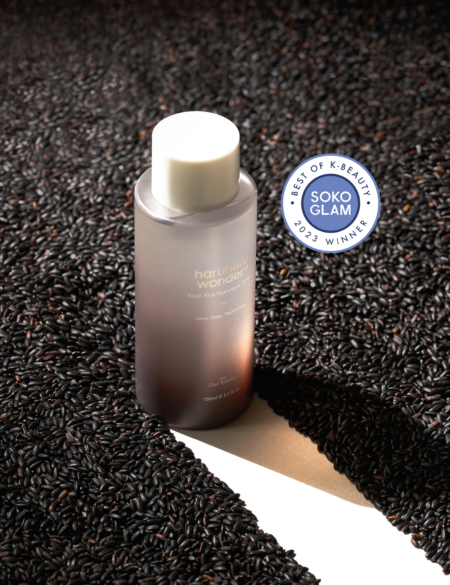
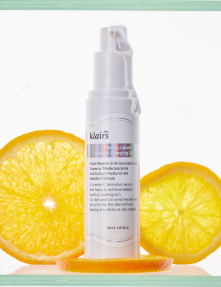
As we all know, a one-step skin care routine will not cut it in keeping the face’s skin healthy, so I also invested in an aloe vera-based toner and moisturizer.
I have to admit that it was hard in the beginning to get myself to devote a few extra minutes every day to my skin routine since I am constantly rushing from Point A to Point B in New York City, but those five additional minutes have proven to be worth it.
Six weeks after beginning my new skin routine, I made another visit to my facial therapist, and she shared with me nothing but promising news for my once moisture-deprived skin. My face felt nice and plump, and I had very few dry patches – a stark contrast to the several dry spots that had once populated my forehead and cheeks.
RELATED: The Right Way to Incorporate Acids Into Your Routine
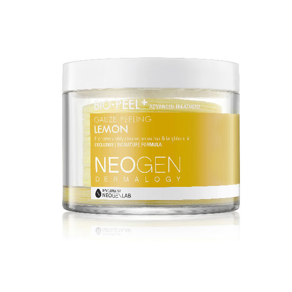
Despite the fact that my skin was making dramatic improvements from what it used to be, my skin therapist recommended that I add a hyaluronic acid-based serum and an exfoliator to my routine. One of my favorite exfoliators that I swear by is the Neogen Bio-Peel Gauze Peeling Lemon. It contains the AHAs lactic and glycolic acids that my skin is able to tolerate, in addition to orange, papaya, and lemon extracts.
I have come a long way from the beginning of my skin care rejuvenation journey that started fifteen months ago. Today, I continue to no longer have patches of dry skin or large patches of redness on my face. Since I have a dry/sensitive skin type, I also make sure to go to my local facial spa at least two to three times a year (based on the dryness of my skin). Trying to compensate for the damage that has been done to your skin is not an easy fix, but seeking advice from a facial therapist or dermatologist can help you make sure you can take the right steps in caring for your skin. From one step to five steps, I have finally learned the definition of damage control.


