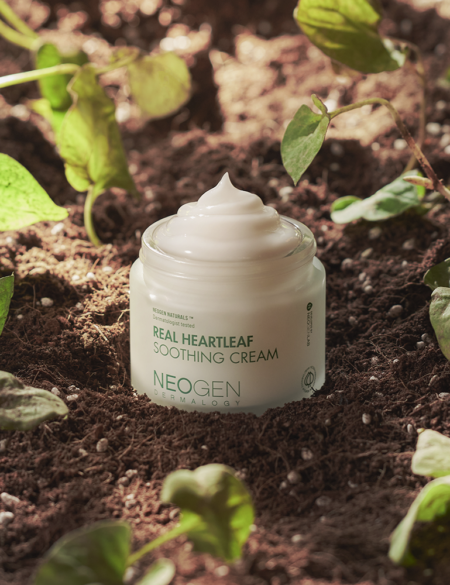
BRB, we’re currently looking for products with this holy grail in their formulations.
What are ceramides? This is something you’ve probably asked yourself while looking at a skin care product ingredient list.
Well, ceramides are a true skin care ingredient hero that everyone should get to know. Once you do, it’s hard not to fall in love.
What Are Ceramides?
“Ceramides are ‘skin identical’-like lipids that penetrate the skin quite well and seal in moisture,” says Angela Caglia, a celebrity esthetician who’s been in the skin care business for two decades. “They are excellent for hydration, and you can expect more plump and moisturized skin with use.”
Think of ceramides as the “glue” that bonds skin cells together, kind of like the frosting that keeps a gingerbread house from falling apart, or the mortar that’s used between bricks. When skin cells are glued together via ceramides, it creates a protective, hard-to-penetrate layer that shields the skin from outside damage and helps retain moisture. Here’s the takeaway: Ceramides are the bomb when it comes to improving skin barrier function!
RELATED: Everything You Ever Wanted to Know About Using Vitamin C For Your Skin
How Do Ceramides Get In Products?
Our skin naturally produces ceramides, but the ceramides you find in products are either synthetic versions or are derived naturally from plants. They are nearly identical to the stuff already found in human skin.
What kind of skin type benefits from ceramides?
Everyone! As we mentioned, your skin naturally produces ceramides, but as you get older, the amount of ceramides in your skin also decreases. This could be a result of your skin becoming damaged or irritated (which happens with sun and wind exposure), drying products, and general aging. Since they are great at building up the skin’s barrier and retaining moisture, ceramides are an amazing ingredient for severely dry skin, those with hyperpigmentation, and people with eczema.
Our Favorite Products With Ceramides
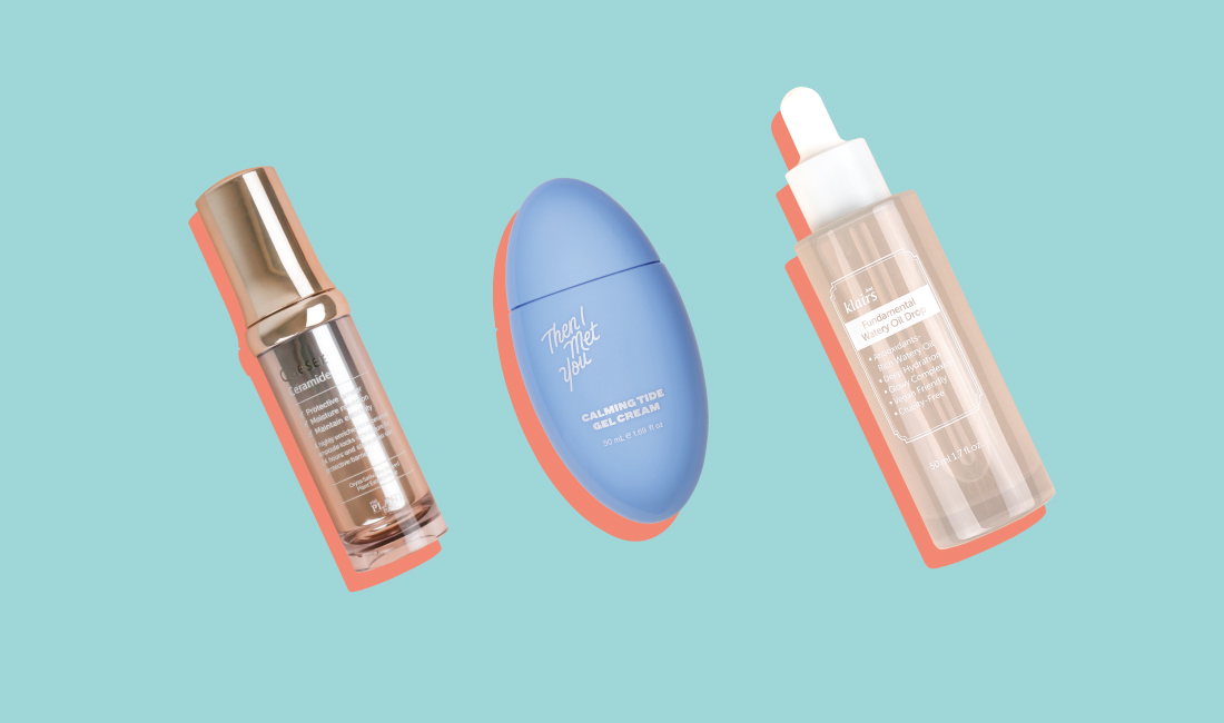
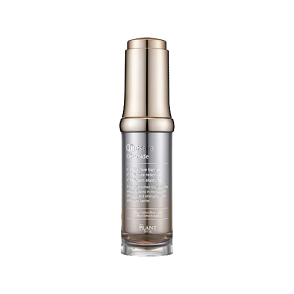
If you’re looking for a solution to restoring moisture to the skin barrier and hydrating the skin, the Plant Base Quesera Ceramide ampoule is a great starting point. Consisting of rice bran oil, niacinamide, and licorice root extract, these ingredients work in tandem with ceramides to deliver a bright, hydrated complexion.
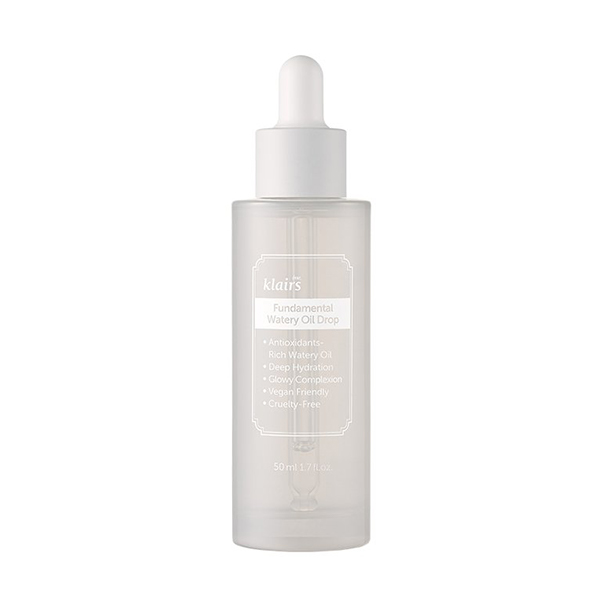
Another one of our favorite hydrators is the Dear, Klairs Fundamental Watery Oil Drop. This water-based serum featuring green tea, ceramide, peptides and ferment extracts locks in all the skin’s moisture while shielding the skin from free radicals.
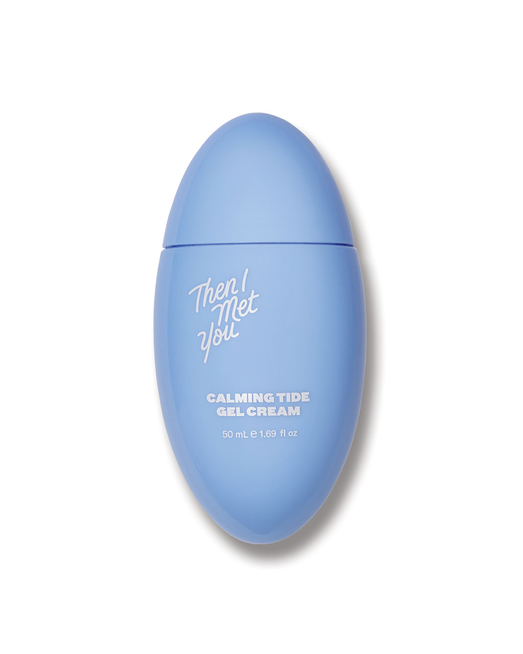
We’re also partial to the Then I Met You Calming Tide Gel Cream, a lightweight, ultra-moisturizing cream that’s loaded up with ceramides, hibiscus, madecassoside, and niacinamide. It’s approved for all skin types, but dry and sensitive skin types will especially love it.
There are ceramides in some makeup products, too! The Nature Republic Super Origin Cushion CC is a cushion foundation that allows you to double-down on your ceramide intake while it helps even out your complexion.
Now you’ll never ask “What are ceramides?” again!

