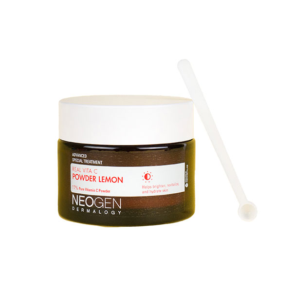
Allow us to introduce you to a new skin care innovation that we’re excited about: The Neogen Real Vita C Powder Lemon. It’s a vitamin C powder that supercharges products you already have in your routine with brightening powers. We asked two people to test the powder for six weeks and share their honest opinions. Keep reading to find out what they thought!
Vitamin C is one of the most powerful skin care ingredients out there. It’s a strong antioxidant that helps protect skin from UV damage and prevent signs of aging from forming, it evens out skin tone, fades hyperpigmentation, and brightens the complexion.
The ingredient is typically found in serums and there are a lot of great options available, however, these types of formulas are not without a few cons.
The liquid form of vitamin C can oxidize after exposure to light, heat, and air, turning a murky shade of yellow or brown and more importantly, becoming less potent. This also means that vitamin C serums don’t exactly travel well. Plus, depending on the dosage, the ingredient can be too harsh for some and it can take time for one’s skin to adjust to it.
K-beauty brand Neogen is aiming to solve these issues with its new Real Vita C Powder Lemon ($20). It’s a powder that’s formulated with 17% ascorbic acid (pure vitamin C), along with ingredients we love like allantoin, hydrolyzed collagen, trehalose, and lemon extract for nourishing and even more brightening benefits. The powder, designed to be mixed in with your toner or essence, is not susceptible to oxidation and can be used on all skin types, including sensitive. 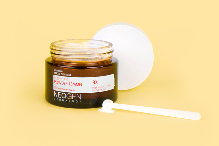
We were lucky enough to get our hands on a few jars before launch and we shared them with friends of The Klog who were looking to brighten their complexions and target dark spots and hyperpigmentation. They each tested Vita C for six weeks. Here, they share their results.
Lauren
What she wanted the Vita C Powder to improve:
I wanted to reduce dark spots – especially one on my chin – and I wanted a natural glow. I feel like other vitamin C products I’ve used have made me look shiny and oily, so I was hoping this one wouldn’t – and it didn’t.
Her first impressions:
I was a little thrown off by the powder form and I’ve never done a DIY skin care treatment before. At first, I was using two scoops of the product [Ed note: the product comes with a spatula for easy and precise application], and it wasn’t dissolving so it felt grainy on my skin. But once I cut down to using one scoop and got used to the idea of mixing in the powder with my toner, I became a pro!
When I first started using it, I mixed the powder with the Benton Aloe BHA Skin Toner, and noticed that my skin was really dry. After mentioning it to a co-worker, she pointed out that you shouldn’t mix vitamin C and BHAs like salicylic acid because they’re both strong, potentially irritating ingredients. She recommended the Klairs Supple Preparation Unscented Facial Toner instead. Once I switched, the dryness went away.
How she used it:
I mixed it with the Klairs toner mentioned above three times a week at night.
Her results:
It took about three to four weeks to see results – that’s when I started getting compliments on how glowy my skin looked from my co-workers. I rarely wear makeup to the office, so I knew it was because of the vitamin C powder. In addition to brightening overall, I’d say the product definitely evened out my skin tone. I’m planning on continuing to use the product – I feel like it’s going to last me forever! In six weeks, I didn’t even make a dent in it.
Erin 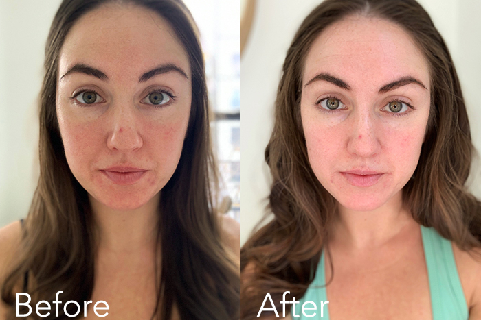
What she wanted the Vita C Powder to improve:
I have long struggled with some acne scarring and hyperpigmentation. My end goal was to have an even complexion so I could say, “Goodbye foundation!”. I understand this is a big goal, but I was hoping this product would speed the process along.
Her first impressions:
I have never been a huge fan of the vitamin C step in my skin care routine. However, this product definitely seemed to work better on my skin compared to other brands. I do not love the gritty feeling of my face immediately following the application, however by the time I apply moisturizer the feeling is gone.
How she used it:
I used it almost every night and mixed it with the Dewytree Ultra Vitalizing Snail Essence Water.
Her results:
I started to see subtle results after about two weeks. There was a slight improvement in my skin tone and dark spots around my chin area. I also noticed that any stress pimples I get on my chin fade faster now. It didn’t do much for the freckles on my nose. That being said, I will continue using this product in hopes that my skin progresses.


