Search for “pregnancy safe skin care ” and you’ll find a whole bunch of articles with conflicting information on what is OK to use and what is absolutely off limits. Below is final information from trusted dermatologists you can rely on.
“While you’re pregnant, and also during breastfeeding, you need to make some adjustments to your beauty routine,” says Neil Sadick of Sadick Dermatology. It’s just a part of the package, and a very important one at that. Your skin is actually the largest organ in your body, so it’s especially important to be conscientious of what you apply on it while you are pregnant.
But fear not! There are plenty of safe and effective ingredients that you can use to maintain your signature pregnancy “glow.” Here, we debunk myths and break down the list of the worst and best products for your pregnancy skin care routine.
The myths about pregnancy and skin care:
Pregnancy is a wonderful time but it can also be scary with all of the information floating around out there about what you can and cannot safely do, and as many pregnant women know, this extends to skin care.
“The biggest myth is that all products are dangerous,” says Sadick. “While there are several ingredients to avoid, there are myriad of products that are absolutely safe. It’s very important to protect your skin from sun damage and keep it hydrated and well-nourished during pregnancy.”
Annie Chiu of The Derm Institute debunks another popular myth out there: The one that says if it’s an “organic” or “all-natural” skin care product, then it will be OK. “That is actually untrue because whether a product is labeled as ‘natural’ or not, if it has not been studied on pregnant women extensively, you can never say it is considered ‘safe during pregnancy,” says Chiu. Therefore, the product actually falls under the “we are not sure” category, due to lack of studies. “As long as there is awareness of this, I encourage discussions of skin care ingredients between expectant mothers and their dermatologists as well as their OB-GYN physician,” says Chiu.
Another myth according to Chiu? The “if the product’s available at the drug store, it must be safe” one. “If you look at the fine print, even most OTC products, including benzoyl peroxides and salicylic acids, which are common OTC skincare ingredients, typically advise you to discuss with a physician during pregnancy,” she says. “There are actually very few ‘proven via studies’-safe ingredients, but they include vitamin C and glycolic acids.”
If your skin is more sensitive, another pregnancy safe option is the Klairs Freshly Juiced Vitamin C Serum. Both of these serums are great for brightening skin and combating dry patches.
The safety of different products is not the only concern in an expecting mother’s skin care regimen—there’s also the preventative and restorative measures taken for those annoying stretch marks. Another myth, according to Dr. Sadick, is the famous “cocoa butter stretch mark cure.”
According to Dr. Vivian Bucay, of Bucay Center for Dermatology and Aesthetics, “One of the biggest misconceptions is that stretch marks can be prevented by moisturizing alone. A stretch mark is a tear in the dermis (deeper layer of skin) that occurs when the skin stretches too quickly. While dry skin can be more easily traumatized, if there is a genetic tendency for stretch marks or weight gain is too fast, no amount of cream or oils will stop a stretch mark from happening.” Sadick adds, “There are several options to eradicate [stretch marks], such as fillers, lasers or radiofrequency.”
The pregnancy skin care ingredient don’ts:
Let’s cut right to the chase…
The definitive list of NO’s: Retinol, hydroquinone, avobenzone, oxybenzone, parabens, ammonia, phthalates, dihydroxyacetone, and tazarotene.
(Helpful hint: some of these ingredients come in other forms and other names, but if the long ingredient name on the bottle contains one of the names, it’s probably a variant so either ask your derm or avoid that product to be on the safe side.)
“Avoid retinol-containing products at all costs as they are known teratogens,” says Sadick. “Retinol can be found in anti-aging creams (typically night creams) or anti-acne creams. Safe alternatives are products that contain azelaic acid, erythromycin, or clindamycin. Glycolic acid peels are also safe, and salicylic acid/benzoyl peroxide is safe in moderation.”
Most of the reasoning behind ingredients to stay away from is the lack of FDA testing on women who are pregnant with these particular ingredients. Dr. Bucay explains “As a rule, pregnant women should avoid vitamin A acid products, including retinol, retinoic acid (Retin A), tazarotene (Tazorac), adapalene (Differin), which are used for acne and/or signs of sun damage. Another compound to avoid is salicylic acid, which is a beta hydroxy acid used to treat acne and brown spots.” Chiu says, “It is likely that most of these products don’t have enough absorption to be problematic, but because the potential of risk versus the cosmetic benefits, it is best to avoid them during pregnancy.”
Retinoids, as most people know, are kind of a lifesaver in an anti-aging regimen. So what’s a mom-to-be to do? The good news is there are tons of other options out there that can be just as effective, and totally safe. In addition to vitamin C being a great component in any anti-aging routine, ingredients like citric acid and white truffle can keep your skin plump and wrinkle-free.
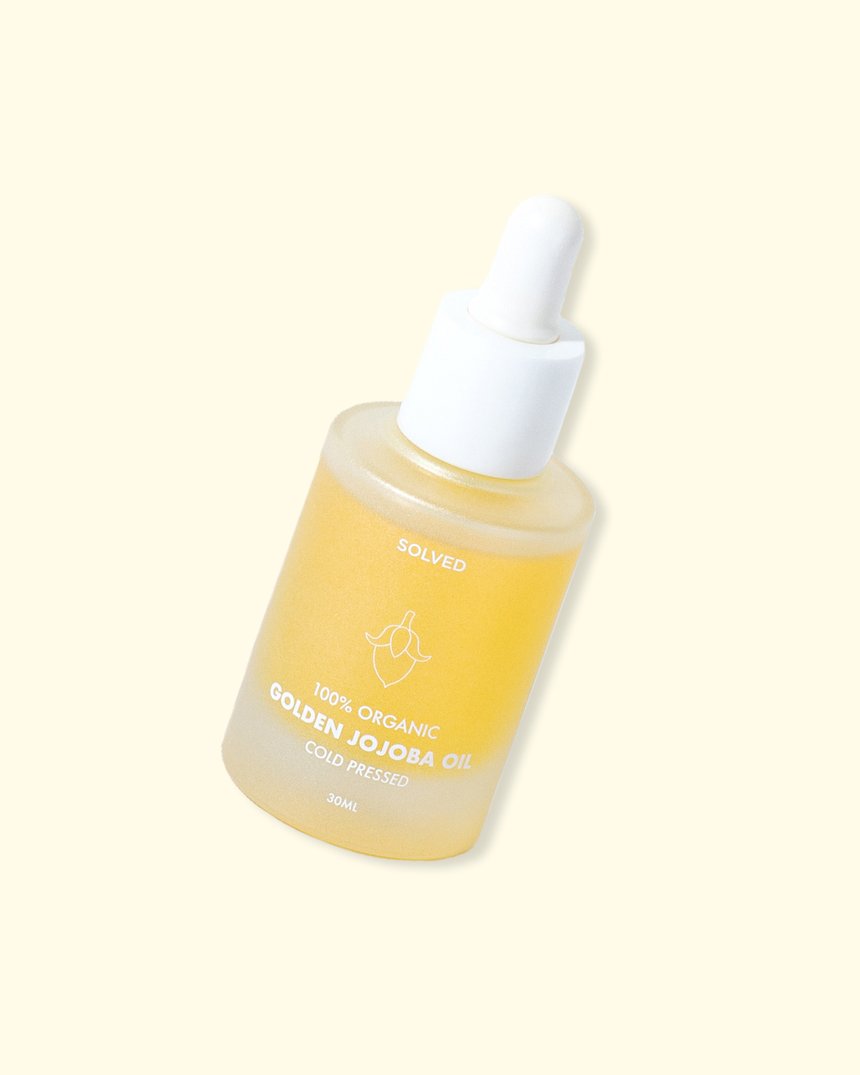
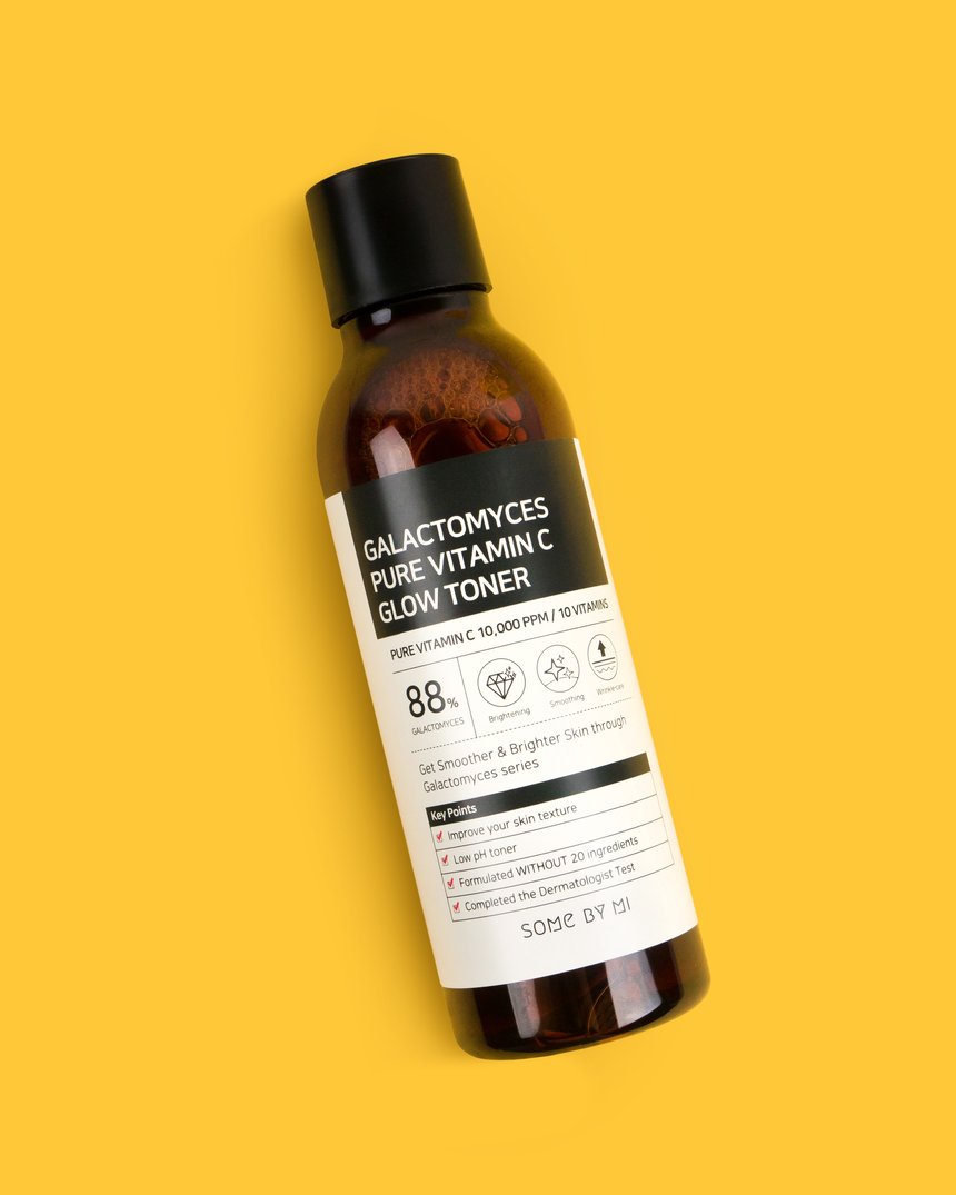
Two products I use in my daily routine that are safe for pregnancy are the Some By Mi Galactomyces Pure Vitamin C Glow Toner and the Solved Skincare 100% Organic Golden Jojoba Oil.
“Hydroquinone is another common ingredient in skin care, particularly in skin brightening/lightening creams, but it may be associated with birth defects so it’s best avoid it,” says Sadick. “Safe alternatives to treat pigmentation issues during pregnancy are alpha hydroxyl acids, found in peels or cream.”
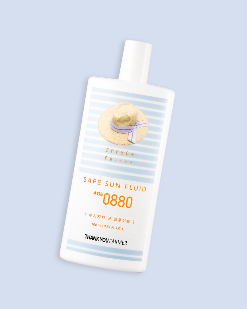
“Avobenzone and oxybenzone, commonly found in sunscreens, are not recommended in pregnancy,” says Sadick. “Products with zinc oxide are considered much more effective and safe.” Luckily, Thank You Farmer’s Safe Sun Fluid AGE 0880 SPF50+ PA++++ is free of those ingredients and completely safe to use. This SPF protectant, which happens to be another personal favorite of the Klog team, is super rich with niacinamide and centella asiatica extract.
Sadick adds: “Other ingredients to avoid are parabens, ammonia, phthalates, dihydroxyacetone—these are found in several products from hair dyes to nail polishes and self-tanners. Although there is no evidence they cause harm to the fetus or baby, some animal studies have shown there is potential for teratogenicity, so best be safe than sorry.”
The ingredient dos:
As mentioned before, a big misconception about pregnancy and skin care is that you are limited from all the good stuff for nine months. But there’s actually a ton of stuff out there that is not only safe, but really good for skin when your body is going through pregnancy.
But don’t fret if you don’t naturally have the famous pregnancy glow. “Another myth is regarding the ‘pregnancy glow,'” says Sadick. “While some women find their skin is radiant, others experience dryness and breakouts that needs to be addressed with appropriate skin care.” And that’s totally fine and normal, and doesn’t mean you can’t find you pregnancy glow through great skin care.
Glycolic acid is a safe and gentle ingredient for women who are pregnant, and it’s great for fighting acne and breakouts. So if you happen to be experiencing a pregnancy-induced breakout, try switching up your cleanser and be sure to follow up with a really good moisturizer if you are also dry skin prone.
Bottom line:
Being proactive about safety when your pregnant is super important. Carefully checking labels and consulting with your derm are great ways to ensure you get the best skin care, with the least risk. However there are a lot of myths out there, so be sure to do your homework and know that being pregnant doesn’t mean giving up great skin care!


