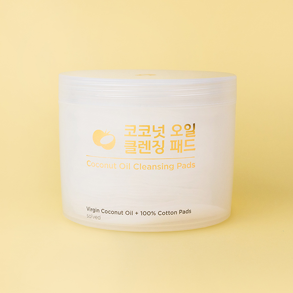
The Solved Skincare Coconut Oil Cleansing Pads claim to remove even the most stubborn smudge- and waterproof makeup. Keep reading to find out how they performed in the face of 16 long-wearing formulas.
Coconut oil serves as an effective makeup remover because it’s able to break down even waterproof makeup while being gentle and nourishing. But if you’ve ever tried to apply raw coconut oil from a jar on your face, you know it can be a messy endeavor. Plus, you have to use your hands, which can spread bacteria, essentially canceling out your cleanse. And then there’s the fact that the oil is considered comedogenic, meaning it can clog pores.
So how can you reap the cleansing and makeup-removing benefits of coconut oil without the cons mentioned above? Meet the Solved Skincare Coconut Oil Cleansing Pads.
The round, double-sided pads are drenched in 100% virgin coconut oil and are equipped with a pocket for your fingers so you can cleanse more efficiently and don’t have to touch your face. In addition to the coconut oil, the formula contains an emulsifier to help ensure the oil rinses off with water so you’re not left with a greasy, pore-clogging film on your skin.
Sure, that all sounds great, but how well do these pads work? To find out, I put them to the ultimate test.
The Experiment 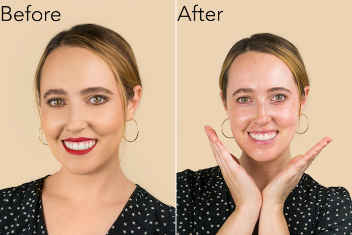
Recently, I had the opportunity to check out Blushington, a makeup and beauty lounge in New York City (there are locations in Los Angeles, Dallas, and Philadelphia too!), where you can enlist the skills of professional makeup artists to glam you up for big events like weddings or of course, just for fun.
Being that it was humid outside and I wanted to see what the Coconut Oil Cleansing Pads were made of, I asked my makeup artist Jenifer to pile on the most hardcore, smudge- and waterproof products she had to create a full face of makeup. The result was a gorgeous natural, yet far from understated look created with 16 products:
- Erborian CC Creme Red Correct
- Becca Ultimate Coverage 24 Hour Foundation
- Stila Eyes are the Window Shadow Palette
- Kevyn Aucoin The Neo-Bronzer
- Stila Convertible Color Cream Blush
- Jouer Blush Bouquet
- RMS Beauty Un Powder-Translucent
- Brow Gal Skinny Eyebrow Pencil and Eyebrow Gel
- Kevyn Aucoin The Etherealist Supernatural Concealer
- Jouer Slim Creme Eyeliner
- Julie Hewett Omit Concealer Pencil
- Eyeko Beach Waterproof Mascara
- Stila Stay All Day Liquid Lipstick in Fiery
- Kevyn Aucoin Glass Glow Face & Body
- Supergoop Defense Refresh Setting Mist
Shop them all on blushington.com.
The Removal Process 
For reference, I typically use three products to cleanse my skin at night: Baby oil (just around the eyes) to remove my waterproof mascara, an oil cleanser (all over the face), and then a water-based cleanser (I like the Benton Tea Tree Cleansing Water) to top it off. If the Solved Skincare pads could consolidate my cleansing routine from three to two steps, that would be a win in my book.
Though I didn’t want to ever take off my Blushington-created look, I went in with a pad in the name of science…or you know, for this article.
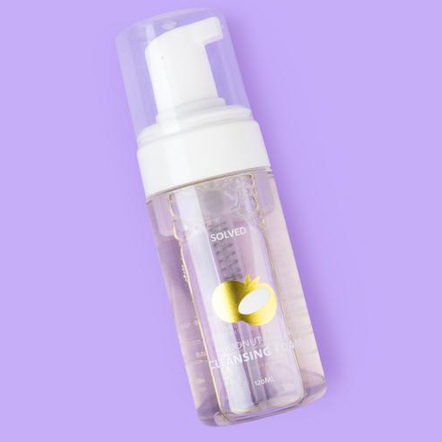
I started with the smaller side around my eyes and in a couple swipes the shadow, eyeliner, and waterproof mascara was gone – all without irritating or pulling at my eyes. A few swipes with the larger side over the face and the primer, foundation, blush, bronzer, and highlighter were but a memory. Finally, back to the smaller side, the bright red pigment on my lips jumped right onto the pad in an instant with no residue left over. I followed with a splash of water and the Solved Skincare Coconut Water Cleansing Foam to finish the job.
Bottom Line
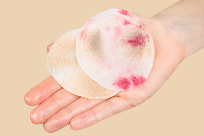 If you’ve struggled to find a makeup remover that can tackle waterproof mascara, liquid matte lipstick, and other hard-to-remove formulas, the Solved Skincare Coconut Oil Cleansing Pads are about to be your BFF. I loved that they removed all traces of my 16-product look and that I didn’t have scrub and tug at my face to do so. And even if you don’t wear tons of makeup, coconut oil is great for removing sunscreen and excess oil, plus a host of other things you can read about here.


