While COVID-19 is still keeping people around the world at home, Korea was one of the first countries to successfully survive its first big outbreak. Now, Korea is no longer in a restrictive quarantine. However, COVID-19 is still affecting people’s lifestyles – people continue to wear masks everywhere and boosting immunity has become everyone’s number one priority. Not surprisingly, the pandemic is also changing the beauty landscape. Read on to learn more about how COVID-19 is impacting skin and hair care trends in Korea.
Wearing masks all day during the hot summer season irritates the skin and enlarges pores. Rather than wearing more makeup to cover up pores, people in Korea are focusing on calming irritated skin, reducing inflammation and minimizing pores. At-home deep conditioning hair masks are also trending as people are taking their time to really focus on overall self care post-COVID-19.
Here are the top five beauty and hair trends and new products that we’re seeing more and more of in Korea due to COVID-19.
Keeping Skin Stress-free: Treating Irritation & Inflammation
COVID-19 made face masks an everyday accessory. Face masks are essential in protecting us from viruses, but skin gets stressed and irritated when being covered by masks all day. According to recent research from Olive Young, the biggest Health & Beauty chain in Korea, more and more people are looking for items related to skin relief and overall sales of calming and soothing skincare products has increased 39% compared to the same period last year. The toner category has increased 60% from last year, which indicates that people are looking for less sensitizing formulas and easy lightweight remedies to help alleviate skin troubles.
Vegan skincare brand Beigic’s new boosting essence helps balance the skin’s pH level. Coffee bean oil from Peru and 6 types of peptide ingredients instantly relieve irritated skin for smoother and healthier-looking skin.
https://www.instagram.com/p/CAnOQmrnX5C/?igshid=nrqv4faq6247
fflow Oilsoo Calming Peeling Pad
This new daily-use peeling pad from fflow will give your skin all the moisturizing, calming and skin balancing benefits. This 3-in-1 pad is also great to use before applying makeup as it helps to remove impurities and prep your skin for a smoother canvas.
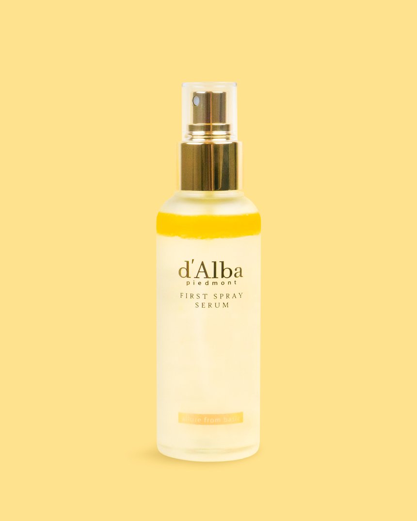
d’Alba piedmont White Truffle Vital Spray Serum
d’Alba recently launched a new variation of its popular White Truffle First Spray Serum. This new “cherry blossom” edition of the serum spray has the similar soothing, hydrating and anti-aging benefits as the White Truffle First Spray, but with additional brightening benefits from cherry blossom extracts. This lightweight serum spray is a great addition to your purse and can be used whenever your skin feels dehydrated or irritated on-the-go.
https://www.instagram.com/p/CBMfPE7HfvH/?utm_source=ig_web_copy_link
Pore Care: Controlling Sebum Production
Steamy summer humidity combined with face masks raises the skin temperature, which becomes the major reason more people are seeing larger pores. As face masks became a daily item, skin care products to take care of pores are becoming an increasing trend.
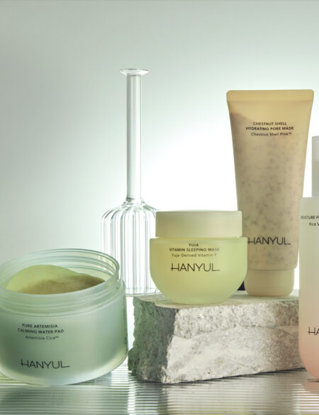
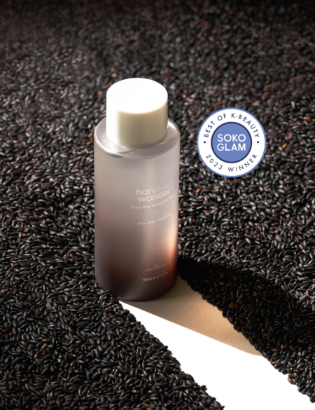
Natural origin PHA ingredients and fruit acid in this gentle toner made for sensitive skin help to reduce excess sebum and blackheads. For best results, it is recommended to use after your water cleanser as the toner helps to remove impurities while strengthening the skin’s moisturizing barrier. If you are looking for a PHA cleanser instead of a toner, try the Hanskin Pore Cleansing Oil [PHA] and Pore Cleansing Balm [PHA]. Both great for sensitive skin types, the cleansing oil and balm are formulated with gentle PHAs to exfoliate dry and faky skin while clearing your pores.
One-step serum care brand SERUMKIND recently introduced a new pore tightening serum. Containing 89% of marmelo leaf extract, the serum helps to reduce the appearance of pores and prevents excessive sebum production.
https://www.instagram.com/p/CBMkWNYJ6no/?utm_source=ig_web_copy_link
Letting Your Skin Breathe: Lighter ‘Foundation-free’ Makeup
A tinted moisturizer or tone up cream over foundation has become the preference, instead of covering skin with heavy makeup or thicker foundations. Many K-beauty brands have developed innovative formulas that are perfect for UVA and UVB ray protection, in addition to providing a healthy glow without the heaviness.
make p:rem Base me. Tinted Moisturizer
This multi-care tinted moisturizer with SPF50+PA++++ can be used as both a sunscreen and moisturizer while providing light coverage. Plus, it provides natural brightening benefits.
Cell Fusion C Toning Sunscreen 100
This naturally pink-colored sunscreen instantly brightens up overall skin tone. The lightweight and non-greasy texture will keep your skin fresh and soft all day long.
https://www.instagram.com/p/Bvs6MFkl2wt/?utm_source=ig_web_copy_link
Treating Skin from the Inside: Strengthening the Skin Barrier
Everyone wants to keep their skin healthy, and beyond just topical applications, treating your skin well from the inside out is important. The demand for skin care products that are rich in antioxidants is increasing. Rather than buying multiple products with different functions, customers are focusing on the items that work with a single drop or instantly give nutrients to the skin to promote a stronger, healthier skin barrier function.
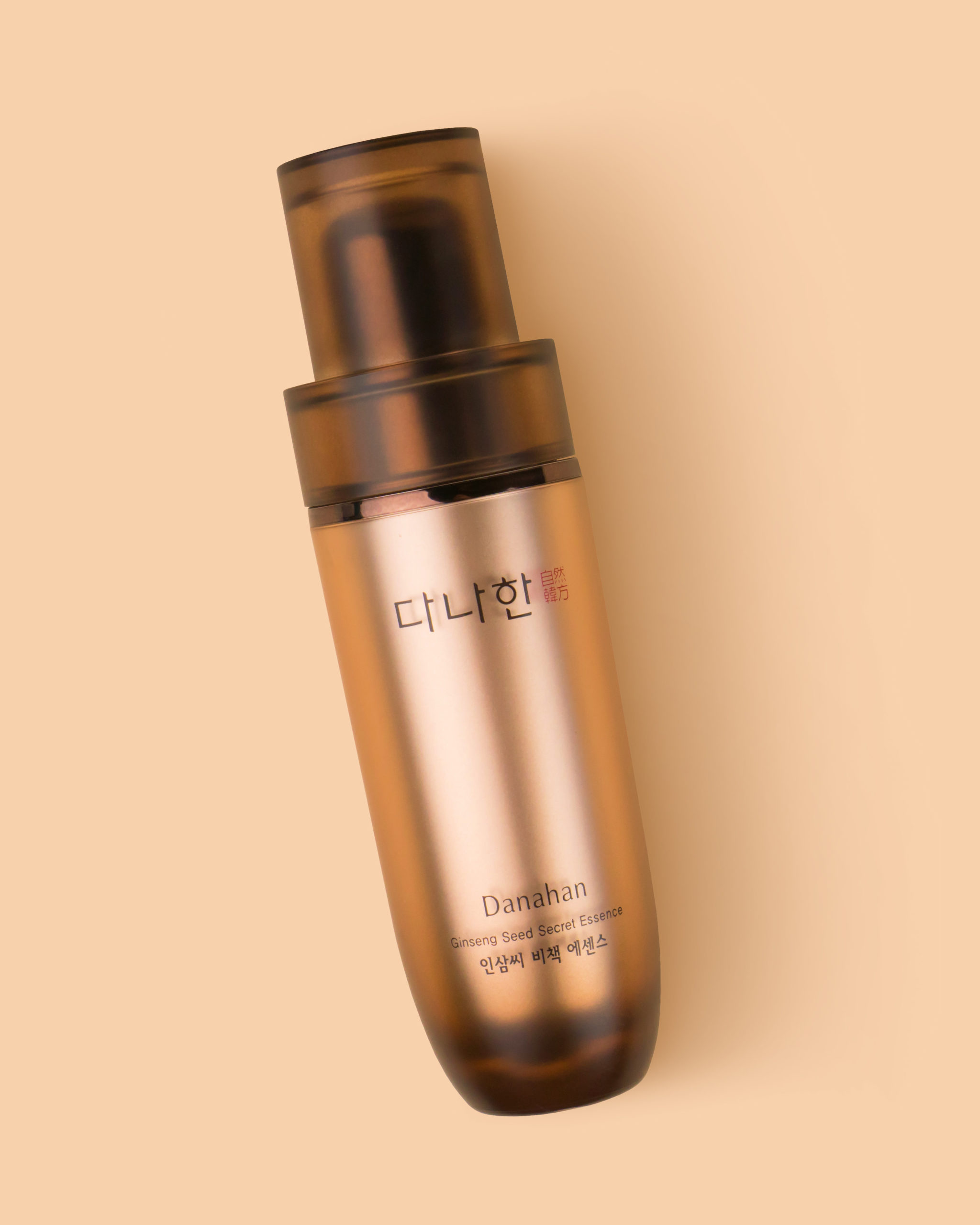
This premium essence is made of one of K-beauty’s favorite ingredients in skin care, 100% red ginseng extract. It effectively delivers powerful antioxidants to the skin while soothing stressed and irritated skin. If you are a fan of ginseng extract, another great product to try is the Danahan Ginseng Seed Extract Essence. Formulated with highly-concentrated ginseng water and other natural antioxidant-rich extracts, this essence will give your skin what it needs for a more youthful complexion.
Celltellian 24 Madeca Relief Cream
Formulated with centella asiatica, this cream helps to soothe and relieve irritated skin while strengthening the skin barrier. With its lightweight texture, this cream is great for spring, summer and fall skin care as it easily absorbs into the skin without clogging pores.
https://www.instagram.com/p/CBc50TVHD-e/?utm_source=ig_web_copy_link
At-Home Hair Treatments
COVID-19 has boosted the demand for treatments that are easy to do by yourself at home, especially hair treatments, also known as hair “clinics” in Korea, that help consumers take hair and scalp health into their own hands. According to recent research from LOHBS, one of the top three Health & Beauty stores in Korea, sales of hair care products have tripled from earlier this year.
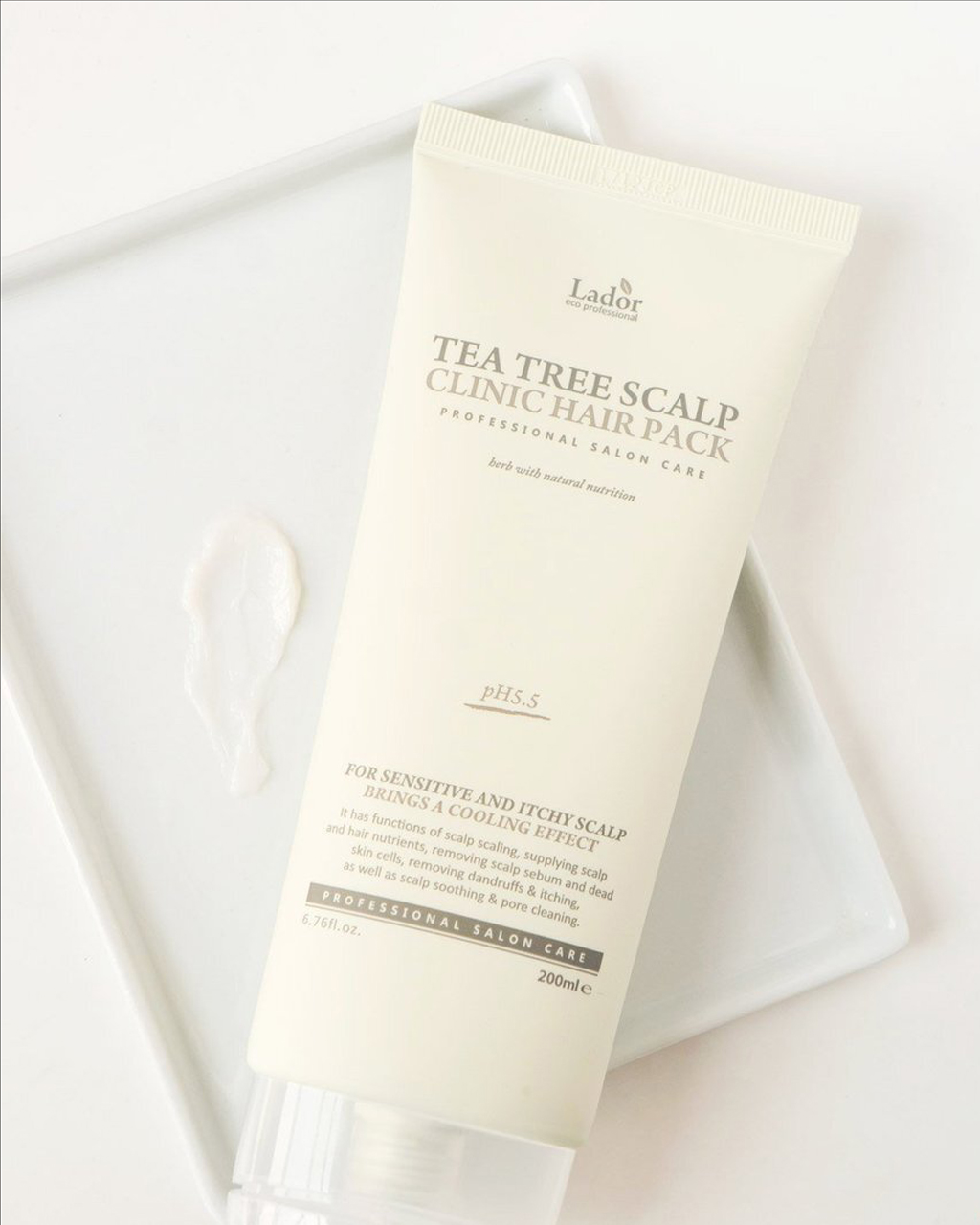
The Aqua De Folli Hair Booster ampoule is an at-home hair and scalp treatment that helps to improve the scalp condition and strengthen the hair from its roots. Aqua De Follis’ patented peptide complex easily absorbs into the hair and scalp to help hair grow thicker, longer and healthier. If this ampoule is difficult to get your hands on or if the price point is too high, you might want to try the La’dor Tea Tree Scalp Clinic Hair Pack. This hair and scalp mask uses professional-grade and natural ingredients like snail mucin and tea tree leaf oil to treat dandruff and help strengthen hair.
https://www.instagram.com/p/B8qSaVLjVmY/?utm_source=ig_web_copy_link
Rated Green Real Shea Protein Recharging Leave-in Treatment
Rated Green uses ‘cold-pressed’ or ‘cold-brewed’ ingredients in all of its hair products to deliver the full energy of active ingredients from nature to the hair and scalp. This leave-in hair treatment is formulated with cold-pressed organic shea butter, oat protein and collagen, which help to revitalize and detangle damaged hair for stronger and healthier hair strands.


