We hear it all the time: Cold weather can dry out your skin, making it rough. But how does that actually happen? We dive deep into how winter actually affects your skin and how you can prevent dry, flaky skin.
Bundling up for winter is hard enough, but keeping your skin moisturized is a whole other project. This is because your skin goes through a lot, forced to experience harsh winds and dry indoor heating and becoming dull as a result.
I, for one, used to struggle to keep my skin balanced and glowing during this season. I had tried everything from extra thick moisturizers to serums that claim to intensely hydrate, but nothing seemed to work.
Over time, I realized this was happening because I was trying to alleviate a skin issue without understanding why it was happening. The most important thing you can do to combat a skin issue is to understand why it occurs in the first place. So let’s start by going in-depth on why dry winter skin occurs. That way, you can choose the best course of action and have glowing skin all winter long.
How your skin works
To really understand how the winter weather affects your skin, let’s quickly review what your skin is made up of. Your skin is composed of several layers that range in depth and thickness. The lowest layer is comprised of subcutaneous fat, which helps insulate the body so that it can withstand varying temperatures. It also helps with energy storage.
The next layer up, the dermis, is a thicker layer that contains sweat and sebaceous glands as well as hair follicles. This layer is where sebum is secreted into hair follicles to keep skin moist and protected.
The outermost layer of the skin is called the epidermis, and it’s a thinner layer that serves as the skin’s protective barrier. The epidermis is where most of the damage occurs to the skin, especially during the winter.
What cold weather does to your skin
The outermost layer of your skin contains the moisture barrier, which protects the skin from bad bacteria, environmental stressors, transepidermal water loss, and other possible irritants. But the drastic temperature changes we tend to experience in the winter can throw off the balance of this moisture barrier. The frigid air and harsh winds, combined with dry indoor heating and lowered humidity, create a recipe for disaster for the moisture barrier.
Think of your moisture barrier as a house that is made up of brick and mortar: Your skin cells serve as the bricks, while lipids serve as the mortar that holds everything together. The lack of humidity in the air, along with the lowered temperatures, can damage the skin by causing that brick and mortar to loosen and essentially strip the skin of its protective barrier.
According to dermatologist Kavita Mariwalla, this then results in “micro-cracks in the skin that show up as redness and irritation.” Plus, once it gets cooler, the water in your skin tends to evaporate quicker. As you can see, these processes make it easy to end up with dry, flaky skin.
How to combat winter skin
It’s best to reinforce your skin’s moisture barrier so it can better protect you from the harsh weather. Given that a healthy barrier is made up of a combination of lipids like cholesterol, free fatty acids, and ceramides, in order to protect it from winter’s unfortunate effects, you need to feed it what it craves — a lipid-rich moisturizer that keeps your skin hydrated all day long.
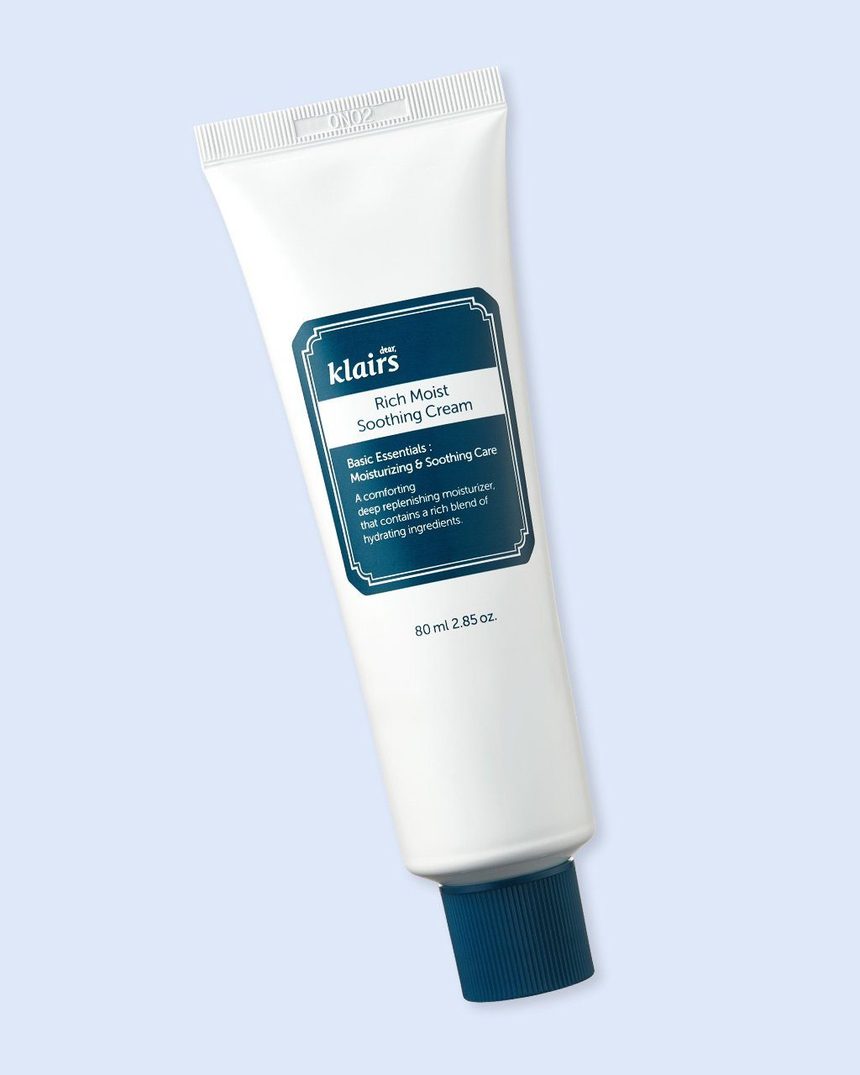
A great option is the Klairs Rich Moist Soothing Cream. It’s specially formulated to strength the skin barrier with a combination of ceramides, shea butter, and soothing rice extract. It also contains papaya fruit extract for gentle exfoliation.
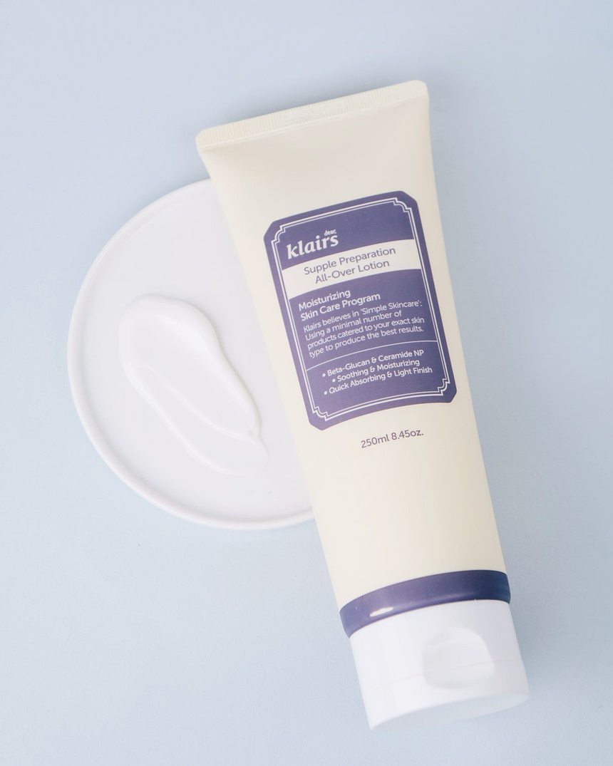
But your facial skin isn’t the only one that gets affected during the winter: The skin on your body can become just as dry and flaky. To keep your body supple and smooth, make sure to choose a lipid-rich moisturizer like the Klairs Supple Preparation All-Over Lotion. It contains shea butter, ceramide MT, and jojoba seed oil to deeply nourish the skin and keep it hydrated without leaving behind a greasy residue.
How to deal with redness
On top of dryness, the rapidly changing temperatures can leave your skin red and inflamed, which is another classic sign of skin barrier damage. According to Mariwalla, your skin can turn red because prolonged exposure to cold temperatures “vasoconstrict our blood vessels so the skin also gets less micro circulation”. Once you return to the warm indoors, “all those vessels vasodilate, [making] you look red,” Mariwalla says.
The use of lipid-rich moisturizers will help keep your skin barrier intact and protect it from environmental damage, alleviating some of the redness as a result. You can also use products with calming ingredients to soothe that red, irritated skin.
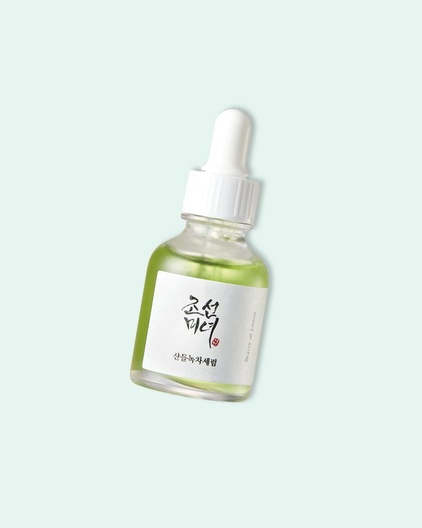
The Beauty of Joseon Calming Serum can do just that while replenishing moisture. This serum is formulated with centella asiatica extract, known to increase skin’s healing process and relieve redness, which makes this serum perfect for those with highly sensitive and reactive skin. It also contains panthenol to smooth and antioxidant-rich green tea to protect the skin from environmental stressors. Using a soothing serum along with skin-fortifying moisturizers will definitely help keep winter redness in check.
On top of that, don’t forget to protect your face and cover it with a scarf when heading outdoors. We sometimes focus so much on bundling up our bodies that we forget to take care of our faces.
Bottom Line:
Winter is a tough time for your skin, but if you understand why it affects your skin, you can be well prepared to combat winter’s adverse effects. To learn more about how you can keep your skin soothed and glowing throughout winter, check out our winter skin care hacks.


