Dry skin? We don’t know her.
Late fall and early winter is a dreamland for moisturizer lovers. Not only do we get to dip into our stash of “winter” creams and lotions, but emails and messages from brands announcing the launches of tempting dense creams and lightweight gels crowd our feeds and inboxes, tempting us to grow our collection of hydrating heroes.
With each moisturizer promising ultimate hydration, and with new skin care brands launching monthly, it’s a bit harder than it used to be to decipher which launches are worth our coin. Below, we’re highlighting the four best recently launched moisturizers to make it easier for you to decide which one best fits your skin concerns.
Let’s get into it!
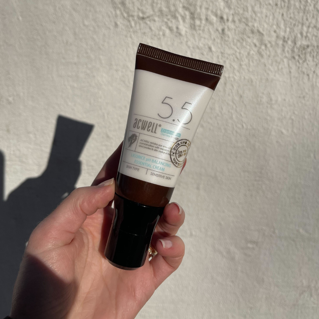
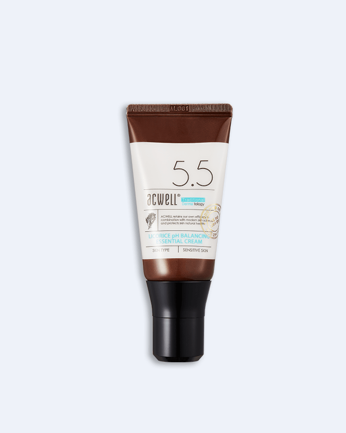
Acwell Licorice pH Balancing Essential Cream
Best For: Hyperpigmentation

Acwell fans are sure to be delighted with the latest addition to the brand’s fan-favorite licorice infused line. Launched late December, this silky cream delivers hydration with a gentle and soothing mixture of glycerin, cica, and mugwort that also makes this a great winter irritation remedy.
Much like it’s licorice line siblings, the Licorice pH Balancing Essential Cream really shines when it comes to its hyperpigmentation benefits. With 60% licorice root water and licorice root extract, this cream targets melanin production so acne scars, dark spots, and hyperpigmentation will fade with consistent usage! Did we mention its formula also boasts brightening niacinamide?
This moisturizer is a great pick for anyone looking to even and brighten their skin tone during the colder winter months!
Then I Met You Renewing Rich Beauty Cream
Best For: Anti-Aging

If Then I Met You has a launch, you know it’s going to be *good.* The jeong-based skin care line notoriously spends years on its formulations, which are often innovative and in an entire lane of their own (*ahem* the sorbet-like texture of their Living Cleansing Balm).
Their Renewing Rich Beauty Cream, launched right before Thanksgiving, follows in Then I Met You’s tradition of purposeful, effective skin care with highly thought out formulas. Seeking a three pronged hydrating approach, this creamy dream of a moisturizer contains a mix of emollients, humectants, and occlusives to fully cocoon the skin in hydration.
However, it’s the product’s focus on a Quad Ginseng Complex that really makes this cream a step above the rest when it comes to counteracting aging. Steamed and dried 9 times, this complex delivers free-radical fighting antioxidants that visibly improve the appearance of lines, boost moisture and promote elasticity.
Neogen Dermalogy Cica Repair Snail Cream
Best For: Sensitivity

Snail mucin’s a staple in the K-Beauty world. The ingredient works well with all skin types and is pretty much a one stop shop– it’s hydrating, gently exfoliating, anti-aging, brightening, and soothing. So, it only makes sense that skin care lovers would want it in their moisturizer.
Neogen’s newest hydrating cream, the Dermalogy Cica Repair Snail Cream pairs 88% snail mucin with cica, a healing and soothing mainstay. In this formulation, snail mucin’s humectant properties really shine, helping the skin to hold onto moisture and promote a healthier barrier!
I’m From Vitamin Tree Water Gel Cream
Best For: Acne

Hydrating moisturizers don’t always need to be luxuriously thick- the I’m From Vitamin Tree Water Gel Cream is a great example of this!
The cooling gel cream spotlights the antioxidant and moisturizing properties of hippophae rhamnoides fruit extract AKA sea buckthorn berry. A favorite ingredient of Kourtney Kardashian, sea buckthorn berry is a great source of vitamin C, vitamin B, and vitamin E, meaning it really works to protect the skin from free radical damage.
This gel cream it a great option for those looking for a bit of cooling protection!
+Which new moisturizer launch are you loving? Let us know below!


