If you have oily skin, you’re likely wary to start the Korean 10 Step skin care routine. For example, you may feel that putting oil on your face is going to make you break out more. But it won’t if you use the right products! Here, we breakdown the best Korean products for oily skin.
Oily skin is something you’re born with so there’s no way to prevent it, but you can treat it by using products suited for oily skin types. You should avoid harsh, drying formulas with ingredients like alcohol. While these formulas may make the skin feel less oily what they’re actually doing is triggering more oil production, because when you strip the skin of its necessary oils, it goes into overdrive to make up for the moisture loss and actually ends up producing more oil. Stick with water based, light-weight formulas that work to hydrate and regulate oil production.
Here’s a basic routine that lays out the best Korean products for oily skin. Feel free to check out our other recommendations here, and switch out where you see fit! It’s all about knowing the right products for your skin type. Then the options are limitless.
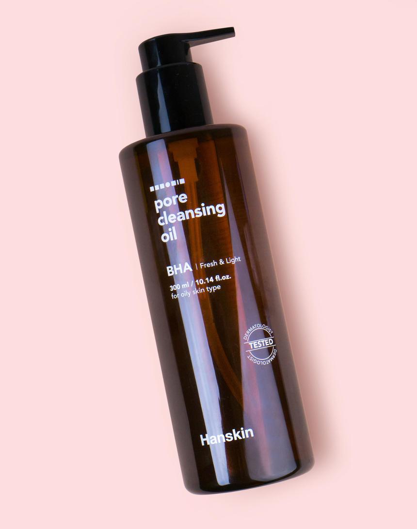
The double cleanse duo: Hanskin Pore Cleansing Oil [BHA] + Neogen Green Tea Real Fresh Foam Cleanser
Contrary to popular belief, using an oil cleanser on oily skin is beneficial. It won’t cause you any unnecessary breakouts. Oil cleansers actually help to rid the skin of excess sebum, and with regular use, help to regulate oil production, leading to a clearer, breakout-free complexion.
One of our favorite Korean products for oily skin is the Hanskin Pore Cleansing Oil [BHA]. It’s formulated with salicylic acid, which will help to cleanse and control sebum production. It’s also packed with fruit oils to deeply clean pores.
You can’t have an oil cleanser without a water based cleanser, and the Neogen Green Tea Real Fresh Foam Cleanser is perfect for oily skin. It’s fortified with green tea. This gentle cleanser will effectively cleanse your face without drying it out—keeping oil in check.
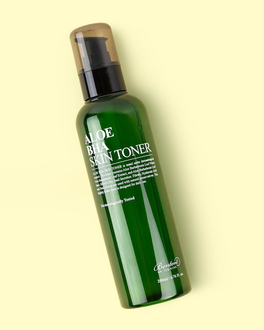
Your skin-balancing toner: Benton Aloe BHA Skin Toner
 Toners are so important for oily skin since they help to prep and balance the skin post-cleansing. They are some of the best Korean products for oily skin because they help to remove any leftover residue (which can lead to breakouts!) and reduce the appearance of large pores. Avoid alcohol based toners and instead reach for hydrating and pH balancing ones that will nourish and renew your skin.
The Benton Aloe BHA Toner is a good choice! It’s jam packed with ingredients that are suited for oily skin. Aloe will aid in soothing the skin and salicylic acid will slough off dead skin cells and reduce excess sebum. It also contains snail mucin, which will moisturize and even out skin tone. These ingredients combined will work to normalize oil production, leading to a fresh and hydrated appearance that isn’t overrun by midday oil.
Moisturizing essence: Chasin’ Rabbits Magic Beauty Shroom
Essences are one of the most confusing steps for those not familiar with the 10 step program, but it’s simpler than you think! Essences work to accelerate skin renewal and help the rest of your products absorb into the skin more efficiently. For oily skin, they can work wonders in hydrating the skin properly. Those with oily skin tend to avoid moisturizing as they don’t think they need it (given all the oil overproduction!) and that since their skin is so oily, they will age slower than other skin types. But that is all a lie. If you avoid moisturizing, you’ll only increase the appearance of fine lines and wrinkles.
No matter the skin type, you need to moisturize properly. Essences aid in hydrating oily skin without weighing it down. The Chasin’ Rabbits Magic Beauty Shroom contains 100% tremella mushroom which will intensely moisturize the skin, leaving you with a glowy finish.
Deep cleaning exfoliator: Neogen Bio-Peel Gauze Peeling Lemon
Exfoliators are one of the key Korean products for oily skin because they deep clean pores and further aid in reducing oil production. Go for a chemical exfoliator rather than a physical one. Physical exfoliators only slough off the dead skin cells on the surface. Chemical exfoliators work beyond the surface to deep clean and dissolve any impurities lurking beneath. Large pores are a major problem that oily skin types face and regular exfoliation will reduce the appearance of your pores and the back up of oil production, which lead to blackheads and whiteheads.
The Neogen Bio-Peel Gauze Peeling Lemon pads boasts several types of effective chemical exfoliants including lactic and glycolic acids and lemon extract. Vitamin C also helps fade acne scars.
Skin-loving serum: Neogen Real Ferment Micro Serum
With excess oil comes unwanted breakouts. This is why most oily skin types are acne-prone. But a consistent proper routine will aid in reducing and preventing these uninvited guests.
Ampoules or serums are a great way to treat acne. The Neogen Real Ferment Micro Serum is gel-like and fast-absorbing and helps balance oil production while brightening and plumping skin.
Optional Sheet Mask: Mediheal W.H.P Brightening & Hydrating Charcoal Sheet Mask
When your skin is feeling particularly oily, a great treatment to grab is a sheet mask! Sheet masks are designed to pack as much moisture as possible into the skin in a small amount of time (usually 15-20 minutes). When it comes to oily skin, reach for masks that will absorb excess sebum and lift impurities.
An especially great choice is the Mediheal W.H.P. Brightening & Hydrating Charcoal Sheet Mask. It’s infused with black charcoal powder to help deep clean pores.
Eye cream: Erborian Seve De Bamboo Eye
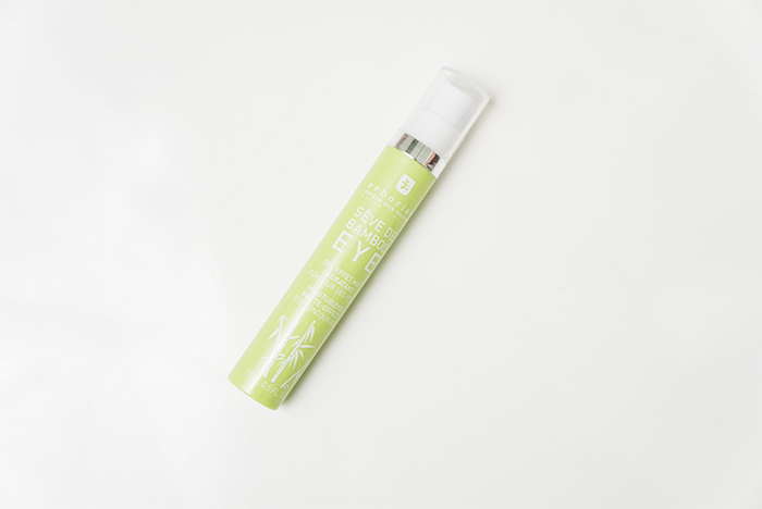 Hydrating your eyes is an essential step in the skincare routine to help prevent dryness, fine lines, and wrinkle formation. For people with oily skin, we recommend using a gel eye cream like the Erborian Seve De Bamboo Eye. This eye cream is a miracle worker, and helps keep the skin around the eyes cool, hydrated, and protected. The bamboo extracts soothe and hydrate the skin, while the bamboo fibers lock in that moisture and strengthen the skin’s natural barrier.
Light-weight moisturizer: Klairs Fundamental Water Gel Cream
Water based, light-weight moisturizers are the perfect products for oily skin. We recommend choosing gel-type ones rather than those that are emollient rich as they may increase oil production (which can end up further clogging pores).
The Klairs Fundamental Water Gel Cream is the best for oily skin. It contains 63.7% Jeju green tea water anda combination of amino acids and panthenol (vitamin B5) to keep skin smooth and super-hydrated for a bouncy, soft appearance.
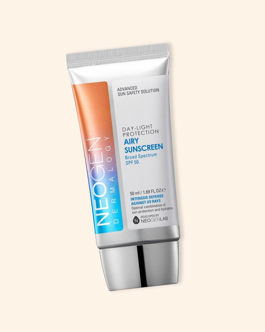
Mattifying SPF: Neogen Day-Light Protection Airy Sunscreen
We know—you’ve searched high and low for an SPF that doesn’t leave you feeling greasy! Most people skip out on SPF because of the unpleasant feeling, but it’s a vital step in protecting your skin from premature aging.
The Neogen Day-Light Protection Airy Sunscreen is one of the best Korean products for oily skin. With over 20 different types of plant extracts, it works to control sebum and oil production.


