We’re breaking down how to build the perfect 10-step routine for everyone 50+.
If you’re going through, or have already gone through, menopause, it can directly impact the look and health of your skin. A decrease in estrogen levels results in a degradation of collagen and elasticity, dehydration, and a compromised moisture barrier. Other common skin concern among this age group are sun spots and slowed cell turnover. But! There is a silver lining: A decrease in sebum production.
You’ll want to focus on products that plump, hydrate, firm, brighten, and protect the skin’s moisture barrier. With that in mind, keep reading below for our tips and K-beauty product recommendations that cater to your unique skin needs.
Oil cleanser: Then I Met You Living Cleansing Balm
The main goal of oil cleansing is to remove oil-based impurities (i.e. makeup, sunscreen, and excess sebum), but if you choose a formula with the right ingredients, it can also be super nourishing as well. This one contains vitamin E, grapeseed oil, sea buckthorn oil, and olive oil – sources of vitamin E and fatty acids, as well as moisturizing anti-aging antioxidants. Plus, it’s free of potential irritants like mineral oil, synthetic fragrance, and parabens.
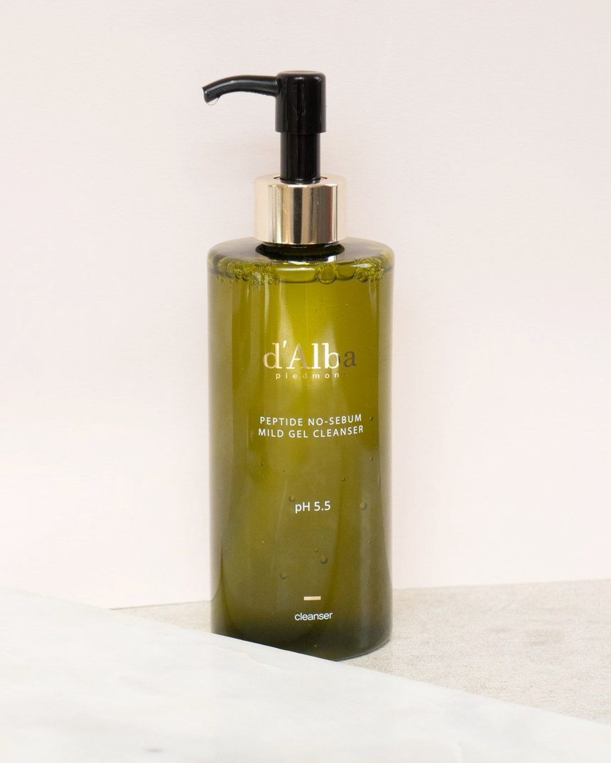
Water cleanser: D’Alba Piedmont Peptide No-Sebum Mild Gel Cleanser
This gel cleanser uses white truffle to increase cell turnover and gently exfoliate skin for a brighter, more youthful complexion, as well as BHA and calamine powder to promote smooth, balanced skin.
Toner: good light Moon Glow Milky Toning Lotion
Niacinamide is now a prized ingredient in skin care for its ability to help improve the structure of the barrier, brighten the complexion, and keep skin smooth and free of excess sebum. This toner features it, along with ceramides and mushroom to provide deep hydration. Because it’s free of alcohol, it won’t strip your skin of moisture.
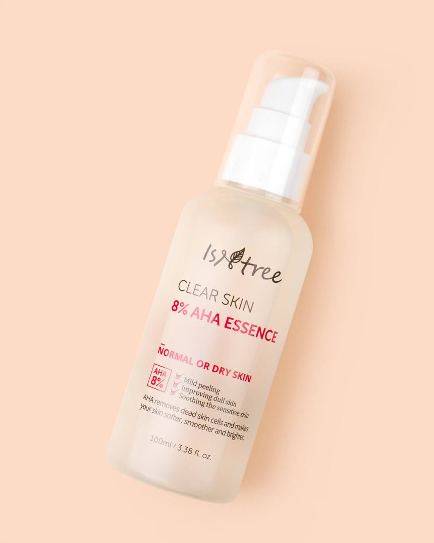
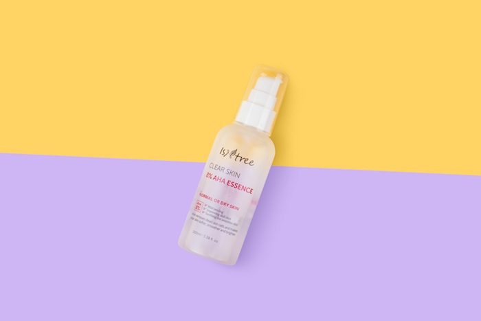
Essence + Exfoliator: Isntree Clear Skin 8% AHA Essence
When cell turnover slows down, exfoliating is key to keeping skin looking bright and youthful. We love this multitasking essence because it contains both glycolic and lactic acids. Glycolic acid effectively sweeps away dead skin cells, while the lactic acid helps improve the skin’s natural moisture factor.
 Serum: The Plant Base Time Stop Collagen Ampoule
If you’re looking for a natural way to plump up deep wrinkles and prevent new lines from forming, look to mushroom extract, which has been shown to increase collagen levels. This serum contains 76.52% mushroom extract, along with a cocktail of anti-aging and antioxidant superstars such as adenosine, licorice root, and beta-glucans.
Mask: Benton Fermentation Mask Pack
Take your mask step to the next level with a sheet mask that does more than just hydrate. This one is souped up with elasticity-boosting, nourishing, and soothing ingredients like bifida ferment lysate, lactobacillus/collagen ferment filtrate, and ceramide NP.
Eye cream: Elensilia CPP Collagen 80% Intensive Eye Cream
When you lose collagen in your eye area, you may not only experience wrinkles, but dark circles. This eye cream tackles both. The formula features hydrolyzed collagen to firm and two different types of peptides to stimulate collagen production and reduce the appearance dark circles and puffiness.
Moisturizer: ENature Birch Juice Hydro Sleeping Pack
If your go-to moisturizer isn’t quite cutting it anymore, we recommend swapping it out for a nourishing overnight mask a few times per week. This formula energizes, moisturizes, and brightens while you sleep with hydrating birch juice, chamomile, and plantain seed extracts so you’ll wake up with a rejuvenated, supple complexion.
Sunscreen: Neogen Day-Light Protection Airy Sunscreen
Protecting your skin with sunscreen is important at any age, but now you have yet another good reason to slather on the SPF: to prevent dark spots.
We like this SPF 50 formula because it’s hydrating without being greasy.


