We’re taking it back to basics.
Whether we like it or not, acne’s one of those unique skin concerns that can occur at any stage of life.
Unlike fine lines and pregnancy spots, according to the American Academy of Dermatology, pimples and breakouts can appear as soon as one enters adolescence and continues well into adulthood– often until one’s 30s and 40s.
There are now entire brands dedicated to eradicating every type of pimple and comedone, with products ranging from hydrocolloid patches to liquid exfoliators packed with AHAs and BHAs, but this season, we’re focusing on simplicity and getting back the acne fighting basics. That’s why we’re set on sharing our favorite budget acne fighting cleansers.
These three water based cleansers tap into the powers of tea tree oil, salicylic acid, and amino acids to eliminate gunk, dirt and grime and keep your skin clear!
Check out our favorite budget acne fighting cleansers below and see which one you should pick up to cut out all that extra summer sunscreen and sebum.
Benton Tea Tree Cleansing Water – $17

This game-changing Soko Glam’s Best of K-Beauty winner is also a favorite amongst beauty editors, having graced the digital pages of publications from Byrdie to Refinery29.
Fragrance free and formulated with only 10 ingredients, the Benton Tea Tree Cleansing Water provides the most for your money with 70% tea tree leaf water.
This cleansing water uses tea tree’s unique antibacterial and antiseptic properties to zap zits without irritation- this natural ingredient soothes inflammation and decreases redness!
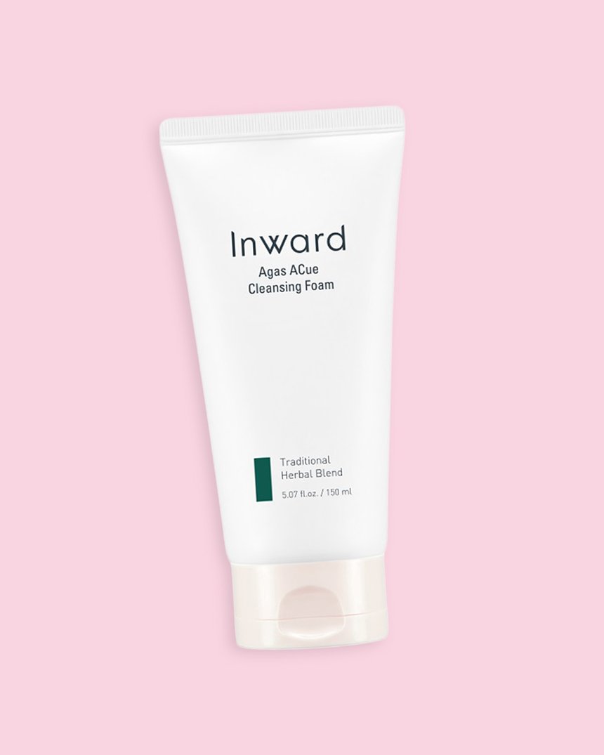
Inward Agas ACue Cleansing Foam – $19

If you’re looking for an AHA and BHA packed cleanser that’s also soothing and moisturizing (yes, it’s possible!) the Inward Agas ACue Cleansing Foam was made for you.
Lactic acid and salicylic acid work together in this dreamy foamy formula to exfoliate acne prone skin and clear out pores- preventing further breakouts while eliminating any current ones.
Moisturizing agastache, or Korean mint, is at the heart of this cleansing foam. Cica lives alongside the agastache in order to provide as little irritation to the skin barrier as possible!
We love this product because not only is it effective, budget friendly, and fragrance free, but it’s formulated with a pH close to the skin’s natural acidity so it doesn’t disrupt the skin’s acid mantle.
Dewytree Hi Amino All Cleanser – $15.99

If acne prevention- and not elimination- is your focus you might want to get into amino acids. Amino acids help the skin reproduce its own antioxidants to provide protection from free radicals like pollution and UV rays. If you’re not aware, free radicals can damage the skin causing everything from fine lines to skin cancer.
Amino acids’ benefits don’t stop there- they also assist the skin in maintaining hydration and keeping healthy with a nourished skin barrier.
A healthy, nourished, and protected barrier means bacteria has a harder time finding a home on the skin’s surface.
Try Dewytree’s Hi Amino All Cleanser facial cleanser In order to get in on amino acid’s benefits!
What’s your favorite budget acne treatment? Let us know below!


