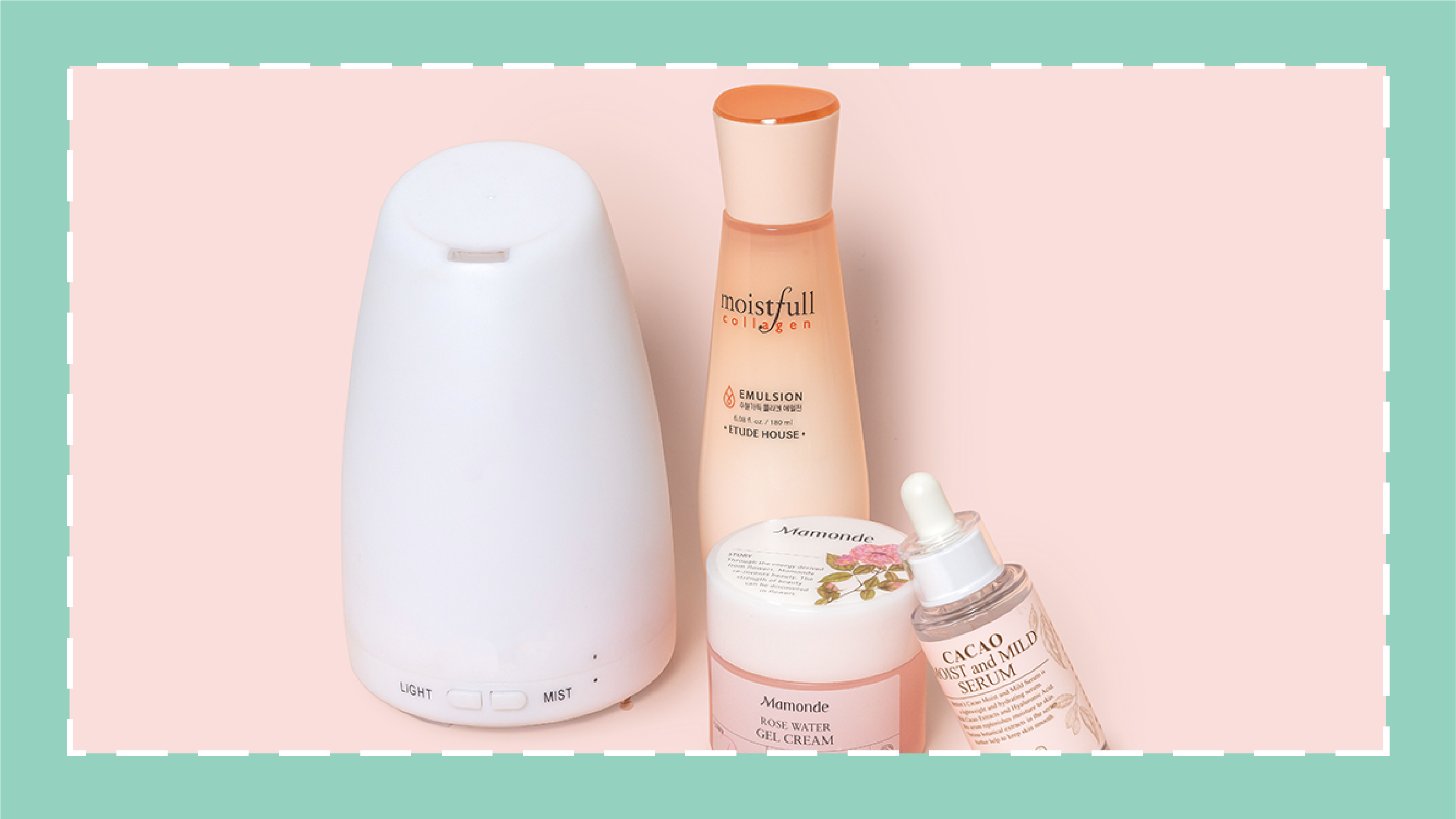
If a product is all over Instagram or in all of your friends’ medicine cabinets should you be using it too? Welcome to “Do You Really Need…”, a new series where we discuss, with the help of some experts, how to determine whether or not a trendy or divisive product really belongs in YOUR skin care routine. Today we’re discussing humidifiers.
It’s technically still summer, but the weather outside is already showing us that fall is following very closely behind. To combat dry skin during this time of year, many turn to a humidifier to supplement a hydrating product routine. But, can keeping a humidifier at your desk and/or bedside really make a difference in the state of your skin? We spoke with two dermatologists for more insights on a humidifier’s benefits.
How can the humidity of the air affect skin?
Even if your skin feels the same all year round, the humidity of the air can still be affecting hydration levels as well as your skin barrier. When the air is more humid, there is little to no evaporation of moisture from the skin, which according to board-certified dermatologist Dr. Viseslav Tonkovic-Capin, keeps your skin more supple and smooth. Therefore, low humidity causes an adverse effect on your complexion.
“When the air is dry, water readily evaporates from our skin, which becomes dry and cracked – similar to the bottom of a dried out puddle,” says Dr. Tonkovic-Capin. If your outer skin layer becomes dehydrated, it can make the skin barrier less functional in its protection of your skin.
Low humidity can be even more damaging if you’re worried about signs of aging. In a 2007 scientific study in Japan on the skin effects of room humidity, volunteers had their skin conductance, elasticity and wrinkles assessed after acclimating to a high-humidity room, and then later again after being in a low-humidity room. The results showed that a 30% decrease in humidity could significantly reduce skin elasticity and deepen fine lines and wrinkles in just 30 minutes.
This is especially relevant in the colder months because not only is the air less humid outside, but central heating inside your home or office can have the same drying result and strip even more moisture from the skin.
RELATED: The 3 Winter Skin Care Myths You Shouldn’t Believe
How does a humidifier help?
It’s common to use a humidifier to prevent these negative effects on your skin. But, how exactly does a humidifier work? “A humidifier is a portable device we can use to help control our environment,” says Vermont-based dermatologist Dr. Laura McGevna.“It forces moisture into the air and back into our skin, which helps seal the skin barrier.” Essentially, humidifiers emit water vapor into the air to improve the humidity of the area around it, which can slow down or stop the evaporation of moisture from the skin.
Using a humidifier can be especially beneficial if you’re starting to notice the signs of low humidity on your skin, but also if you usually deal with dryness or flakes. Those with dry skin conditions such as eczema or psoriasis can even see an improvement in some of the common symptoms, according to Dr. McGevna. She recommends using a humidifier at night any time you turn on the heat, especially if you live in an environment that’s cold for the majority of the year. Dr. Tonkovic-Capin says you should also use one “as soon as you start noticing patches of dry or cracking skin.”
So, do you really need a humidifier?
It depends on how much you think you would benefit from it. If you have naturally dry skin or it has been dehydrated and cracking from the cold weather, a humidifier can consistently increase overall hydration of the skin without the application of any skin care. It could also make your life a little more comfortable if you have dry patches all over, such as with eczema or psoriasis.
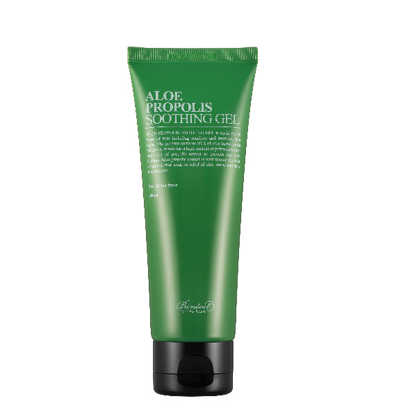
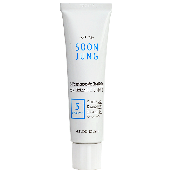
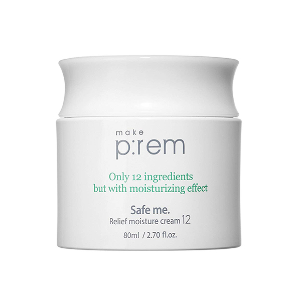
But if you’re not worried about low humidity or dry skin, adding moisturizing products could be enough to keep your skin soft and hydrated throughout the season. If you prefer the latter, Dr. Tonkovic-Capin suggests applying products with humectants, that “wick moisture to the skin.” Look for skin care products that have ingredients such as aloe, panthenol, or glycerin.

